I’ve noticed over the years when I was doing consultations and visiting homes, that there are a few things that jump out at me when I look at a space and these 5 tips will make your space even better. Things that could be improved upon with just a little work and effort will bring your room to life. These are ways to enhance your room and make it better. So, let’s get started with the first one.
(Southern Accents: Photo: Antoine Bootz, Designer: Bobbi Smith)
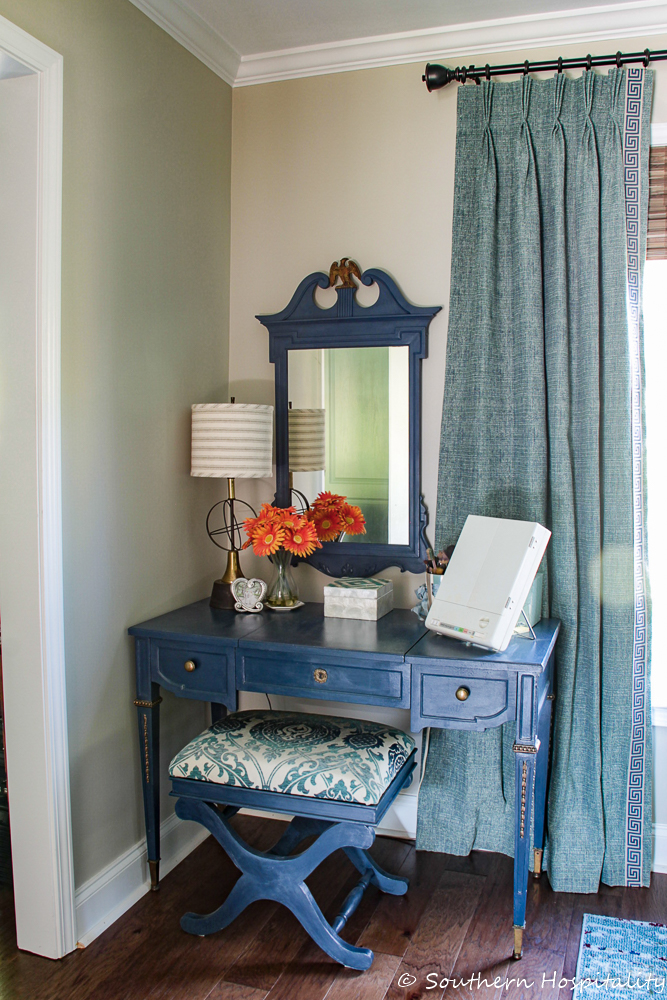
Here’s a shot of our master bedroom with the drapes hung almost to the crown molding.
1. Hang your drapes as high as you can.
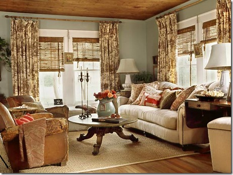
One thing I learned a few years ago when I started having drapes made and hanging them up was this, hang them as high as you can and wider than the window. All the way to the crown molding. Picture #1 is a good example of how it looks to hang your drapes all the way up to the crown. Also notice that the window panel skims the outside of the window frame and doesn’t block the window itself. If you hang ‘em high and take them out wider than the windows, it really gives the illusion of much bigger windows and lets in a lot of light. You don’t want to block that beautiful light. I’ve done this in my house on all the windows and it really works! Gives those windows much more presence and importance.
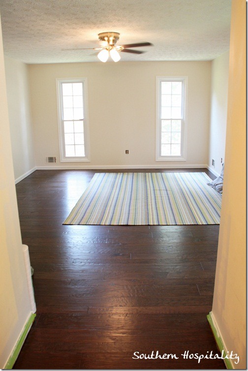
Here’s my old house for example. See how narrow the windows are?
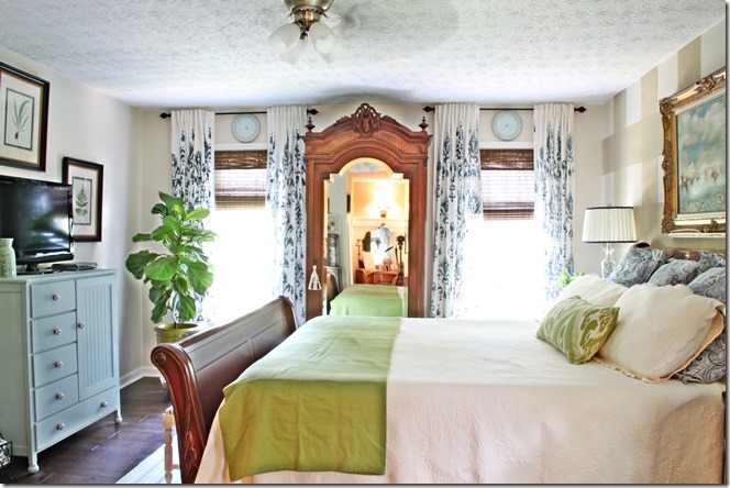
Same windows! I just took the drapes all the way to the ceiling and hung them wider than the windows for a much better look. It completely fools the eye into thinking the windows are bigger than they really are.
(Coastal Living: Photo Deborah Whitlaw Llewellyn)
2. Hang your artwork lower than you might think.
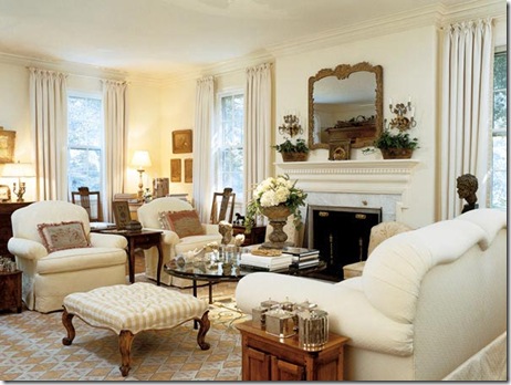
There’s nothing worse than walking in a home and seeing art hung WAY up high, so you’re looking up to see it. Artwork should be hung at eye level and I know that everyone’s eye level is different, but I usually err on the low side instead of the high side when it comes to placing artwork on a wall. The above pic shows how bringing the art down with the seating group really works well. It feels like part of the grouping and not like it’s floating above. When hanging art over something like a console table or sofa, I think the rule of thumb is about 5-6” above the item that it’s hanging over. This seems to work well and keeps the grouping cohesive.
(Cottage Living: Photo Tria Giovan)
3. Mix the room with textures.
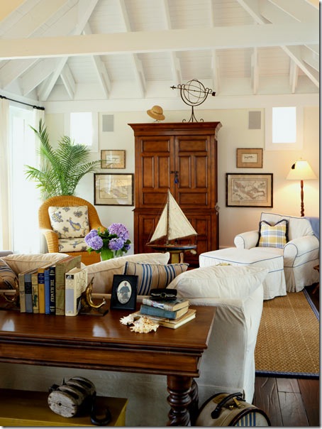
What makes a beautiful room? Mixing up the texture is a great way to add lots of interest to your room. If you have a room that’s all soft fabrics, then everything will look and feel the same and you won’t have that energy of different textures around the room that makes a beautiful room work. There are all sorts of ways to add texture. See the above pic, with the soft fabric on the sofa, lots of colorful pillows, and a seagrass rug and bamboo blinds? Mixing up that texture really makes the room pretty and inviting. This is one of my favorite inspiration pics. I just love the feel of this room. Notice how the drapery panels are hung almost all the way to the ceiling in this room too. Think about mixing up furniture pieces too: glass, iron, wood, there’s room for all of these things in the same room. In my living room, I added a glass and iron coffee table in with the 3 wood side tables to mix it up. You can have too much of a good thing sometimes, so get out of the matchy-matchy mentality.
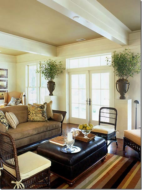
The pic below is also a great example of mixing up textures, with the soft fabric on the sofa, pillows that bring in other texture and pattern, the leather ottoman, and rattan chairs. The striped rug feels casual with a cotton look to it and mixes well with all the other elements in the room. Even the large urns with plants add some extra texture to the room. So, don’t forget to mix up the textures in your room to make it more exciting!
(Coastal Living: Harry Taylor)
(Coastal Living: Photo: Deborah Whitlaw Llewellyn, Stylist: Tracey Rapisardi, Designer: Lisa Knowlton)
4. Group your accessories in 3’s or 5’s.
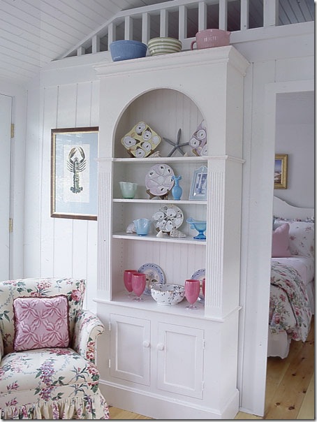
This has been the advice from designers for many years and it just seems to work. Something about those groupings just are visually more appealing and it makes for a nice feel and look to a room. So,think about that when you are putting together a vignette on a table, sideboard, or bookcase. I don’t always follow this rule, but it does work. Notice above on top of the bookcase, the designer has grouped 3 pottery pieces. This would not have worked as well with 2 or 4, but 3 is the magic number. You can see that for the most part, the other groupings are also in 3’s or 5’s (some with 2 like items acting as one). Also, vary the heights of your items so they are not all lined up in a row. You want the eye to travel up and down the grouping and side to side.
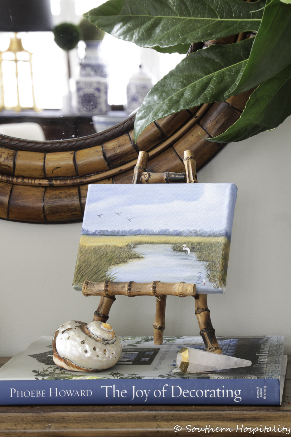
Also, one thing I’ve been working on in my own home is using larger accessories instead of many smaller ones. That is a much better look too and things don’t look as cluttered. I’m not a minimalist, as I’ve often said, but those bigger pieces are much more visually appealing.
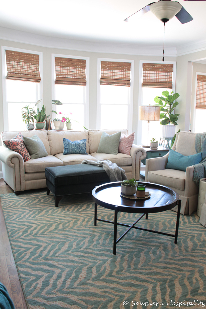
As you can see in our family room, the front feet of the furniture sits on the rug to anchor the rug.
5. Get the right size rug. Make sure your rugs big enough for the front feet of furniture to sit on.
I’ve seen this one a lot, as many people just don’t know how to choose a rug size to work in their room. I most always will choose a rug to fit a furniture grouping and have that grouping around the rug (as shown above). You can see the chair and sofa are on the edge of the rug, as is the ottoman in front of the fireplace, so the rug grounds the furniture seating area. A too small rug will just look lost and one that is floating way out in the middle of the room just looks out of place. The rule of thumb that I’ve found works is to have the front feet or legs of your furniture sit on top of the rug and it’s fine for the back legs to be off the rug. It’s just visually a good look.
I hope these 5 little tips help you to make your room better. These are just a few observations that I’ve had over the years in my own home and I think by paying attention to the details, your room can look so much better. It’s not any harder or more expensive to change these small things, but they can have a tremendous impact to the final look of your space.


Great tips! I made sure to read through them all!
That was a great post. I want the room in the first picture!
GREAT tips! Can’t wait for the spring fluffing party! I’ve been working on springing up my bedroom!
Great Advice! My biggest pet peeve is pictures too high or too low! Ugg I can hardly hold my tongue on that one…
xoxo,
Cathleen
Hi Rhoda – thanks for the great tips and pics. I definitely agree about the drapes and pictures, in fact everything.
I’ve just posted the dining room makeover – stop by and tell me if I got it – English country to country French, ha! See what happens after a month in France!!!!
Hugs – Mary
P.S. Still have to do linen drapes and old velvet chair seats.
I love this post, Rhoda. All the information was new to me, but my favourite tip was about textures.
For your poster, Desiree, who’s looking for a sisal rug with a black border. I saw many different sizes at Pottery Barn. Maybe she could check it out.
Cheers!
Great tips and very valuable advice. Love the beautiful photos. Absolutely fab.
I love your post, as usual. You’re blog is so informative and inspirational! I want to live in every room in the post…wish, wish, wish…aaahhh.
Love your ideas Rhoda! Thanks for the great tips.
Great examples to demonstrate these tried-and-true tips, Rhoda! And the tips are so well-written, too. The rooms are beautifully staged for the magazines. I have a too-small rug; just can’t afford to get one the right size. I’m debating whether it’s better to just have no rug at all than to have a too-small rug, but I like the texture it brings to the wood floors. Some day, the budget will allow for a right-size rug.
Yes! Tip #1 about the curtains can really transform a ranch house with high/small 1950’s windows.
(ask me how I know!)
Rhoda, I love your new look here. so clean and bright. It really showcases your photos.
Thanks to Nesting Place for providing a link.
I appreciate the tips. I’ll definitely be implementing the 3/5 grouping.
I wasn’t planning on adding curtains since we’re only living in our apartment for a year.
This is a great post Rhoda. Your Cottage Living photo is one of my absolute favorites also, along with the rest of that cute little cottage. I’m going to send this link to a decorating-challenged friend who needs advice on rug sizing. Thanks so much.
Thank you Rhoda! I am saving this to help me learn all this stuff because I have the hardest time decorating. It takes me wayyyyy longer than it should because I get so frusterated with it because I don’t know what to do or can’t figure it out. I have me a folder that I am saving stuff in so I can go refer back to it. I am a visual person so when I see it I can do it. That is most of the time. lol
I appreciate you taking your time to explain this to all of us. You are a busy woman and it sure is nice of you to do this for us! Thank you again!!!!
Hi Rhoda! Love your site and have enjoyed browsing back thru your posts for inspiration. I love the new look of your new blog home but I HATE HATE HATE that I can no longer just breeze thru your posts but have to click on each individual post.