I’m joining Melissa over at 320 Sycamore for a paint party today, so I’ll be sharing my favorite paint colors. Since I have many colors in my house, I guess I would have to consider them my favorite, at least for the moment. Like many of you, I’ve been through all sorts of trends with paint colors over the years, but I’ve been really happy with the choices I made in this house. It has not come without trial and error, believe me.
I did a post last year about Choosing the Perfect Paint color, and if you read that, you will notice that I don’t claim to have the perfect paint colors nor is there a sure-fire way to pick the right one, other than that trial and error thing I mentioned above. It sure helps to have blogs out there now so that you can see a paint color in an actual room and know at a glance whether it might be something you could love yourself. So, that has helped me a lot over the years too.
But, one thing I did stress in the above post is this: you must test out a paint color in YOUR home to find out if it will work for you. I have painted over bathrooms 3 times trying to get that “perfect in my head” shade that I was looking for, so just because it looks great on a paint chip OR for that matter, in someone else’s home, doesn’t mean it will work perfectly for you. That’s always my disclaimer with paint when I’m helping someone choose a paint for their space. It can be a tricky process, to say the least. So, if you want more info about choosing paint, read that post from last year for lots more particulars on the subject.
Today, I’m going to share the paint colors in my house and how they’ve worked for me.
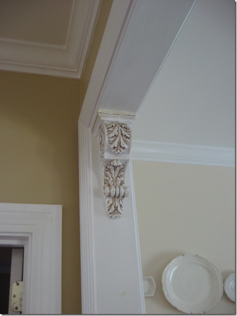
Above: on the left is Sherwin Williams Whole Wheat, which is the main color I’ve used throughout my common area. On the right is the newly painted dining room with Sherwin Williams Antique White. I’ve used 4 colors off that Whole Wheat color strip and it’s worked out very well for our home.
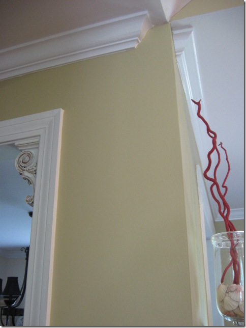
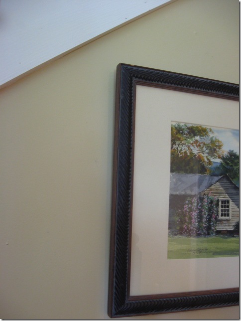
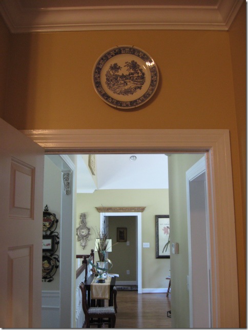
Another shot of Whole Wheat. I have really enjoyed this color a lot and it goes with so many fabrics and colors. A nice backdrop for everything.
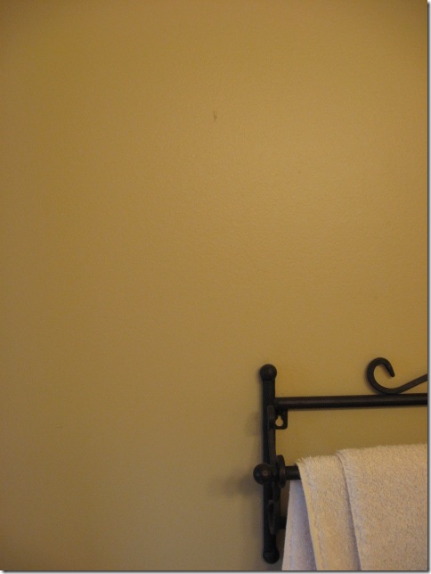
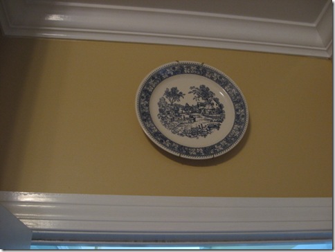
In the upstairs guestbath, I used the darker shade on that strip, Camelback. It has more depth and is a bit darker for this smaller bathroom.
Another shot of Camelback.
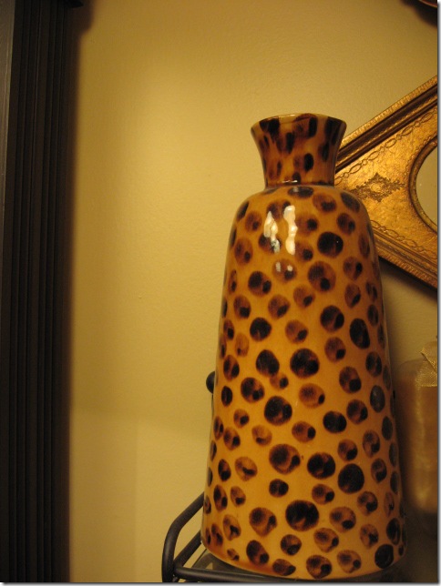
And downstairs in the den, I used Believable Buff, again on that same color strip by Sherwin Williams. I’d highly recommend this strip.
In our master bedroom, I used Sherwin Williams Blonde. Sometimes in certain light, it looks really yellow, other times it just has a nice warm glow. It’s worked well with all my fabrics in that room too.
Blonde looking out to the livingroom with Whole Wheat. This is with no lights on, so it’s taking on a strange tone in this pic.
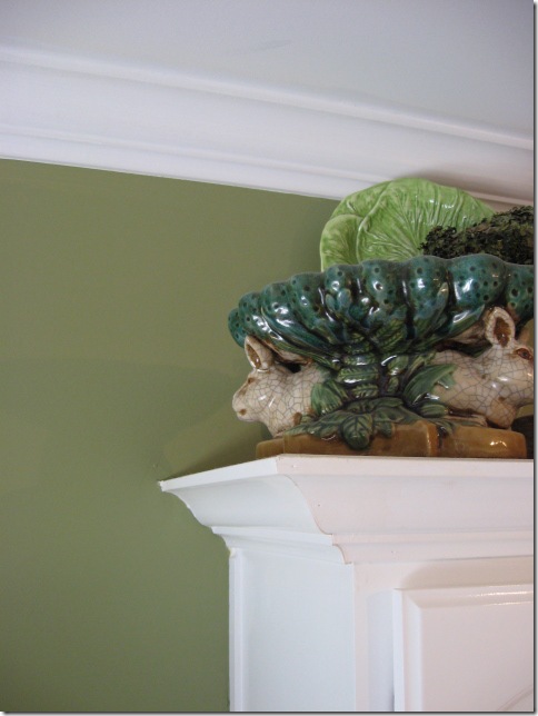
Kitchen has Laura Ashley Olive 4, which I loved so much in my old kitchen, I brought it over here too. It has quite a bit of yellow and I love this color. If you pick up a chip of this and look at it, you will swear it’s not the same color, since the chip looks so drab.
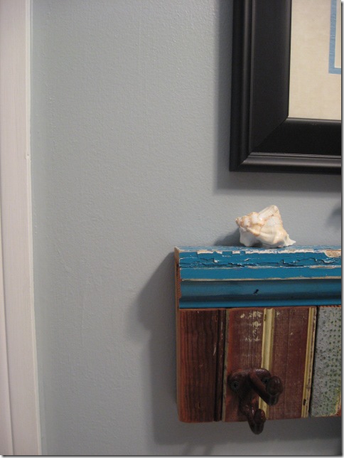
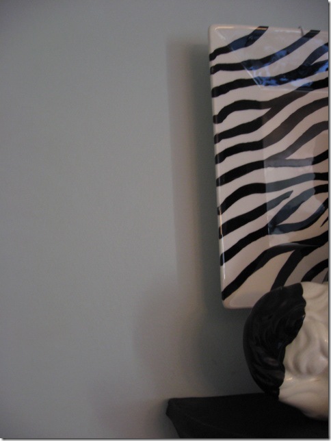
Downstairs guestbath is Ben Moore, Wedgewood Gray. This is the bath that I painted 3 times til I got the right color. Blues can be SO hard to get right. It’s still hard to really capture this color on camera too, as it is not quite as gray as it looks here.
And the beachy guestroom is painted with Sherwin Williams Rainwashed. It was actually a little more gray than I wanted after I got it finished, since this room gets hardly any natural light, only one window. So I colorwashed over it with an aqua I had around that just gave it a little more brightness. Again, this color is not accurate, it’s more lively than this in real life.
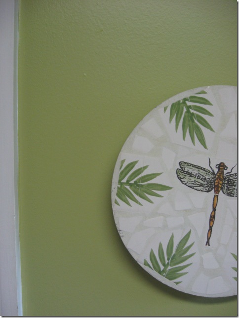
And, the laundry room is done in Behr Grasscloth (at Home Depot). I’ve really enjoyed this color and added it on one wall of my office nook as well.
Trim colors:
Several have asked me before about my white trim paint. It was here when we moved in and I was not about to change it. I took a small little piece and matched it to Lowes Anthem White and it matches my existing color perfectly. I might have picked a little more creamy white if I was choosing from scratch, but the good thing about a brighter white is, it looks great with any color on the wall and makes color pop out.
Other great trim colors that I’ve heard about: Sherwin Williams: Dove White
Benjamin Moore: Decorators White, White Dove, Linen White
So, that’s a wrap up of my favorite paint colors. I left out a couple of my rooms, but these are the main ones. So hop on over the party if you are looking to make some paint changes. You may be inspired by a pic to choose a whole new color for your home! I know I sure love to see what a paint color looks like before I even buy a sample. It helps to see the pic and then I always, always recommend buying a sample quart to test it out in YOUR home before you buy a gallon.
Happy painting!





I love all your choices! Such a good tip to operate off of the same color strip, then you know they will coordinate. Thanks for sharing.
Your colors look great, Rhoda, and you are so right… they can be tricky. Light is different in each location. Thank goodness for those itty bitty paint pots from Benjamin Moore! lol!
We used Dunmore Cream by Benjamin Moore in our dining room and kitchen in our getaway. I get lots of compliments on that color. I like it better in winter when light pours in due to trees without leaves. But it's still good in summer, too. The trim we used in our getaway is Super White by Benjamin Moore. I had walls done in that same color in flat. It is true and reflects light well, particularly when you are using bright, true colors or strong pastels in fabrics. I used Philadelphia Cream on walls upstairs, and while I like it, I don't like it with the strong pastels I have. I tend to like more grey and less yellow in colors. I see colors I love, and I probably should ask when I see them. I saw some the other night that were stunning. It was a pale neutral with a hint of yellow, and it made everything and everyone in that room glow.
I've also used Decorators White by Ben Moore for trim in my other house, and it has served well. A friend of mine talked me into an eggshell finish (she's a designer), and I wasn't pleased. I like a semi-gloss finish on paint. Old woodwork has blems, and they really don't bother me. I'm an old house girl, and I think of it as character. She, on the other hand, feels that the lower gloss paints hides more. It does, but to me, it's a little on the lifeless side. She says, Po-ta-toe; I say Po-tat-ta. 😉
XO,
Sheila 🙂
Lower gloss paints "hide" more. I just caught the type where I said "paints hides more" and cringed! 😉
Love the colors! Your so right, blue is so hard to get right! It took two different shots at our laundry room. We got lucky with Kelsie's room, only because I cheated and used Pottery Barn! *smiles*
Thanks for the post on the color info. I have a 1930s home and it had wallpaper which I have left since it matches the age of the home. I rent my mom's home and hers is same age as mine and we pulled all the wallpaper off and painted. We have sure had a time deciding on colors over there.
I really like Whole Wheat. What a stunning color! This post is perfect for me at this present time (trying to figure out what to paint that living room wall). I'm off to read your older post regarding "Choosing the perfect paint color". Thanks again!
Great information Rhoda! Thanks for sharing all your knowledge. I think it is funny that you went with the whole wheat colors because our house has done the same with SW latte family. It's like family and types of cars or hairdressers. When you got a good one – you stick with it!
I love the colors, Rhoda! I painted my twin boys' room Wedgewood Gray after I had seen the color in one of your posts. I love it! Very calming color!
I'll take pics of all my house colors and join you all. 🙂
Blessings,
Sandra
What pretty color…very calming to say the least.
Rhoda, That's really helpful to show paint colors that work. I was in a friend's house who had a large kithen/dining/living room, and because of the difference in lighting of this one large L-shaped room, she painted some walls Whole Wheat and the kitchen Blonde and it looked like it was all the same color! I have used Ben.Moore Dove White and love it. Question: what is your experience (or clients') with seagrass? We are thinking of putting it in our living room (that we really live in). We would be using a good quality from a reputable carpet store along with a pad underneath. Thanks, Linda
Such lovely colors! Makes me want to paint my house!
This was perfect timing as I am about to redo my foyer. I found what I think is the perfect paint color on one of the links here!! Love this!!
angela
Love, love all the beautiful colors you've used in your home. What an inspiration! I've used an antique white shade but from Behr.
Blessings,
Marie
http://emmacallsmemama.com
Gorgeous Rhoda! 🙂
Love all of your choices and your magnificent home.
Thanks for that update, Rhoda!
Mary Lou
Beautiful paint colors! I really like the Wedgewood Gray in the guestbath.
Beautiful colors! I may try Whole Wheat in my entry. I've got red there now, and it's time for a change!
Love the wheat color too and used it in our farm house…but if we ever build a normal home…I want more pastel colors…like moss greens..
You certainly have a knack for picking PERFECT colors. I saved your pix w/ paint color titles for future use at my place.
Thanks for sharing!
What a beautiful look at paint colors. We have just put up Sherwin Williams Blonde in our living room and I love it. Like your said, colors do change throughout the day. People need to consider when they use the room the most and see how it looks in that light.
Dawn