Happy New Year to all of you! Welcome to 2017! I hope you all enjoyed a wonderful New Year’s Eve. We went out for a nice Italian dinner and ended up staying in and watching football, since we’re both feeling a bit under the weather with cold symptoms. I’m sure this week will bring improvements and I’m looking forward to a fresh new year ahead.
I really don’t put a lot of stock in the color of the year choices, because most of the time they really don’t influence what I put in my house or what I wear. But, it’s fun to see what Pantone comes up with each year as their Color of the Year and this year, I actually like it a lot!
From Pantone: Greenery is a fresh and zesty yellow-green shade that evokes the first days of spring when nature’s greens revive, restore and renew. Illustrative of flourishing foliage and the lushness of the great outdoors, the fortifying attributes of Greenery signals consumers to take a deep breath, oxygenate and reinvigorate.
Green is one of my top fave colors and I have used it in my house in many ways over the years, in many different hues from Hunter Green to Seafoam as well as brighter shades of green. This year’s pick, Greenery, is a bold and vivid yellow green that definitely jumps out at you. It’s not a shy color at all. I rounded up some photos from magazine sources to see how this green works in a home and what you can expect with it. I think using it as an accent is a really fun thing, so keep that in mind as you’re looking.
What do you think about Greenery? Called Nature’s neutral, it certainly has a feeling of Spring, new life, and new beginnings and I like that about it. There’s just something so pretty and happy about this color.
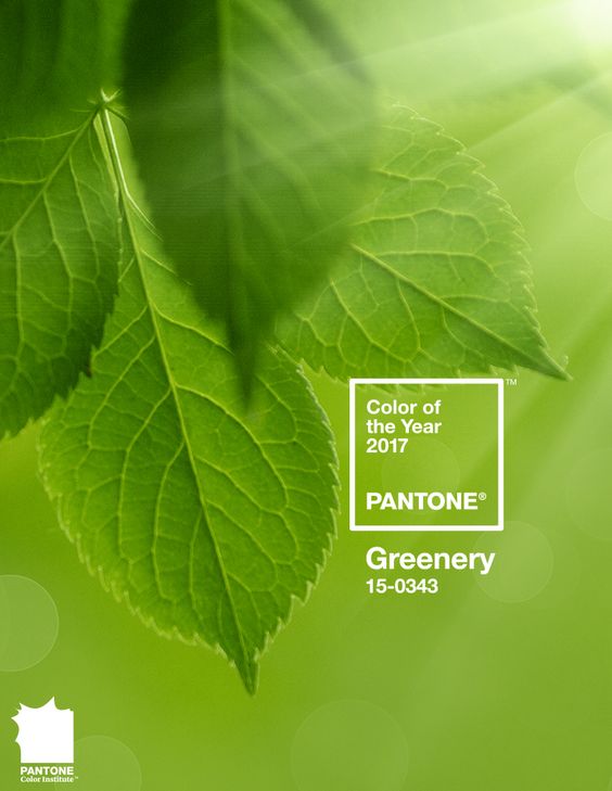
We used to call it Lime Green back in the day and I still have a wide toothed comb in my bathroom basket that I’ve had since I was a teen. It’s lime green!
I thought it would be fun to see this shade of green in rooms designed over the years. It’s really not new, it’s been used a lot over the decades to liven up a space.
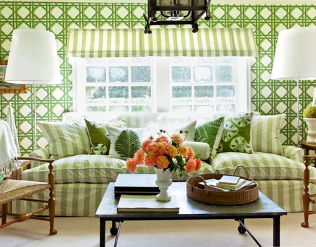
I’ve always loved Frances Shultz’s cottage living room in spring greens.
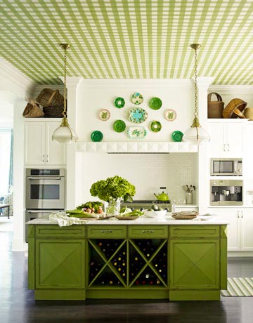
Designer Gideon Mendelson created a pea-green gingham ceiling that was first painted on canvas by Silvère Boureau. To further animate the room, Mendelson designed the island and painted it a custom bright green. From House Beautiful.
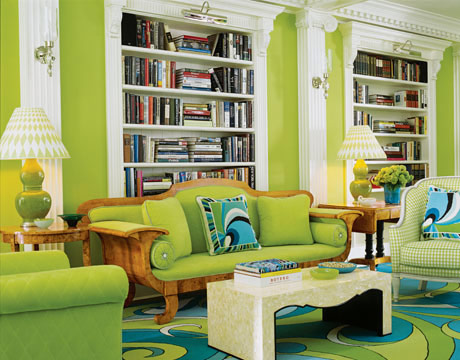
Designers Anthony Baratta and William Diamond, bold green living room.
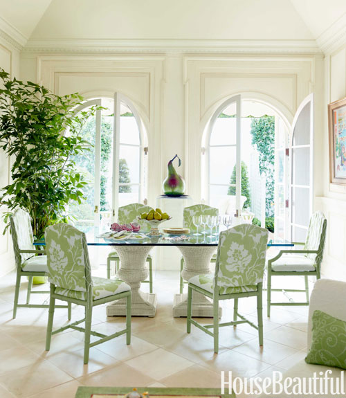
A more subdued green, but very fresh and pretty in this dining room.
{All photos above from House Beautiful.com)
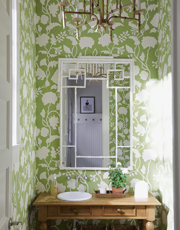
Designer Meg Braff’s pretty green wall papered bathroom.
The following photos are from Better Homes and Gardens online.
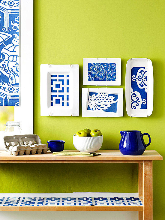
Now this is a bright space! I do love the combo of this spring green with navy blue and white.
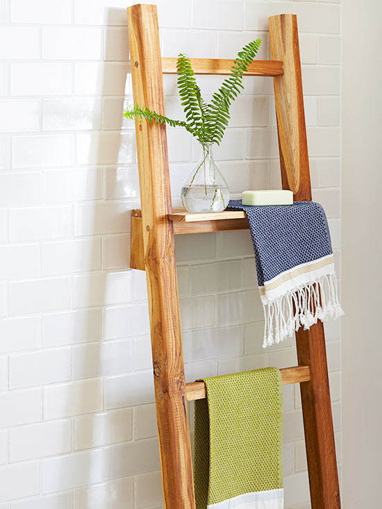
For just a touch of green, how about a hand towel to brighten up a space.
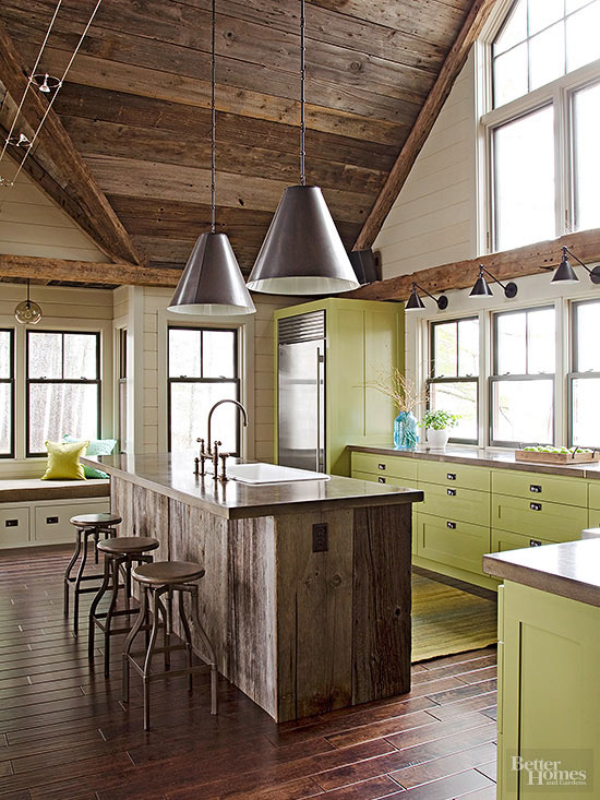
Green on kitchen cabinets is a bold move, but it really works with the rustic island and hardwood floors.
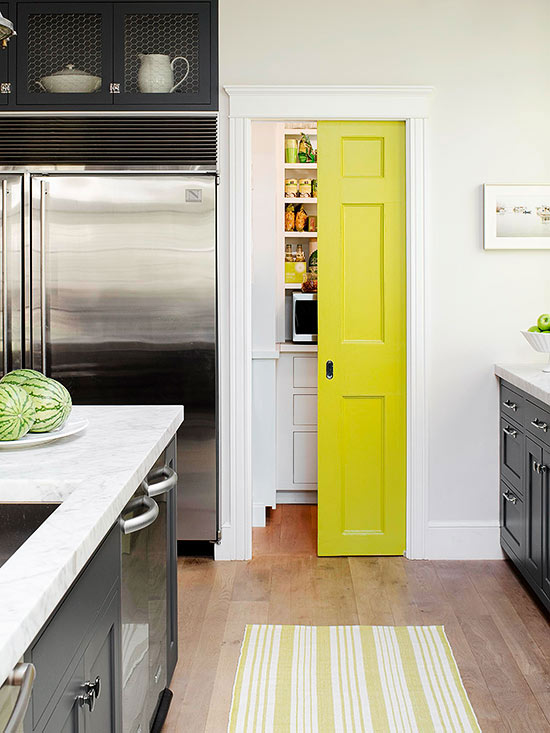
I love this pop of color on the pantry door and the striped green and white rug adds a lot to the space.
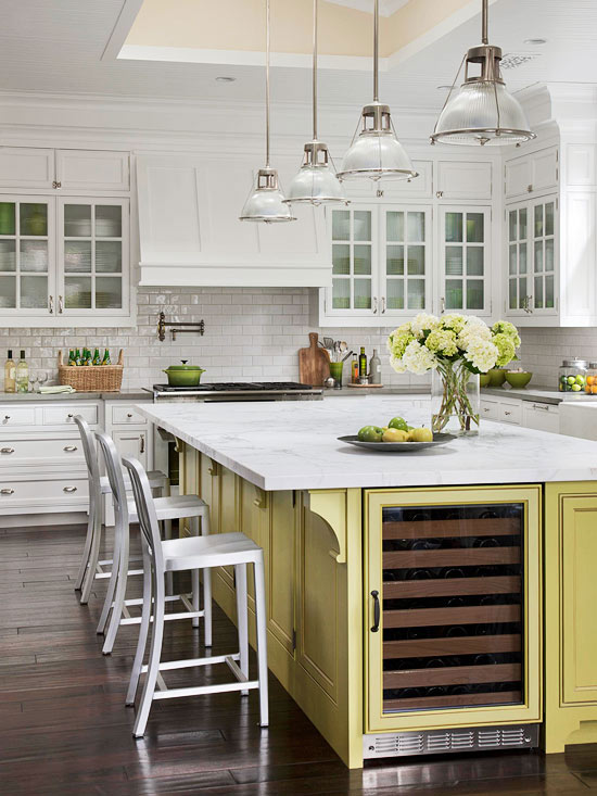
They are calling green a neutral and I think used as an accent, it definitely can be. It goes with so many other colors in a complementary way.
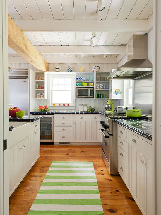
Another striped rug in spring green and white accents this pretty neutral kitchen. Notice the green mixer and pot on the stove.
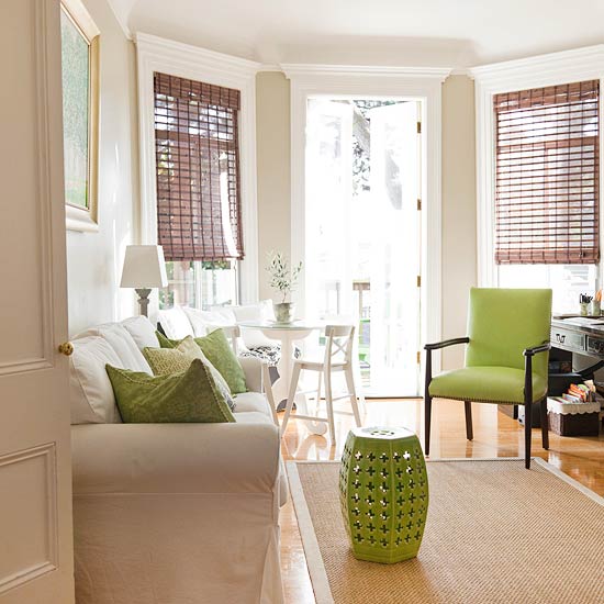
In an all neutral space, green will definitely show off.
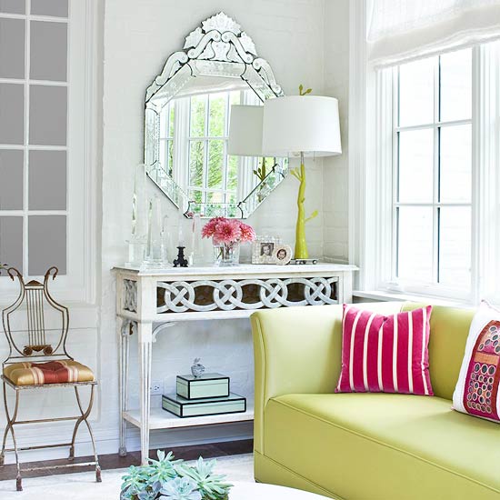
And it does mix well with other colors. Green and pink is a favorite combination for many.
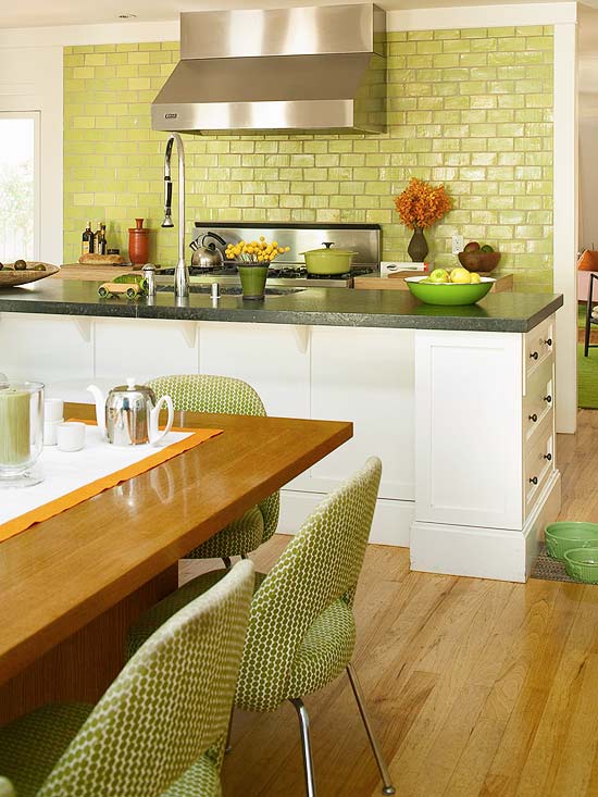
Another green kitchen with the backsplash, white cabinets and green upholstered chairs.
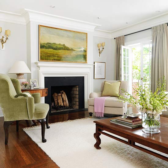
I love the feel of this space with the softer green chair. Brighter green fresh flowers really do add an accent.
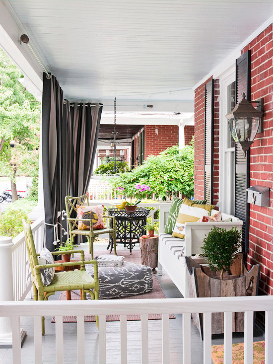
Nature’s green is the backdrop outside, so why not mix it on a porch as well. I love these bamboo chairs finished in a pretty green paint.
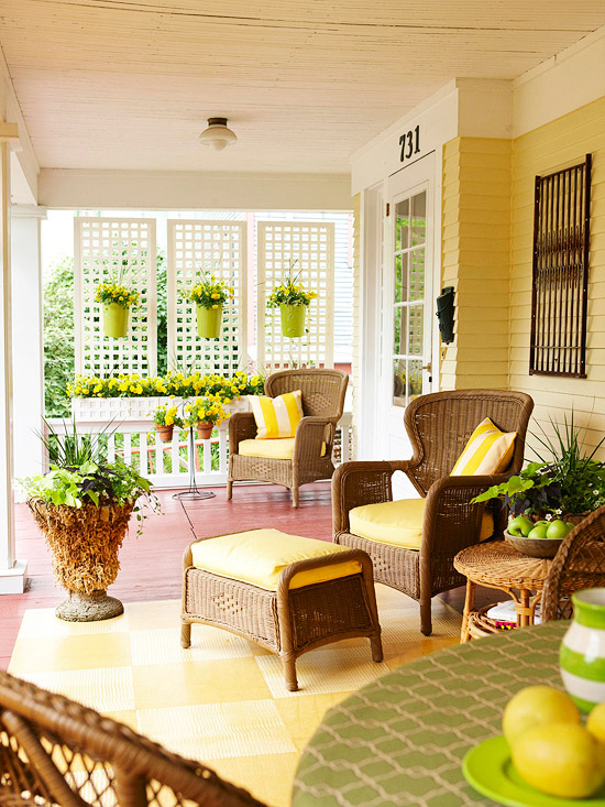
Another pretty porch with yellow and green accents. I remember back in the 60’s when green and yellow was a popular combination. Anyone else remember that?
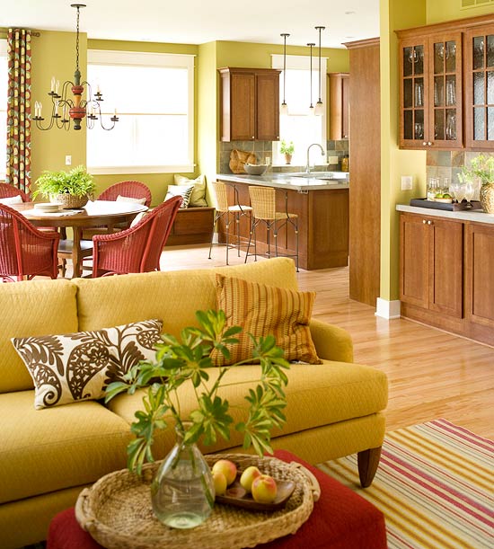
This space has green on the walls and a pretty green sofa all used with red accents. Goes to show, you really can mix this color with so many others.
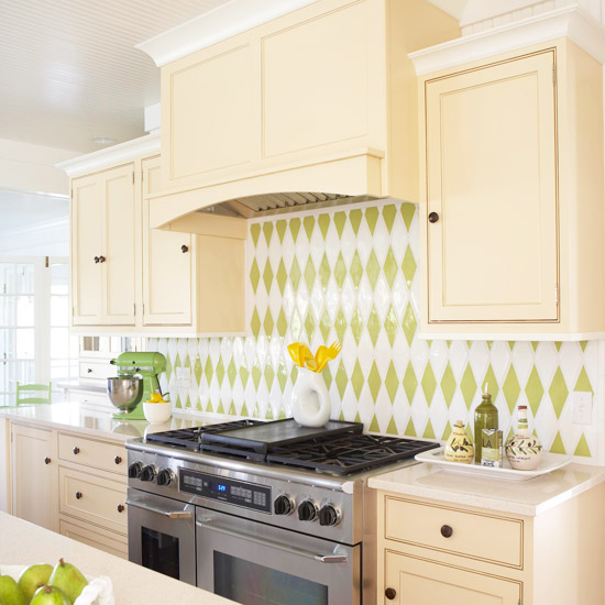
A bold green and white diamond backsplash is really pretty. I don’t think I’d have the nerve to do it, but I love it.
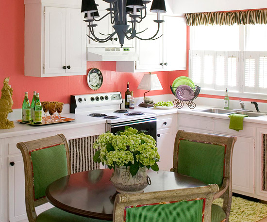
Another pretty combination of green with coral.
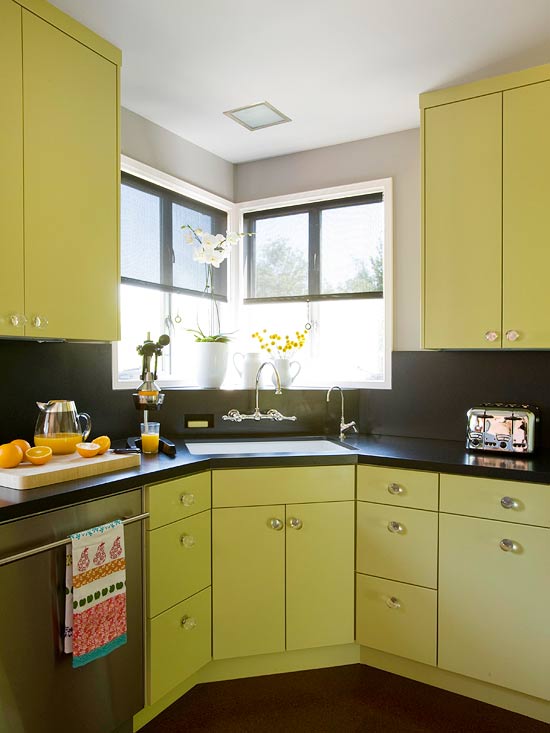
This modern kitchen combines spring green on the cabinets with black everywhere else, definitely giving it a more contemporary feel.
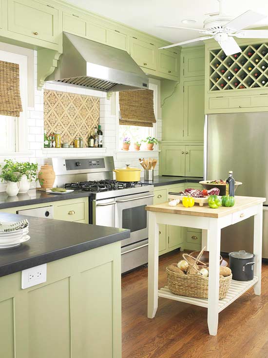
While this kitchen has more subdued green on the cabinets with white and natural accents, it gives off a cottage feel.
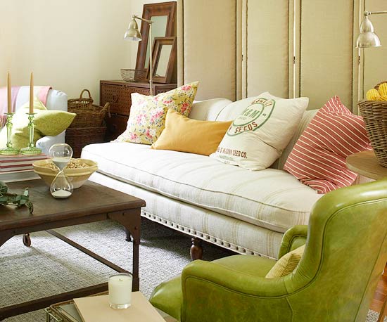
A bold leather chair mixes well with the neutral of the sofa and wood table. Red/pink accents in this space.
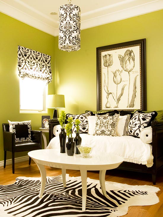
I also remember when green, black and white was a popular and bold combination. They went for it on these walls! And I have this combo in my office space.
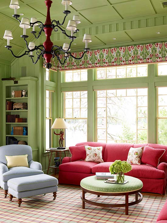
A little more toned down spring green in this space feels comforting and pretty, mixed with a coral pink sofa.
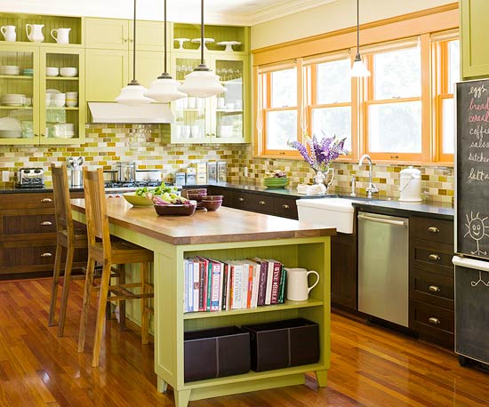
And one more last kitchen with a green island and bold greens in the glass tile backsplash.
{All photos above from BHG.com}
I really do love it and it has influenced my spaces a lot. I have a yellow green paint in my office and kitchen, Pratt and Lambert’s Fennel, that I’ve really enjoyed. It’s more subdued than the Pantone Greenery color, but definitely in the same family.
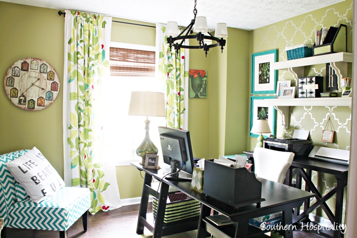
It does make for a happy space and mixes so well with turquoise shades in my office along with black and white furniture.
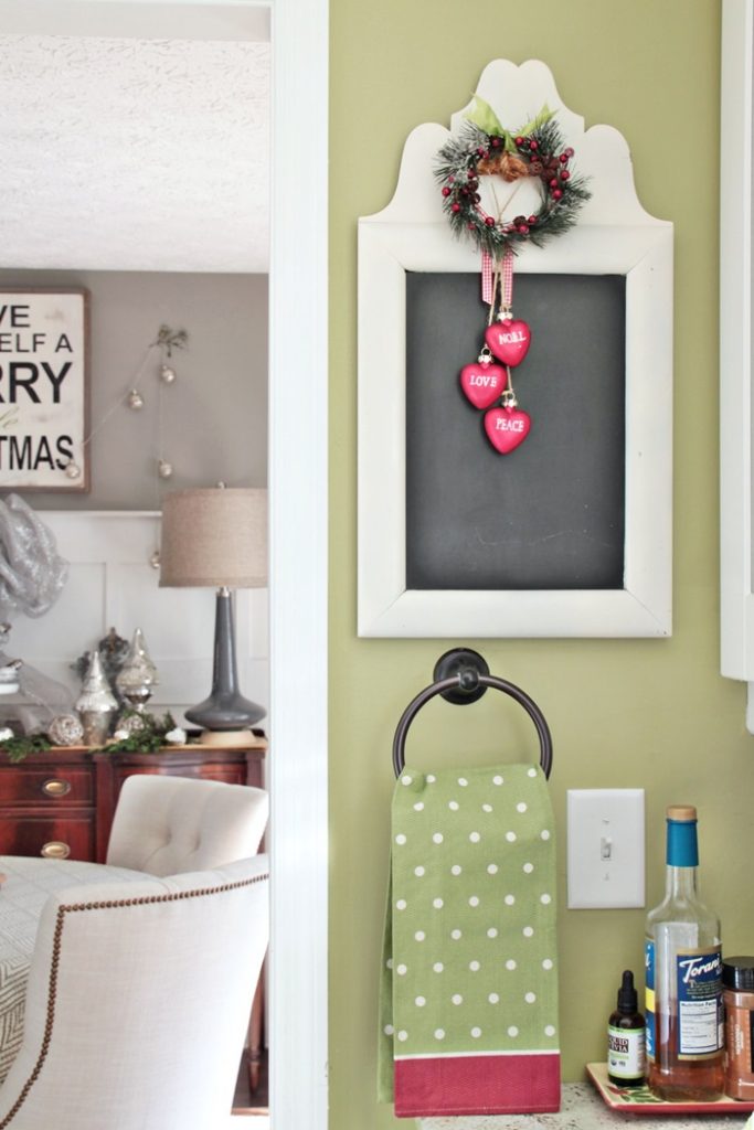
And in my kitchen with white cabinets and dark wood floors, it’s a fun backdrop on the walls to liven things up in there a little.
So, how do you feel about green? Is it one of your colors too, or can you take it or leave it. Green will definitely always have a special place in my heart!




I just pinned the last picture with your chalkboard. I love it!
I love Pantone’s Greenery! The Bee Cottage green is wonderful, as are the HB dining and powder room (Meg Braff). It’s that bright spring green look of leaves against a wet, blackish bark of a tree look that does it for me, nothing acid-looking by too much yellow. Fun post. Happy 2017, Rhoda, and I hope you feel your best soon.
All very pretty. I’d use it for more of an accent color. I love all the outdoor spaces. I’m ready for spring as soon as the last Christmas bauble goes back in the box!
Me too, Barbara! January and February are our worst months, so once we get through those, spring is around the corner.
Beautiful inspiration pictures. I actually used a similar green as an accent last spring and can’t wait to bring it out again. This is the first “color of the year” that I have truly loved.
Great post! What goes around, comes around!!!! Happy New Year!
Ha. At Thanksgiving I repainted a sofa table a softer shade of green (rather than the more neon color featured here – chalk paint) and have added other touches of green in my downstairs den. Have embraced other shades throughout my home. It brightens up the more neutral palate of my wall colors. Thanks for the feature today.
I have to note that this color choice was influenced by the fact that I inherited a family heirloom – an early 1900’s Aladdin brand oil lamp with a green Depression glass base.
Rhoda: blogs come and go from my reading list but yours remains one of my favorites with ideas and photos that are relatable to my lifestyle and income level. I’m believing that our Lord will continue to bless your life and expand your borders in 2017. Happy New Year.
Becky, thank you so much! You are just the sweetest and the best encourager. I’m so happy to have so many of you girls hanging out with me all these years. I’m excited for 2017! 🙂
I always enjoy seeing what color Pantone has chosen, though it never affects me too much. . . but this year may be an exception! Green is absolutely my favorite color, and this spring green is just beautiful.
While they’re not typically considered “neutral” colors, I’ve always thought of greens and blues as God’s background colors. I wrote a post about that many years ago. . . I should re-post it now that Pantene has popularized green again! 🙂
(Here’s that post if you want to see it–it’s interesting! http://www.impartinggrace.com/2011/03/re-thinking-background-colors.html)
I love your post, Richella, thanks for sharing!
Green is my mother’s FAVORITE color. Our home always had green when I was growing up, even avocado appliances in the early 70s! Of your examples above, I’m drawn to the ones with green as an accent or pop of color. Some of the others are just too much for me. LOL
Many blessings to you and yours for 2017!
HI, Brandye, yes all those avocado appliances we grew up with almost scarred me for life on using that color, but it’s funny how hues come and go. Greens have certainly been resurrected along the way in different hues. I do like the rooms with green accents the best too.
Hi Rhoda,
I must be ahead of my time – I sold my home in Savannah a year ago. It had this color in the family room for 12 years. Sadly, the realtor talked me into painting the room a neutral color…..She said that potential buyers would be “repulsed” by this green. (sigh) Go figure! Anyway, that room always felt so happy and fresh. I still love the color. Thanks for the post! Hugs, cat
Hi, Cat, well I bet it was a very happy room with green as the background.
Hey Rhoda,
I just love your blog! I too love that last photo with the green walls! I have probably asked you this before…but is there a place where you have all the paint colors listed that you have used your your lovely home.
HI, Nancy, yes I did a post right after I moved in with all my paint colors. I need to go back and update this with better pics and my master bath is the only room that has changed colors slightly.
http://southernhospitalityblog.com/my-new-house-paint-colors-2/
I love the coral with the green. This shade of green really never goes out ofd style, and it goes with so much. Remember Laura Ashley’s Olive colors? I still have this in my bar area, Olive 2 and my daughter’s family room is Olive 3. I’ve hung onto the paint chips, just in case.
HI, Mary and yes, I totally remember all those popular Laura Ashley colors, Olives especially. They were warm and easy to work with back then. Sage was so popular for quite a few years. Green has been around in some form or fashion for a long time.
Leave it in the past! Way too bright!! A very small is all I could take of that. I like green, but not Pantone’s color of the year.
Oh I love this color. Green has always been my favorite. My hubby and I had basket weave wallpaper … similar to the first photo…in our first little kitchen. That was 51 years ago! Then we went through the avacado green appliances…not so great:-) Now I have a green and white kitchen…similar to yours. Over the years green has always been present in my home. It is a very HAPPY color.
I do love the color green. I use it in my home in several rooms…love how you use it in your home..here’s to a bright and happy color chosen this year. Happy New Year Rhoda!
This shade of green is a welcome change for this year’s color. It’s happy and bright and just what we all need. Great post, Rhoda!!
All the best for a Happy and Blessed New Year!
I love greens and browns! How pretty! -Marci @ Stone Cottage Adventures
Being a gardener I love this year’s color and appreciate seeing your ideas of how to use it in the home.