Many of you have asked about the paint colors in my new house, so I’m happy to share. I’ve shared them as I’ve blogged about each room painted, but this time I’ll put them all together in one post so they can be referenced back to when needed.
When deciding paint colors for my house, I took into consideration all the fabrics and furniture I already owned, knowing what colors were in those fabrics and making sure the colors I chose would flow well and I’m happy to say, my choices have worked well with what I have. I really think I’m going to enjoy these colors for years to come. That is, until something new catches my eye, but that won’t be for a long while.
Paint is one of the easiest things to change, as we all know, and changing your mind about a room color is not the end of the world. If you find out you’ve picked a wrong color, go ahead and change it. You’ll be happy you did! As they say, it’s only paint.
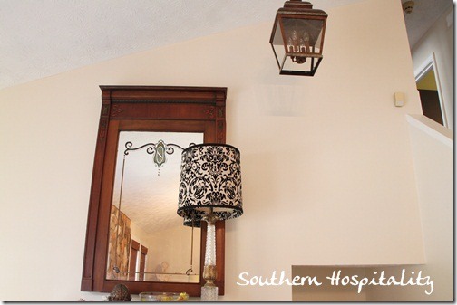
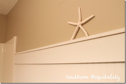
Painting my main living spaces one neutral color was something that I always had in mind from the beginning. I’ve seen that done in magazines and loved the look. Since I chose a very neutral warm white, I also decided that my trim paint would be best served in a bright white for some contrast at least and I’ve been happy with that decision too.
It’s hard to capture the real hue of a warm white, but Moderate White by Sherwin Williams is a warm white, not too yellow or peach or gray, but it’s very nice in the daytime and at night. It has a slight yellow tone to it in daylight, but is really nice and mellow at night. I didn’t want stark white, but a little warmth in this color plays well with fabrics and is a great backdrop for artwork. This is the main color from the living room, up the hallway, to the guestroom, and master bedroom.
All trim is done in Sherwin Williams Pure White in Semi-Gloss. And all of my wall paints are in Satin finish. That’s the finish I always prefer for walls.
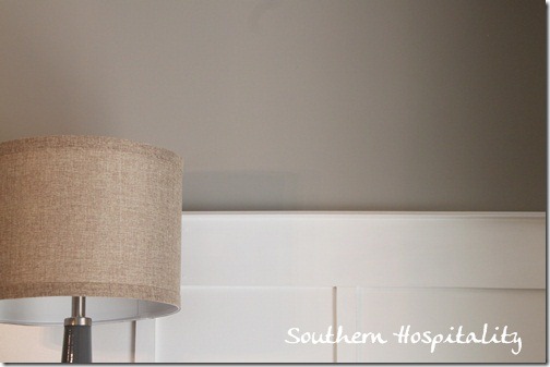
In the dining room, above the board and batten, I’ve used Benjamin Moore Rockport Gray (mixed in Valspar at Lowes). It’s a nice warm gray and I love it in this room with my golden tan upholstered dining chairs.
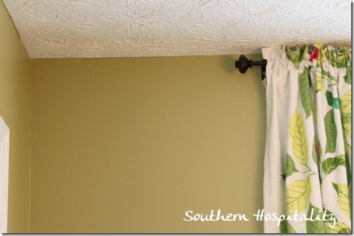
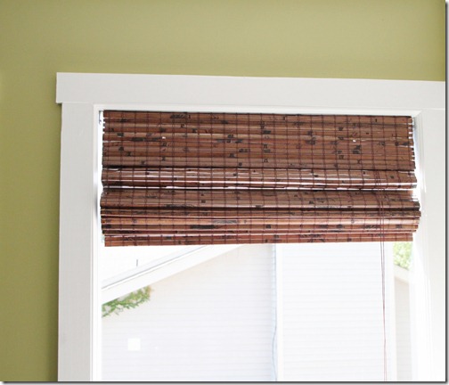
My kitchen and office are both done in Fennel by Pratt and Lambert, although I had it mixed at Sherwin Williams, since they too have the formula. It’s hard to capture the true hue of this vibrant yellowy-green, but it’s somewhere in between these 2 pics. Sneak peak at my office drapes just hung up this weekend.
It is lively and has quite a bit of yellow in it and I love it.
Hall bathroom is done in Sherwin Williams Windsor Greige, a nice medium Khaki color.
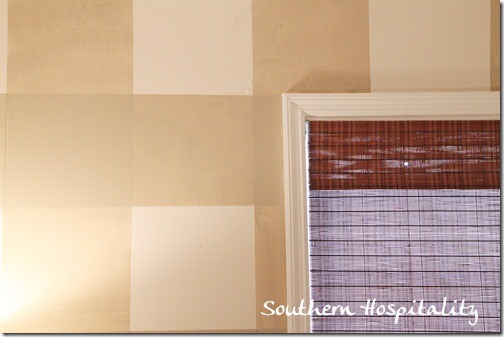
My master bedroom focal wall gingham paint treatment is also Sherwin Williams Windsor Greige mixed with glaze and this color is also in my vanity area. White color on this wall is also Moderate White.
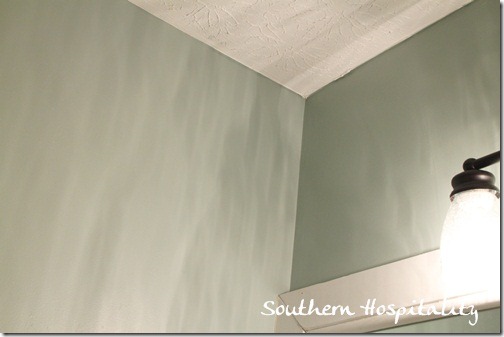
In my master bath, I have Sherwin Williams Quietude, a nice watery blue-green. It’s hard to capture with the lights throwing shadows around the tiny room.
But this is pretty accurate.
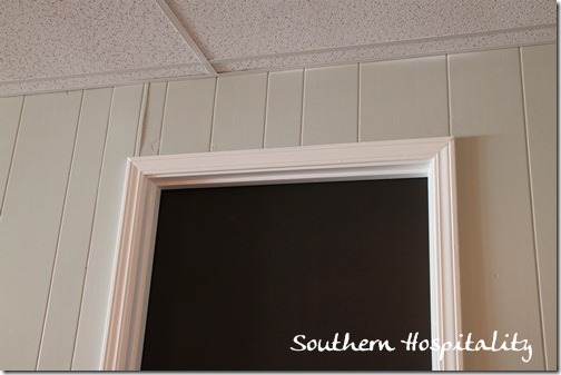
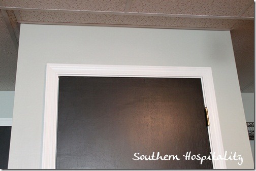
Downstairs in the den, I have Sherwin Williams Comfort Gray and it’s a great blue-gray color.
All of my interior doors are painted with Valspar Fired Earth in Satin finish as well.
Another look at Comfort Gray and Fired Earth.
So, those are my paint colors throughout the house. I’ve really enjoyed choosing them and maybe these will give you some inspiration as well on picking paint colors that you’ll enjoy living with for a few years. I don’t plan on changing any of mine for quite awhile.
The best tips I can give for choosing paint colors are these:
- Look to your fabrics first for inspiration and don’t try to pick paint colors first. Let your fabric choices dictate the paint color you choose for a room. I had that in mind as I chose all of mine.
- Satin finish for walls will show the least amount of imperfections except for flat. Satin is a low luster and gives a nice glow to the walls without being shiny.
- Painting your main space with a warm white will allow your furniture and fabrics to really shine and is a great backdrop for artwork. A non-color will not compete with artwork or accessories and allows your furniture and accessories to show their full potential.
- Be aware of undertones in paint before you commit. Be careful of pink, gray, and green undertones which might not show up unless you look at a color chip and see all the hues of that color down the row. You can then start to see the undertones much better and avoid a bad tone coming out that you might not want.
- Always, always get test quarts of paint first before you commit to those 2 or 3 gallons. That’s a lesson I’ve learned along the way and still stick to that one! As some mentioned in the comments, it is a really good idea to paint swatches on the walls or poster boards and look at them throughout the day, in morning, afternoon, and evening light. It’s amazing how color changes from time of day, room to room and house to house!
That’s my paint colors! As you can see, I’m going with lots of lightish neutrals (except for my green!) these days and really liking the lighter and airier feel that they bring to a home.
I’m still working away on the house, making baby step progress, but it’s coming along slowly but surely. I will be so glad to get it all in shape again!



I love all the colors you chose, You were SMART to chose the colors that matched what you already had. You dd a great Job. Your new home looks Fabulous.
Thank you so much for putting all this in one post – I love seeing all your choices and reading your tips. I love your new house!
Thanks for this post with the tips. We have a lot of painting to get done in the next year (I hope!) so this will come in handy! I’ve pinned for reference.
Debbie 🙂
I love these! My three favorites are Rockport Gray (LOVE), Windsor Greige, and Quietude.
Thank you. 🙂
Such a pretty color palette! I love how there is a bit of contrast with your trim and neutral wall colors, and how bright and cheerful your space is!
They all look fabulous and are great choices to live with – it is difficult to picture color. If people have time, its also good to paint some swatches on the wall and see how the light affects them during a whole day – this can determine too dark, light, muddled etc. Have a great week! ;-))
I love your whole palette, probably because I gravitate towards the same! Love Quietude – it was in the mix for our new bath but turned out to be just a smidge too blue for the tile (which is green glass. And if I still blogged I’d write about it, lol). Another thing I did when we first got the shore house was to paint small boards and move them around the rooms at different times of day/night so I could see what the colors would look like in all possible lights/angles. Even though the colors are mostly soft and neutral it still made a big difference looking at them that way.
Hi Rhoda! Beautiful colors! I’m so excited for you and will follow every step as you make your house your home! 🙂
Thanks for posting these! I may have to look again at Windsor Greige. SW’s 40% off sale ends tomorrow; I bought sample cans of Irish Cream and Fragile Beauty for our open architecture living room/foyer, but I think they’re going to be too light. I’ve had SW Beeswax for a very long time; have loved that golden yellow but am ready for something to accomodate any changes in fabric/artwork that I may make.
Hi Rhoda, I’ve been reading for a very long time. Love your new house. What color paint and finish do you use on your ceilings?
Thanks, Kathi. I had a painter friend paint my ceilings and he just used a basic ceiling white in a flat finish. Have no idea the color, but usually there is a ceiling white at most paint stores. My ceilings are 70’s style swirly plaster.
Thanks for sharing Rhoda! I think my absolute favorite is the BJ Rockport Gray!
Tasteful as always, Rhoda — beautiful neutral palette, calming and pleasant. I know you’re having a ball. It’s good for the spirit to have a new space to decorate. As I’ve lived in Dove Cottage almost 8 years, I re-decorate often, or at the very least rearrange the floor plan much more often than average. Thanks for sharing!
Thanks, I happen to be painting my new to me home and this post is a big help. Where did you get the shade in your office? I’ve been thinking of something like that for my house somewhere, maybe bedroom?
Thanks, again. Great post!
Hi, Debbie, those drapes are from Ikea in my office. Blad is the name.
Stippled ceilings can be easily sanded ‘mostly’ smooth DIY.
When painted they look like a plaster ceiling.
Not a perfect smooth, but at least better than stipple.
Garden & Be Well, XO Tara
Hey,Tara, so I really don’t hate my stippled ceilings that much, considering all the other things I had to deal with. So, no way am I going to sand down all these ceilings. Oh no, not gonna happen! I’m fine with them.
Such a BEAUTIFUL selection. Thanks for sharing the tips too!
Tammy
Your color choices are great! I especially love the “gingham” painted walls. Really sharp!
What beautiful colors! Thanks for sharing your paint tips too!
Leslie
Rhoda — I applaud your choice of neutrals that still have some personality to them. Your walls look beautiful.
I prefer flat finish on walls because it’s easier to touch up, whether you need to patch and spot-touch up, or just dab on some paint. However, satin finish will just get more shiny if you try to touch up with paint.
But if you like the glow of satin paint, I understand your choice. Satin finish does clean easier with soap and water if the paint is good quality, and it sound like you’ve chosen good quality paints.
Thanks for a great paint roundup post and all your tips.
Absolutely gorgeous! Thanks for the tips! Your paint colors are wonderful! Your work on your home is amazing and so inspiring! I know you are enjoying it!
Great colors, love them and great tips.
Cynthia