Squeallllll, do you see it? The new design?
In spring of 2009, I got my very first real professional blog design done and it was an exciting day indeed. I was very happy with the outcome and that’s what you’ve seen on my blog all these years. Four and 1/2 years is eons in blogland! That pretty banner with the pics that I took myself, showing things that I love, including a starfish for my love of the beach and other things that represent my style, I loved it for a long time.
Greens and grays were the colors I chose and I loved the vibe of these colors together, creating a look and brand for Southern Hospitality. The look was me through and through and I’ve thoroughly enjoyed it. But, after having the same design for a few years, there was need for improvement and better flow. I wanted to be able to load larger pics. I was limited to the size of pics that I could upload on my blog to 500 px wide. I love big beautiful pics and wanted to go bigger than that, but I was limited to the size of my content box and my theme and design.

I also felt the need, as have many of my fellow bloggers to go a little more streamlined, clean and classic in the look of my blog. I didn’t want a lot of background “noise” or lots of things going on. My sidebar is busy enough and I wanted my content and my design to be cheerful and welcoming. I put off a redesign for a long, long time. I just didn’t want to spend a boatload of money on a new design since I had heard horror stories about that part from blog friends. My blog wasn’t broken, so I didn’t feel an urgent need to fix it. I didn’t know who to work with or who to trust with my blog.
Along came a brand new designer right here in Atlanta, Sarah Fogle, with Sweet Theory Designs. I met her through our Atlanta blogger meet-ups and she’s a young and talented designer with a blog of her own, the Ugly Duckling House. She works fulltime, is going to school for her MBA and also launched this new web design service. Oh, not to mention, she’s renovating her own house! Busy much, Sarah!
Well, Sarah is a whizz at all of this and walked me through the process of redesigning Southern Hospitality and creating a brand new fresh look for my blog and I couldn’t be happier with how it turned out. I just love the freshness, the simplicity, and the classic logo we came up with.
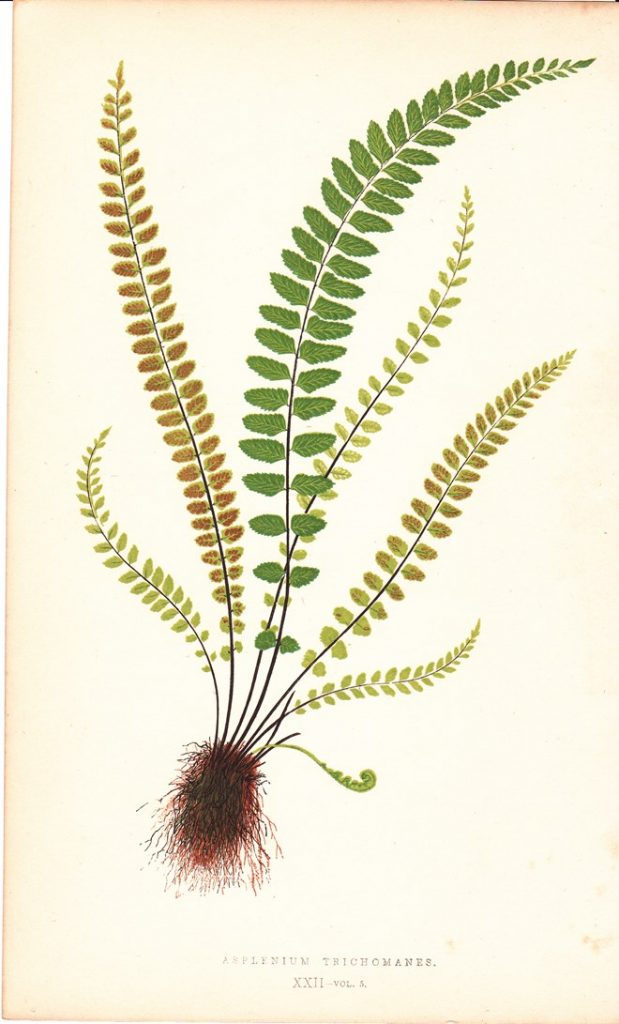
I had these fern bookplates that I bought antiquing and that is what we ended up using for my logo, the beautiful fern you see at the top of my blog. So, I kept the feel and colors of my blog, just freshened it up a bit. Sarah did a fantastic job of taking my “I’m not sure what I want” ideas and running with them, like adding a touch of beadboard, which is near and dear to my heart. I couldn’t recommend anyone more highly, so if you’re looking for a blog redesign, then Sarah’s your girl. And, she is SO reasonable!
She updated my theme to the Genesis child’s theme and not only is my design fresher looking, it’s also hopefully easier to navigate. We’ve got drop-down menus and everything should be really easy to find now. I’ll be checking things out to make sure all the buttons are working properly, so if you see something off, let me know. Also, you’ll notice a row of pics across the top. Those will be rotating and are thumbnails of recent posts, so you can easily see if you want to click on something. The olde posts are also just below the main post, as always too.
I absolutely love it and I hope you do too! Thanks again to all of my readers out there who so faithfully support me and my blog by coming by every single day. I appreciate y’all SO much!!


Love the new look, Rhoda (and the fern bookplates).
We will all enjoy the wider photos. That’s going to be fab.
And I totally understand your indecision about the redesign. Blog redesigns are so much harder than room redesigns. It’s like committing to a dramatic new hairstyle. You think you like it in the mirror but you want to see what everyone else is going to say. Well, yours is great!
Beautiful!!! I love it! Great job Sarah!
Rhoda, this is beaut-i-ful. It flows so well and is nice and clean with just the right amount of white space. Sophisticated and welcoming too. Great job, kudos to both of you.
I didn’t read through the comments to see if anyone else mentioned it, it on my iPad, in landscape, the email and twitter buttons cover up your logo. That doesn’t happen in portrait view though.
I can understand why a few readers prefer your original blog design. It is the one that has greeted us for years and change comes hard for some. I agree the larger photos from your original blog drew me in too. But…this is your blog!!! Your personality!!! Let it shine and keep on being you! You, your story, your design style, your DIY projects, your recipes….that’s why we read your blog. Love the ferns! Blessings sweet friend! Vic
Love it Rhoda!
We’ve come a long way from those little brown “calico” templates in 2007!:-)
The fresh new look is lovely, Rhoda. The colors are pretty and sophisticated, and the ferns add a natural element that is welcoming. Great job, Sarah. 🙂
Looks great and much easier to navigate!! Love that I can see multiple posts on the homepage and just scroll down instead of them being teeny tiny. Love your blog!! Great job Sarah!!
Looks great, Rhoda!
I love it, Rhoda! So clean, fresh and pretty!
Love it (and you)—— a new blog design is a leap of faith, like going to church in a style and color you’ve never worn before and knowing you’ll be front and center. Remember dear Rhoda the fact that YOU love it and that you feel it speaks for you is all that matters! It’s loveliness is a bonus, yes? 🙂
I love the new design, Rhoda! It is clean, fresh, warm, and welcoming. Congrats!
It is very beautiful! Love the new look!
Love it, Love it, Love it!
Sarah does such great work! Sarah gave iheartpurdythings a update recently and that is one talented girl I would recommend. Your new look is fab and I do like the larger pictures and your inspiration of the fern. Of course best of all is what you share on your blog, you.
Oh, it’s pretty, Rhoda! And still looks like “you”. Just noticing the beadboard accents up above the comment form, smile.
LOVE it! 😀 So fresh and tidy and clean and just wonderful! Congratulations. I love visiting with you over coffee every day, now I’ll enjoy it even more. Bless you. You have a great heart. Hugs from Canada. 🙂
So pretty and fresh, love the ferns, it is still very much you!
Love it!! So fresh and clean! Great job!
Weeeee! looks very fresh and clean. Request: can we see some updated photos of your kitchen? I cannot believe that you’ve not ‘tweaked’ it some from the original set up (have you rearranged the decor on the open shelves?). I am CONSTANTLY rearranging the pottery I have on my open hutch in my dining area, so I have to believe you do the same. 🙂
Hey, Becky, I really have not done much to those shelves. I like what’s up there and leave them alone. Too busy with working on other parts of the house. I’ll do refresher photos again, but the shelves look the same as in this post:
http://southernhospitalityblog.com/ikea-kitchen-renovation-cost-breakdown/
I just finished Phase II of my laundry/mudroom, so those pics are coming next week! Very proud of that space.
Love it–very fresh, as so many have already pointed out! I had mine re-done lately, and love the cleaner look. (My 53 year-old self ants to believe the “youthfulness” will rub off.)