So, when this year’s Pantone color of the year was announced, Radiant Orchid, did you jump up and down with excitement?
Me neither. In fact, I looked at the color and said, YUCK. It’s definitely not my fave color to decorate a room around. Maybe wear it in clothing or paint my nails with it, but decorating a room? Ummmm, no, I just can’t see it. It took me right back to the 80’s when I decorated my first house in mauve and seafoam green. Remember that combo? Not my finest moment, although that combination was definitely a trendy one in the 80’s. I’m so trying to stay away from blatant trends these days, but it’s hard not to fall for a few.
So, how do you incorporate this color if you really do like it into your décor. Small doses, that’s for sure in my book. Perhaps a flower arrangement, vase, pillow, something small. But, to have a little fun I collected a few inspiration pics around the web, showing how some designers are using this vivid pink in their decorating schemes.
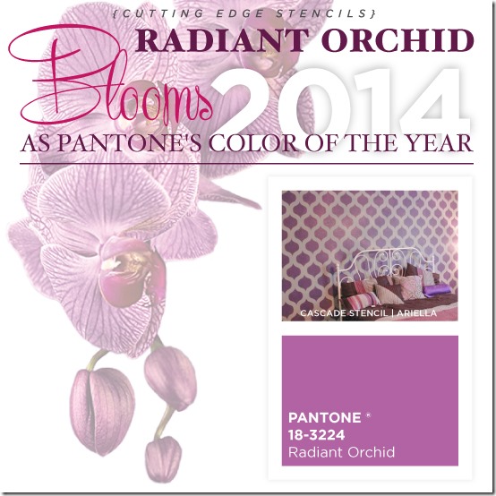
My friends at Cutting Edge Stencils put together a stencil idea using Radiant Orchid. A backdrop feature wall might work!
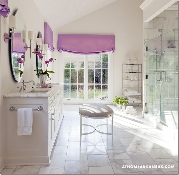
From At Home Arkansas.com, this otherwise neutral yet elegant bathroom has hits of this mauvey pink hue, just on the window treatments and the expected orchid. Of course, Radiant Orchid would be gorgeous on a flower and it is. How do you like that?
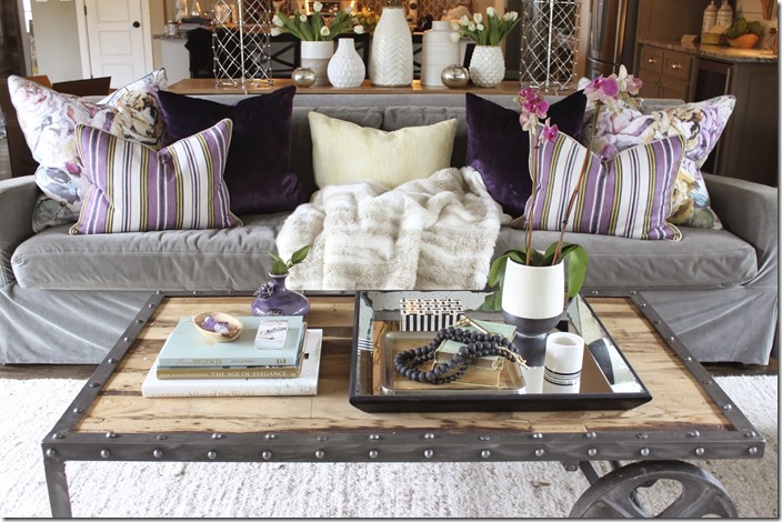
My fun friend, Sherry Hart, did a recent design installation using this purpley hue and look how fun this room turned out!
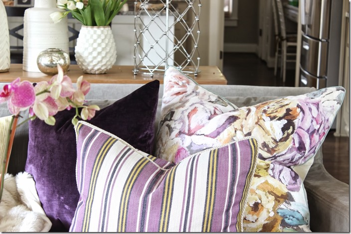
She’s a genius at mixing up fabrics so I’m not at all surprised how pretty it all looks. The floral, stripe and solid is a winning combo and I don’t even mind the colors! Accents only with all the other neutrals in the room. That’s how to bring in this color without overwhelming the room.
So, with a little bit of inspiration for you, I’ll share with you what I did for my Lowes project this month. We were challenged to use this color in our home. No guidelines at all, so I decided to do just a pop of Radiant Orchid on a vase. No surprise that I visited the thriftstore to pick one up!
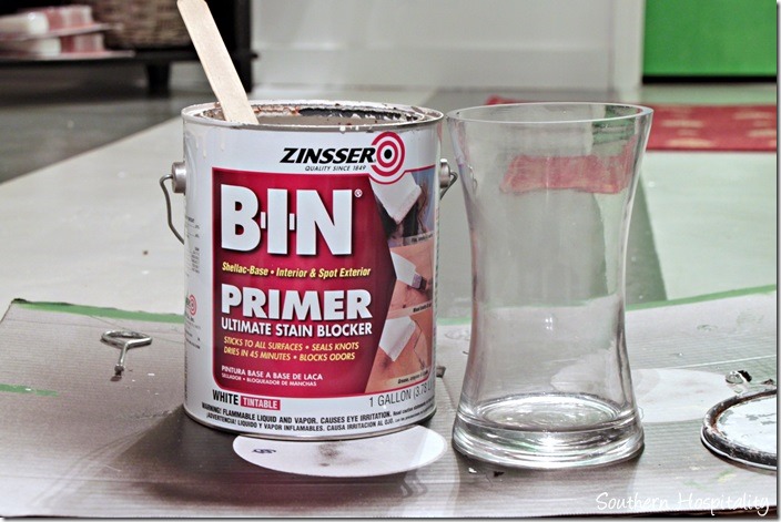
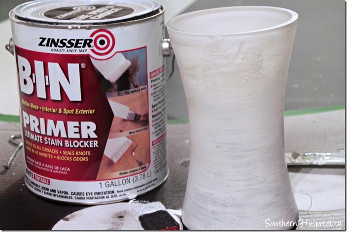
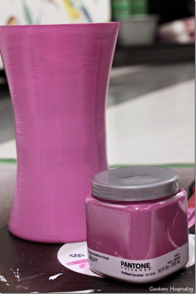
This chunky glass vase set me back about $2 and was the perfect candidate to create a project with. I used BIN primer and primed the vase first. Most anything can be painted these days, but primer assures that the paint will stick. This shellac primer makes anything stick!
After a coat of primer.
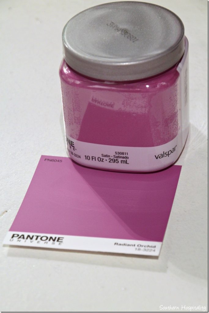
I bought a sample container of Valspar Radiant Orchid and you can find these in the paint department at Lowes.
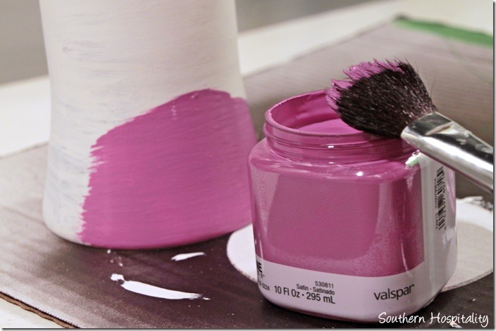
I used my craft brush to brush on the paint color and before I knew it, my vase was PINK!
It’s really, really PINK!
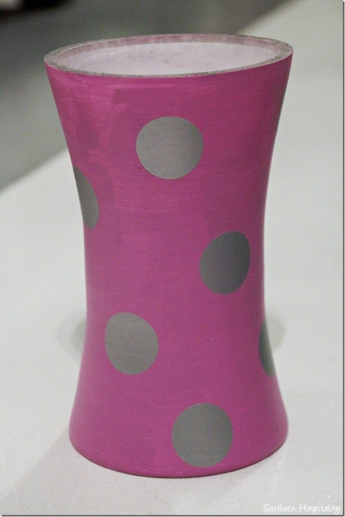
I had some fun polkadots that my friend, Shelley, sent me to use in projects. These are silver and she has all sorts of fun vinyls in her shop, so check it out.
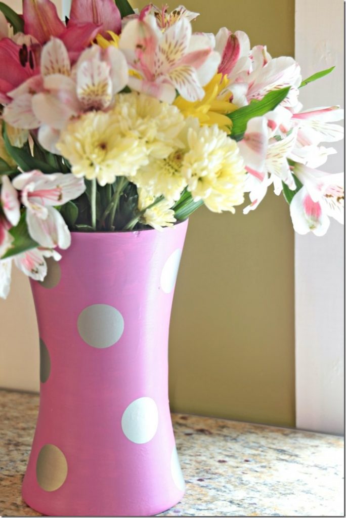
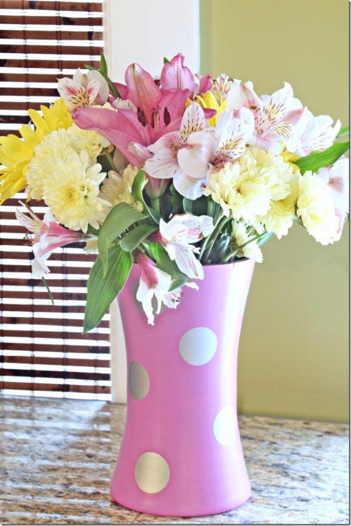
I just added these silver polkadots at random all around the vase and filled it with fresh springy flowers. I could see using some vases like this for spring table centerpieces, if you’re trying to pull decor together on a budget. Head to the thriftstore and buy up several glass vases and paint them all the same. Whatever color you want to feature!
And now I’m completely in the mood for spring, how about you?
What do YOU think about Radiant Orchid? Will it be a color you would embrace for a pop of color or are you like me and more likely to wear it on a shirt or on your nails?

Check out Lowes Creative Ideas Magazine app, visit Lowes on Facebook, and Lowes on Pinterest.
You can see Lowes on Instagram as well. Instagram is fun for every day real life happenings.
Disclosure: As a Lowes Creative blogger, I am sent gift cards to spend on projects and to blog about them. This post is sponsored by Lowes, but all ideas and projects are my own.



I’m with you. This color has got to be my absolute favorite color to hate. I think Pantone must be playing a joke on us.
Definitely agree – A little goes a long way with that color. Love the vase.
It’s not my favorite color either but I must say it does look nice in the bathroom you featured, very elegant. It looks good on your vase too, especially with those flowers. Kathy
I love this color in clothing and accessories. There is really not one place in my home decor scheme that could carry it. But I actually really do like the subdued interpretation of it in Sherry Hart’s room. That’s a very nice combination.
Every January I try to use the color of the year to decorate a little. Along with everyone else, I felt this year’s color was a little challenging. I did, however try to bring some of the color of the year in right before Valentine’s Day. I was surprised at how nice it looked against a neutral scheme. For March I took away the hearts and put in some green and decided to leave it. Even though my color leans a little more to the purple hues, it’s a nice color to use for ushering in Spring. If you would like to see it, I posted a picture on Insta Gram. My username is gailgrams. Maybe I’ll do a blog post too.
Your vase it really cute, however, I do vividly remember my sectional being covered with mauve and country blue pillows back in the day ,and quite frankly, it makes me want to barf! Blek :0
Rhoda, I like your vase but I’m just not feeling this color. I’ve decided to embrace colors and things I’m drawn to and not get into trendy colors or stuff. Pantone’s color of the year reminds me too much of the mauve’s from the 80’s and early 90’s. I’m finally discovering my own unique style and don’t want to let the decorating market influence my choices. Since the blogging world exploded things trend in and out at the speed of lightening and pretty soon all the homes start looking the same.
No I am not a fan of this color. Frankly I am not one to follow trends, I have a classic and traditional style that suites my taste and home and incorporates all of my treasures from the last 30 years of travel. I think everyone should decorate their home to suit their taste, budget and life not follow the trends because someone else thinks it is cool.
That said I think your vase project is very spring like and would look lovely for Easter.
Don’t care for the color much but love your vase project. Very cute and very spring. Great idea for my wedding file for my daughter.
Hi Rhoda- I agree about the Orchid Color. But, I do have to say I just go to IKEA and buy pillow covers, and a throw, and make 2 floral and 2 striped pillow covers. My furniture is all neutral, so I can change it out easily, and then either save them or give then to Charity (the covers, and throws). Not much money involved and it changes things up a bit.
It’s not a color I would automatically migrate to, but up against neutrals like white and shades of gray, I think it’s fresh and beautiful as shown in the photo of the gray couch and multi-patterned pillows posted on this site. I have a gray couch and white chairs in my great room so will be trying the color and various shades of it in that room in pillows and maybe some glassware. I don’t think Pantone means for us to take this one color so literally. When I read about the color announcement, the embraced all shades of orchid, violet, lavendar. . .there’s lots of room for interpretation. Wait until we see room shots with touches of the color in BH&G; I predict there will be converts! 😉
I love that color but haven’t seen it anywhere but the paint. It is not a mauve I don’t like mauve. I wish I could find more items with that color.