So, when this year’s Pantone color of the year was announced, Radiant Orchid, did you jump up and down with excitement?
Me neither. In fact, I looked at the color and said, YUCK. It’s definitely not my fave color to decorate a room around. Maybe wear it in clothing or paint my nails with it, but decorating a room? Ummmm, no, I just can’t see it. It took me right back to the 80’s when I decorated my first house in mauve and seafoam green. Remember that combo? Not my finest moment, although that combination was definitely a trendy one in the 80’s. I’m so trying to stay away from blatant trends these days, but it’s hard not to fall for a few.
So, how do you incorporate this color if you really do like it into your décor. Small doses, that’s for sure in my book. Perhaps a flower arrangement, vase, pillow, something small. But, to have a little fun I collected a few inspiration pics around the web, showing how some designers are using this vivid pink in their decorating schemes.
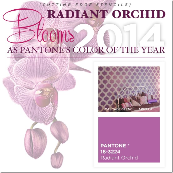
My friends at Cutting Edge Stencils put together a stencil idea using Radiant Orchid. A backdrop feature wall might work!
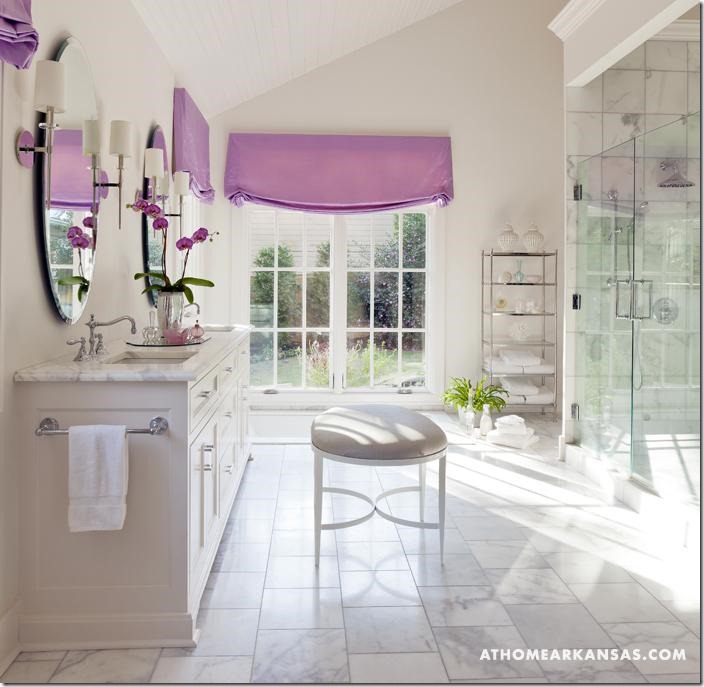
From At Home Arkansas.com, this otherwise neutral yet elegant bathroom has hits of this mauvey pink hue, just on the window treatments and the expected orchid. Of course, Radiant Orchid would be gorgeous on a flower and it is. How do you like that?
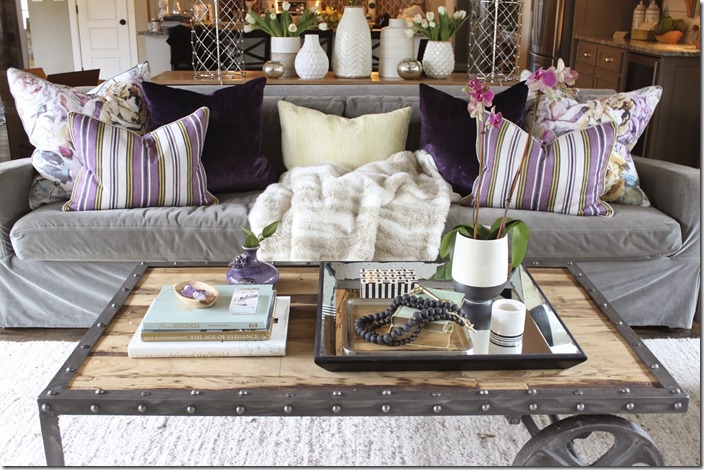
My fun friend, Sherry Hart, did a recent design installation using this purpley hue and look how fun this room turned out!
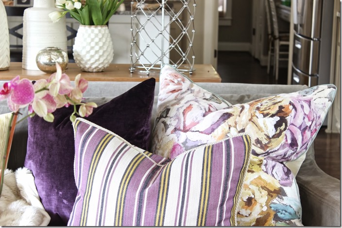
She’s a genius at mixing up fabrics so I’m not at all surprised how pretty it all looks. The floral, stripe and solid is a winning combo and I don’t even mind the colors! Accents only with all the other neutrals in the room. That’s how to bring in this color without overwhelming the room.
So, with a little bit of inspiration for you, I’ll share with you what I did for my Lowes project this month. We were challenged to use this color in our home. No guidelines at all, so I decided to do just a pop of Radiant Orchid on a vase. No surprise that I visited the thriftstore to pick one up!
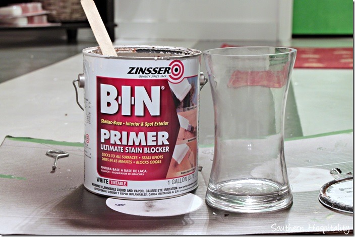
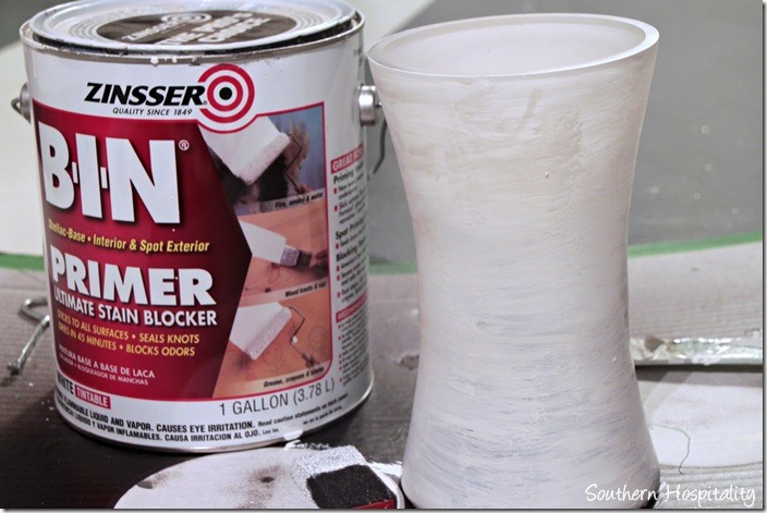
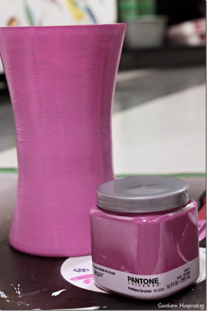
This chunky glass vase set me back about $2 and was the perfect candidate to create a project with. I used BIN primer and primed the vase first. Most anything can be painted these days, but primer assures that the paint will stick. This shellac primer makes anything stick!
After a coat of primer.
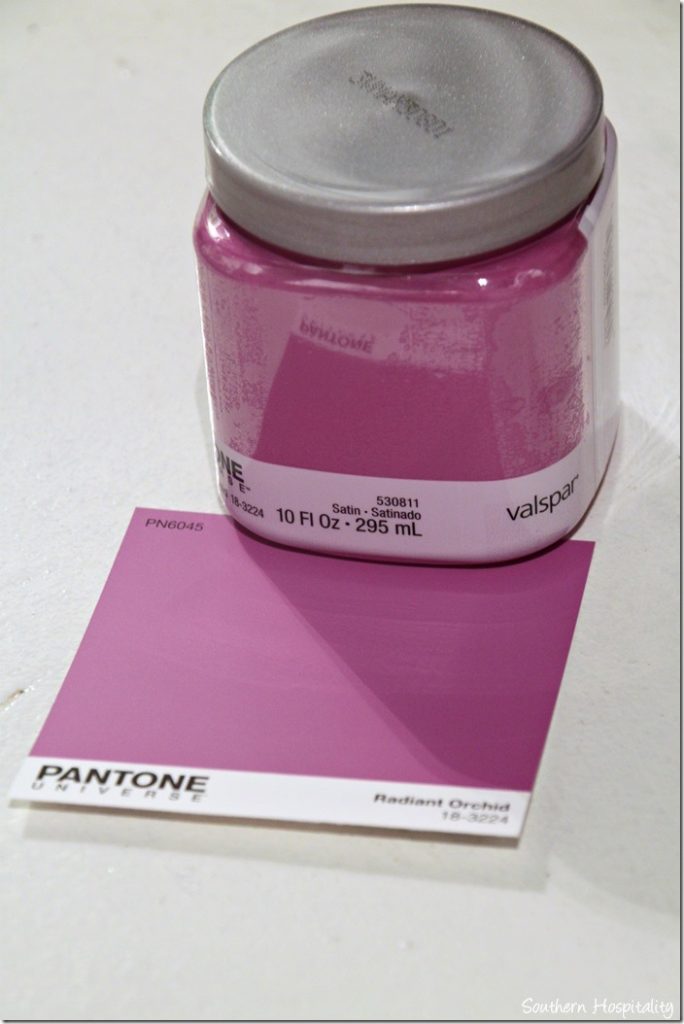
I bought a sample container of Valspar Radiant Orchid and you can find these in the paint department at Lowes.
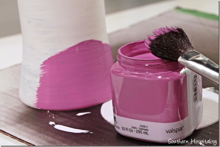
I used my craft brush to brush on the paint color and before I knew it, my vase was PINK!
It’s really, really PINK!
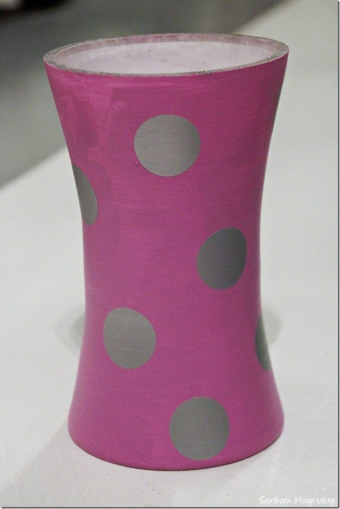
I had some fun polkadots that my friend, Shelley, sent me to use in projects. These are silver and she has all sorts of fun vinyls in her shop, so check it out.
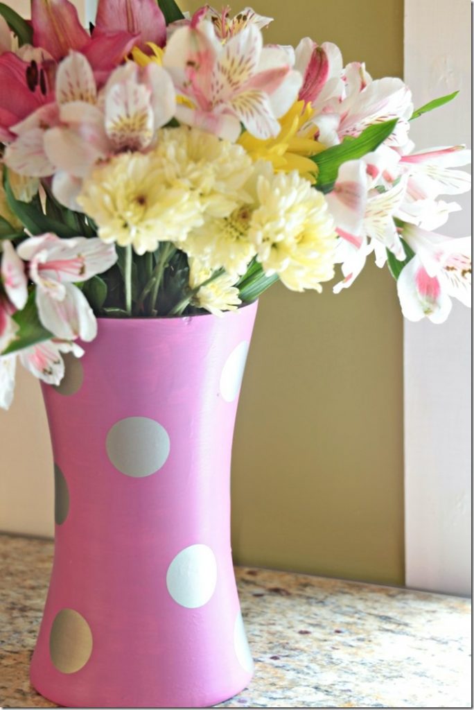
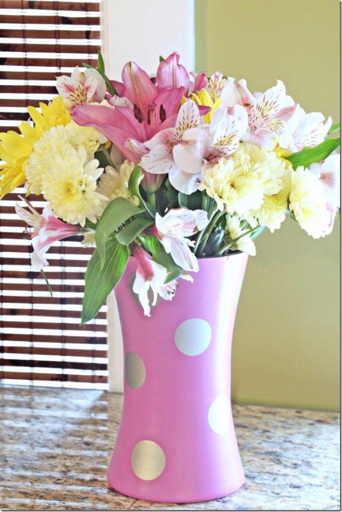
I just added these silver polkadots at random all around the vase and filled it with fresh springy flowers. I could see using some vases like this for spring table centerpieces, if you’re trying to pull decor together on a budget. Head to the thriftstore and buy up several glass vases and paint them all the same. Whatever color you want to feature!
And now I’m completely in the mood for spring, how about you?
What do YOU think about Radiant Orchid? Will it be a color you would embrace for a pop of color or are you like me and more likely to wear it on a shirt or on your nails?

Check out Lowes Creative Ideas Magazine app, visit Lowes on Facebook, and Lowes on Pinterest.
You can see Lowes on Instagram as well. Instagram is fun for every day real life happenings.
Disclosure: As a Lowes Creative blogger, I am sent gift cards to spend on projects and to blog about them. This post is sponsored by Lowes, but all ideas and projects are my own.


I don’t think I will be embracing it in my home. I actually like a bluer purple. That is a little too close to my nemesis, mauve. Mauve was so overdone in the 70″s and 80’s that I can barely stand the sight of it, LOL. When my sister got married, my mother had looked at mauve bridesmaids dresses for my other sister and me, and I said, “Mama, what are you thinking? We will look sick in mauve!” Plus my sister has reddish hair. The horror of me almost having to wear it still scares me today! So you can see how I can’t embrace this new, recycled version of the same. ;-). I actually don’t mind some shades of purple in pops, but it has to be carefully done. I mean, I have family in Louisiana where the school colors are gold and purple! 😉
You asked, Rhoda. Like George Washington, I cannot tell a lie!
xoxox
Sheila
PS: I predict this trend will last about five minutes. Oh, and when someone gives me a purple orchid, I regift it. White. That needs to be the color of the year, and then we can mix anything we want with it! 😉 xoxoxo
I am not a fan of this color at all, so will not be using it. It IS a color that would flatter my coloring, so perhaps I will wear something this color. It is pretty – just not for a home, at least not our home.
I am one who decorates with what I/we like, not what is the popular color. The “color of the year” thing always cracks me up!
I think Pantone may have missed the mark on this one. My immediate reaction was that it reminded me of my grandma’s favorite pantsuits from the early 80’s. Not sure I want to revisit that era! I can see the early teen girls jumping on that bandwagon for a bedroom or accent color but not adults. Not that I’ve ever been accused of being on the cutting edge, but I would have thought they would have gone with something in the blue family. Oh well, time will tell. Thanks for breaking the news to all of us. 😉
I’m a fan of purple, but not that shade. I have some extra glass vases under the sink, waiting for the daffys and other spring flowers to emerge. It might be fun to paint some of them to get a brighter look around the house.
definitely not a fan of this color…your vase is very cute though and an easy way to bring a pop of color into your home without investing a whole lot on a trend
I’m with you on this color, Rhoda! I think those of us who remember the mauve days just aren’t going to be able to embrace this color for our home decor, huh? A nice summer top, maybe–or some polish for my toenails! In my house, I reckon this color will be limited to what might appear on a real orchid!
Not a color that I want to include in the house. I did find a purse (on deep, deep discount) with that color so I’ll use it that way. Funny about their color of the year choices. Right now I am all about a deep navy for some reason. To each her own I guess. Love your dotted vase for Spring. I just wish it would come to us in Alabama and stay for a while!
I totally agree with all of you….this is not a color I like. I would probably have it in clothing only. Maybe in a scarf. It looks ok on your vase though.
I think your use of the color is perfect. Small doses, for sure!
Oh, someone missed the mark on this color. I won’t use it…it reminds me of the color of the burial dress my Granny wore (died, 1974). Pantone may want to push it, but you can’t put lipstick on a pig – even if it IS orchid.
“…staying away from trends..” all we are seeing on a lot of these posts/blogs IS “trendy”…let’s see something original!
Ugh. no.
As always, I appreciate your creativity and vase is adorable. My thoughts on the color…YUCK. I will not be using it in my home.
Love the vase and, although I won’t use the color, I have to say it cheered me up on the very wintery day in my neck of the woods. I love you technique on the vase and will be doing the polka dots, for sure. I am crushing on Kate Spade these days and loving the dots!
I am new to your blog and wanted to say I was inspired by your personal story. So happy for you that you decided to make lemonade, and you are rocking those lemons!
Take care, Tammy
HI, Tammy, welcome and thank you SO much!
My daughter is getting married March 29th and I am giving the bridesmaids brunch the morning of the wedding. The color scheme is pink and green. It will be set up right outside the area where hair and makeup are being done. I was trying to avoid spending $100.00 a piece on flower arrangement and these vases will be perfect. I am definitely on a tight budget and this should save me plenty.
Not so crazy about this color too, however, it does look terrific paired with neutrals and that vase is perfect with those flowers!
I was one of the ones who was excited about it. I love most colors, but mauve is one I never used because I hated it. Mauve is dulled down, and I hate dull shades of any color. Clear color is so much prettier, no matter what the hue.
Any bright color is a boost to a neutral background so that it does not become a snooze before breakfast. Of course, that is the safe way to go. I have always believed that people should use what they like in their homes because color does affect mood.
So, while there is definitely a skill to using a color like this well, there is certainly a place for it. as one commenter noted, shades of blue seem to be more popular right one, and they are classic and safe. but who always wants to play safe?
Rhoda – I agree with you on this one…small doses, very small doses. I really like the vase idea. My elderly mother has tons of those glass vases so my spring vase project will be even less than thrift store price!
I thought we might see more women at the Oscars wearing this shade. The only one I saw was Candace Bergen who looked lovely in an orchid jacket with black pants and a white top. I’m hoping to find an orchid top for the spring to be paired with black, grey, navy or even other shades of purple. The polka dots really make the vase – how were they applied?
Lindy, they are just peel off and stick on polkadots.