It’s always so fun to get the invitation to preview the Atlanta Symphony Showhouse. This year’s house is in West Atlanta. In partnership with Atlanta Magazine and Atlanta Magazine Home, the house is a masterpiece of modern architecture. The official architect is Robert Tretsch of Harrison Design and to say this house is unlike anything I’ve ever seen before is an understatement. When I saw the exterior, I have to admit I was a little skeptical to see the inside, but the inside is truly a contemporary delight if you like modern. I like to feature all house types here on the blog, so even though I predict you, my dear readers, will not embrace this type house, I hope you enjoy the tour of a truly different architecture of a house.
The house is open to the public for tours through March 8th. Tickets can be found that the link above. If you love house tours, you’ll love this one as well.
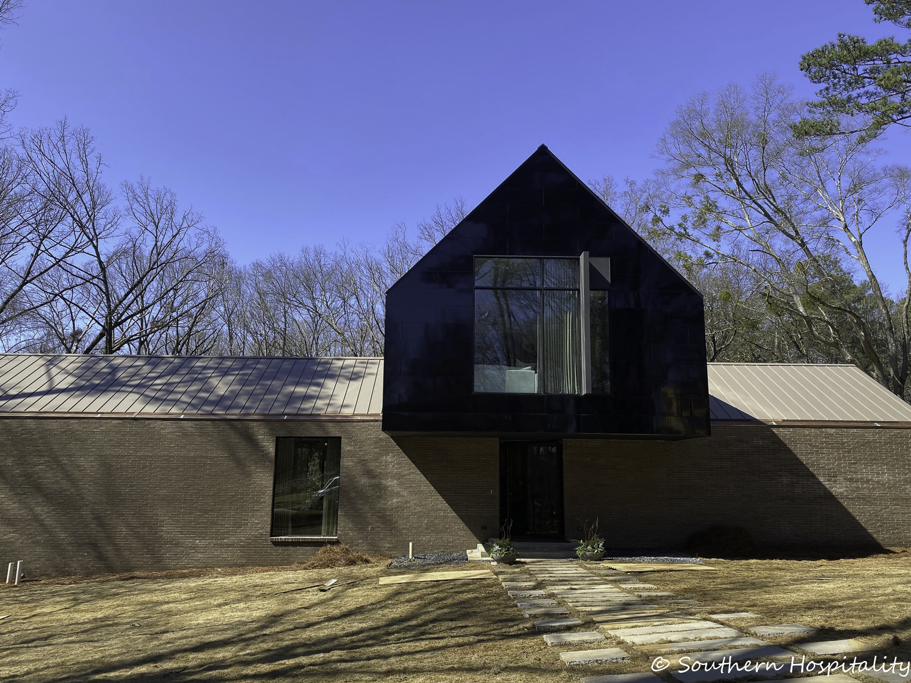
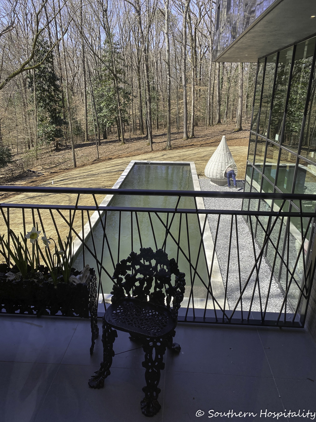
Different, no? I was underwhelmed by the exterior, but wish I could have gotten a shot from the backside. The interior of the home is filled with light from all angles, so wait until you see that. Modern lovers will be in heaven with this house, which is a mix of brick, stucco, stone and steel
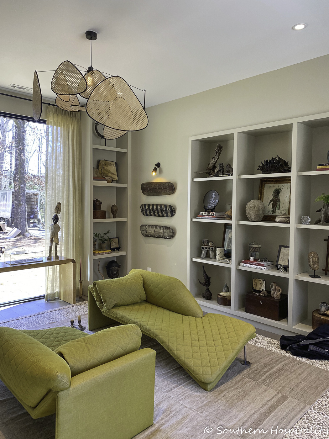
Let’s go inside for the full tour. I tried to take pics of all the rooms and show the soaring spaces as I saw them. We’ll start in the study.
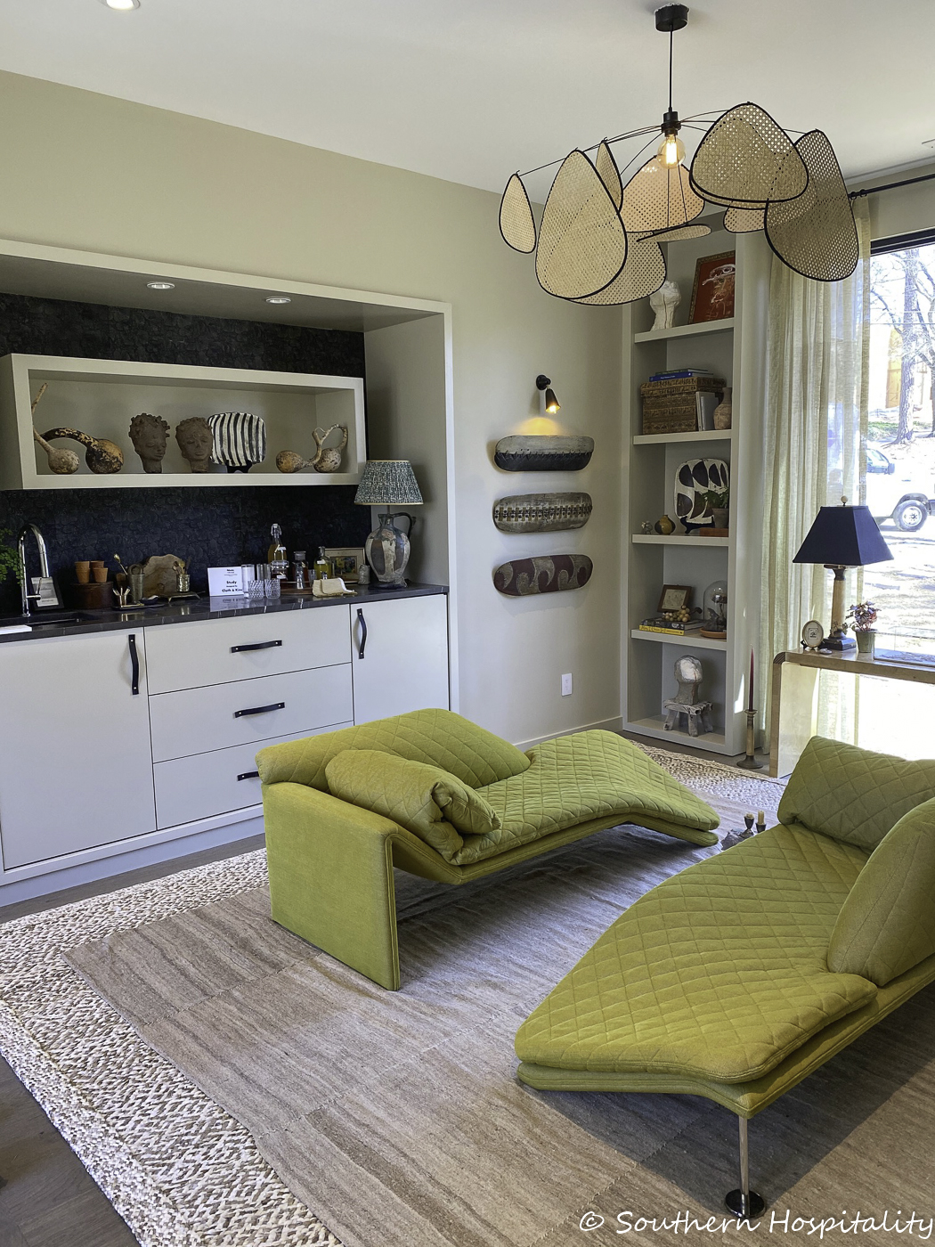
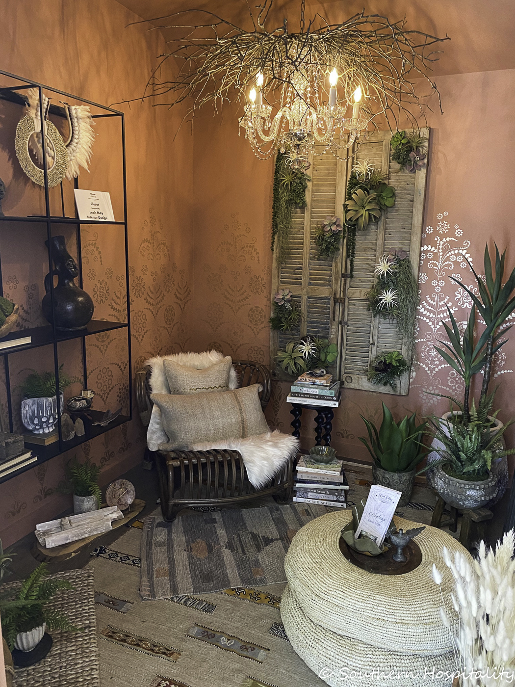
Designed by Cloth and Kind: Tami Ramsay and Krista Nicholas
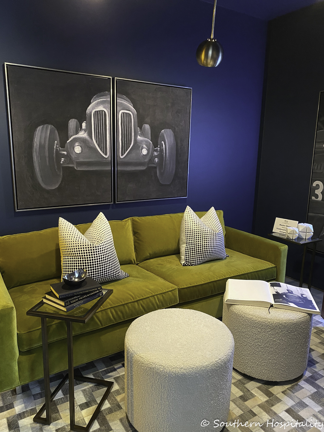
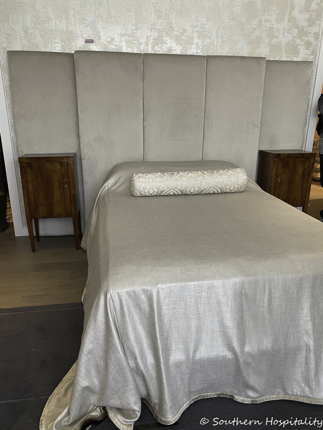
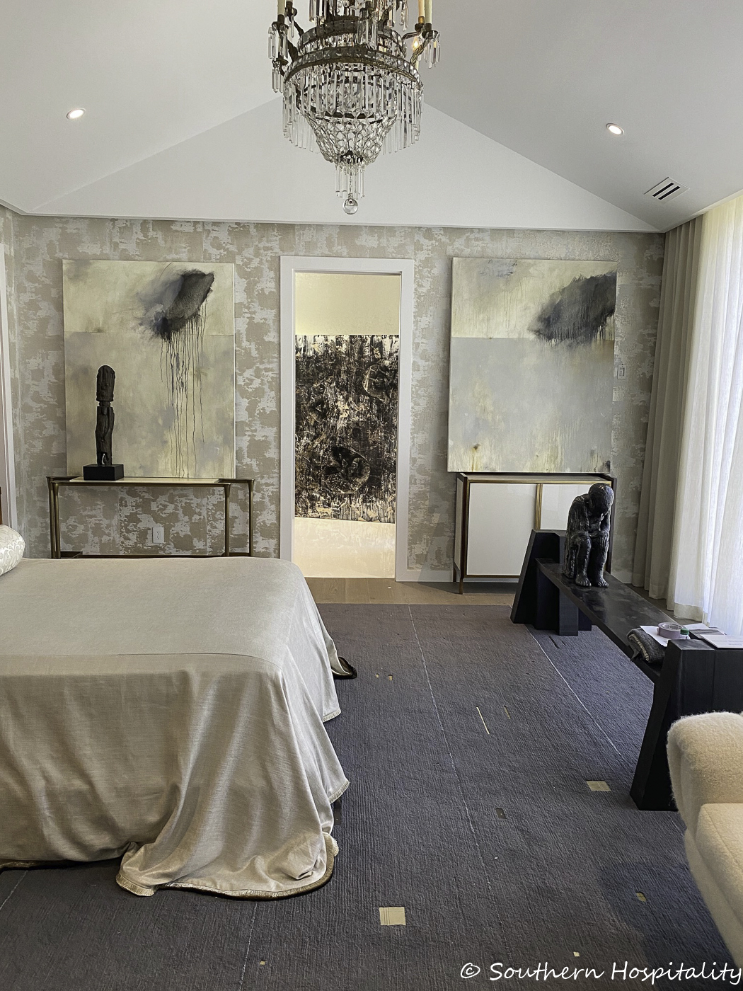
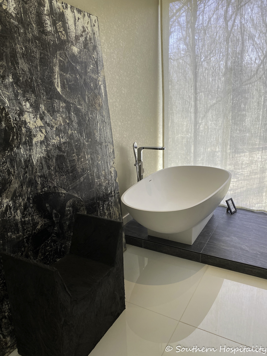
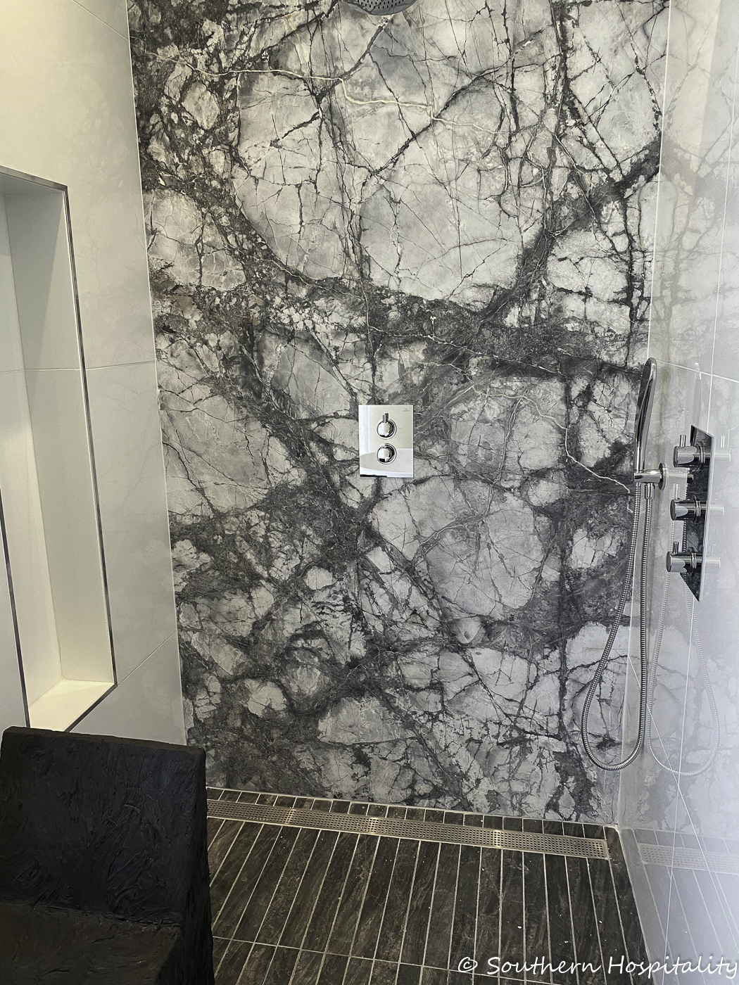
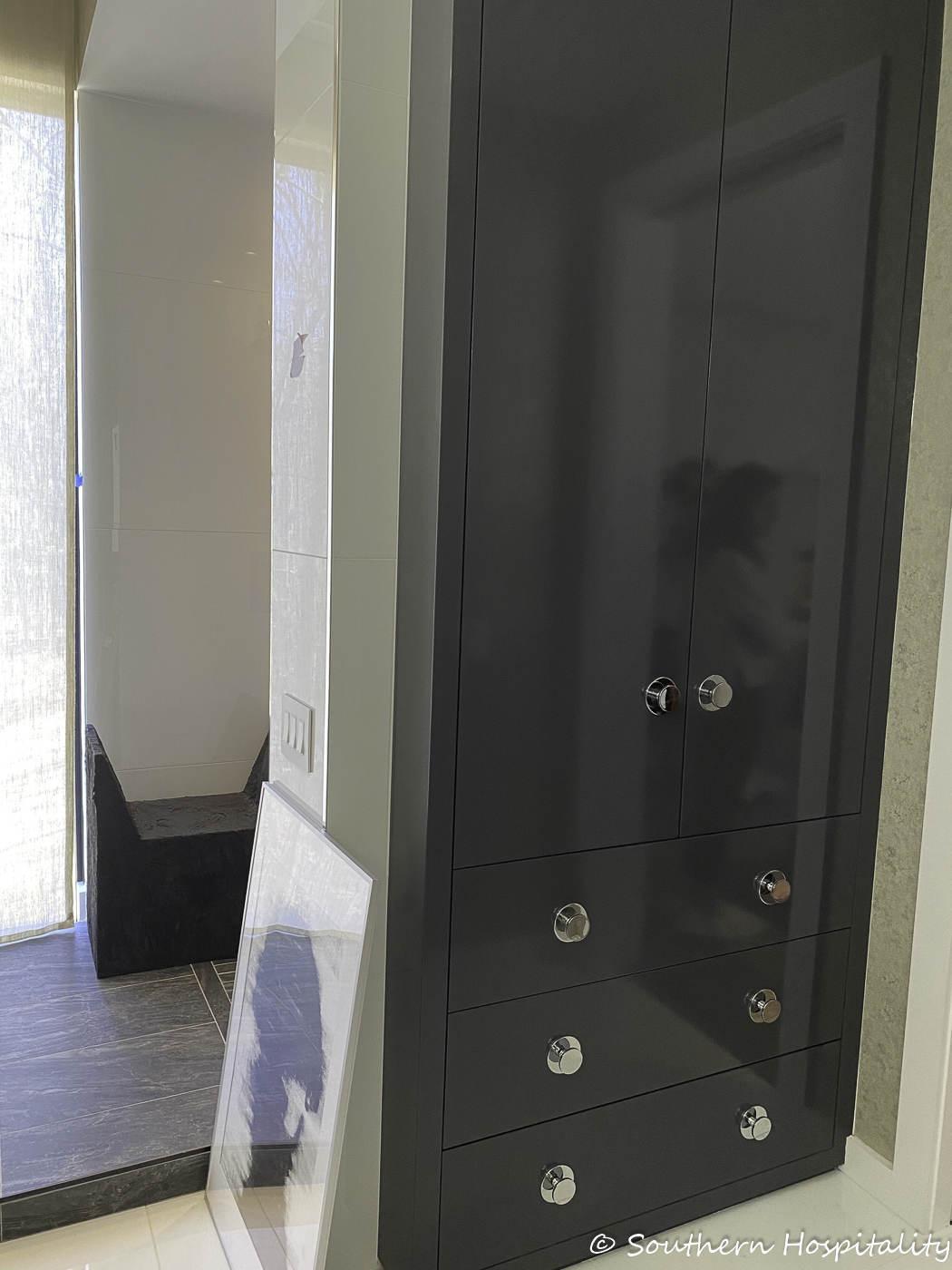
Master Bedroom & Bath: William Peace/Peace Designs
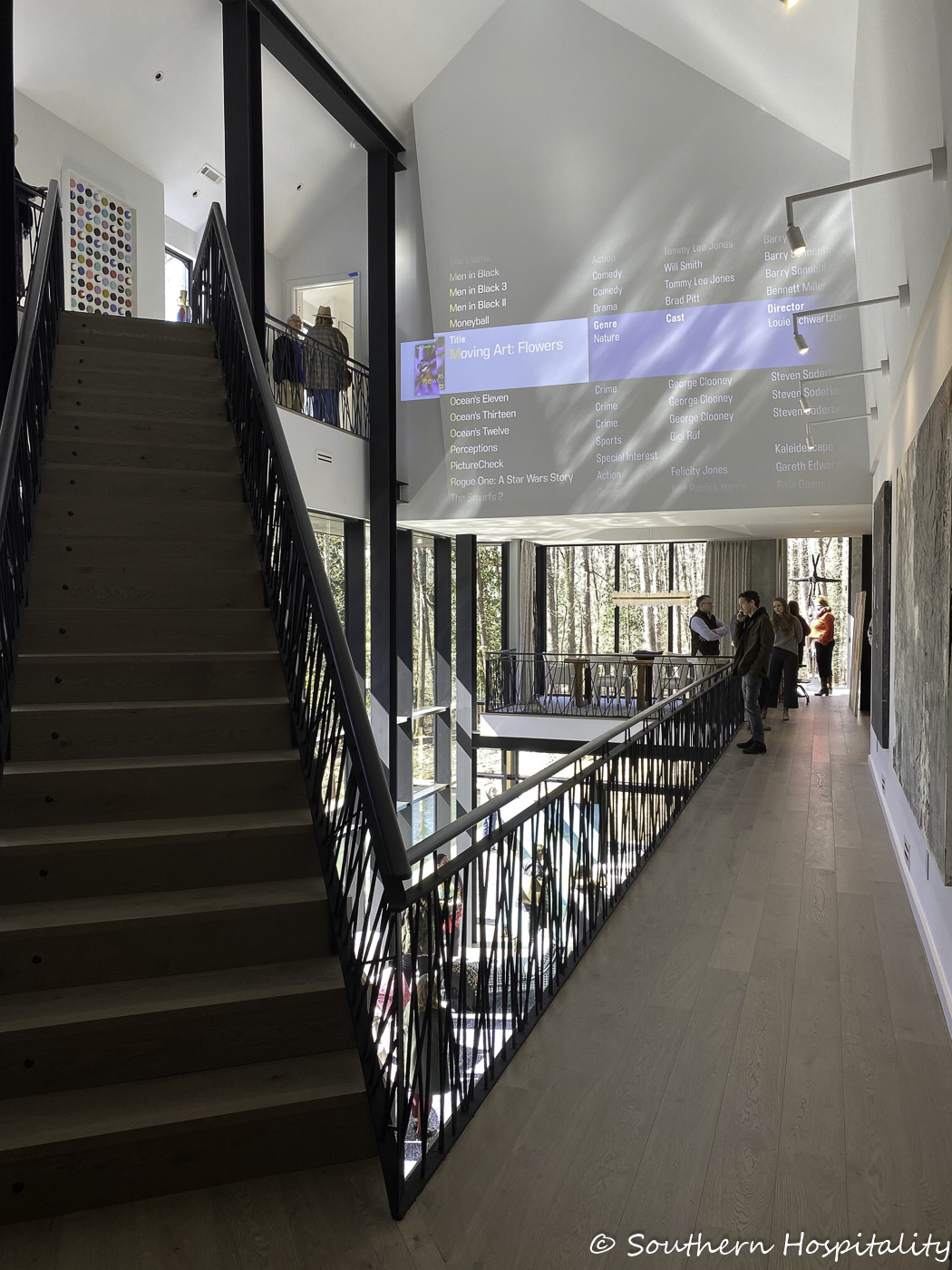
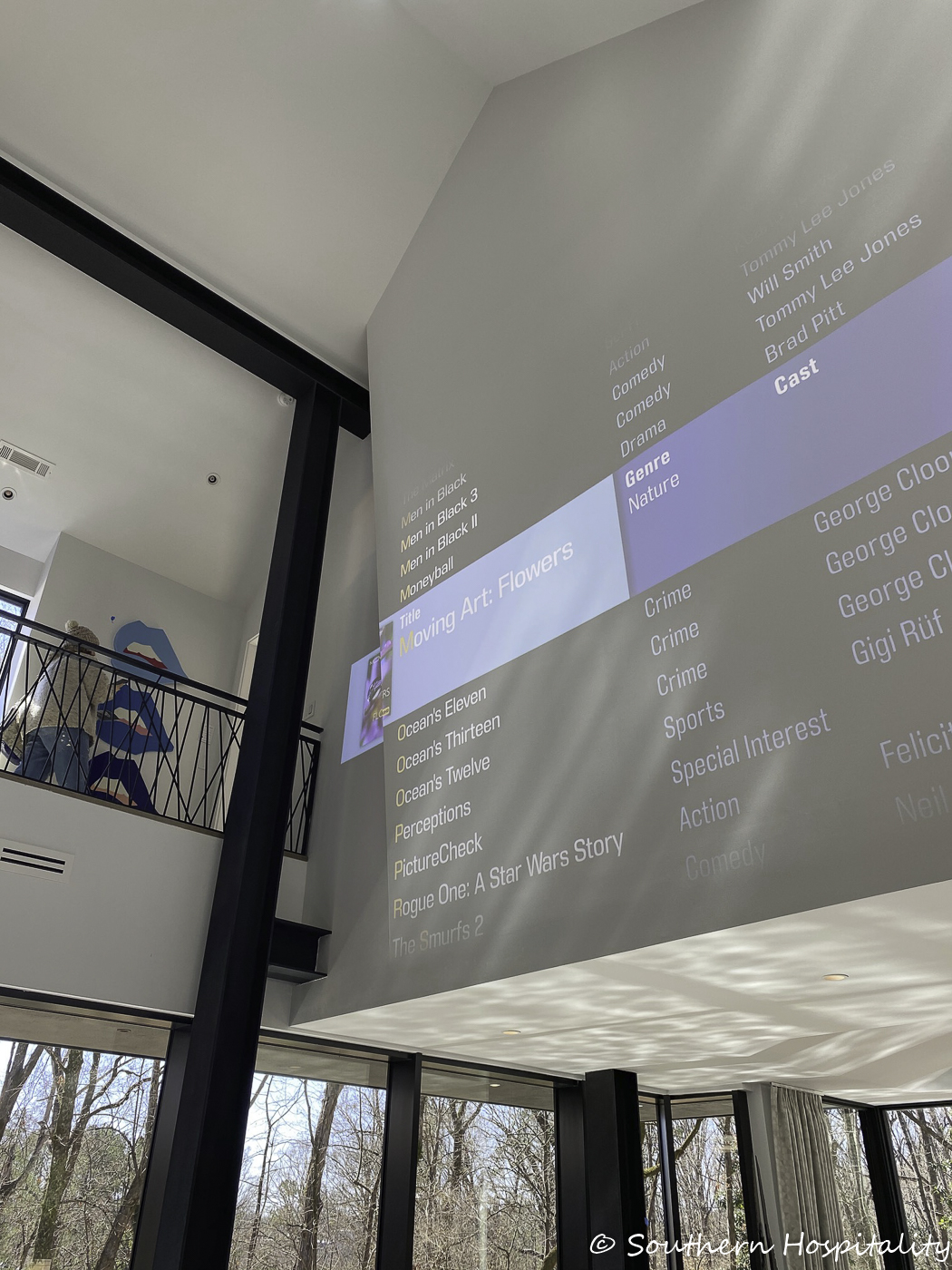
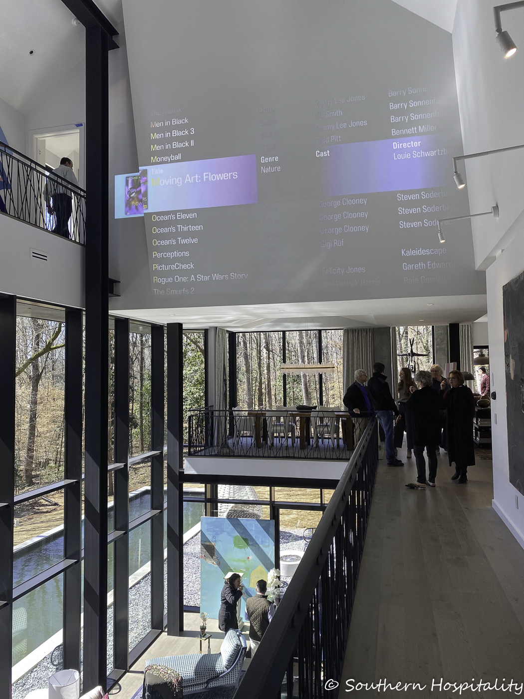
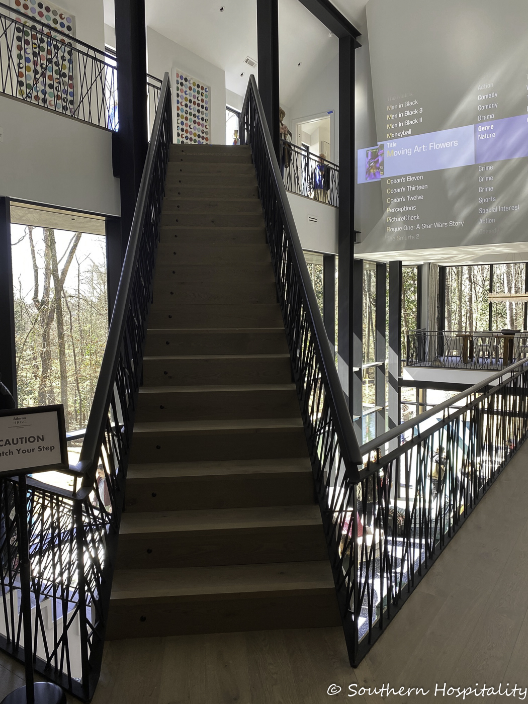
Here’s where you realize this house is unlike anything you’ve seen before. Staircases intersect and go up and down from this level. It’s amazingly light filled, soaring and spacious. What a house!
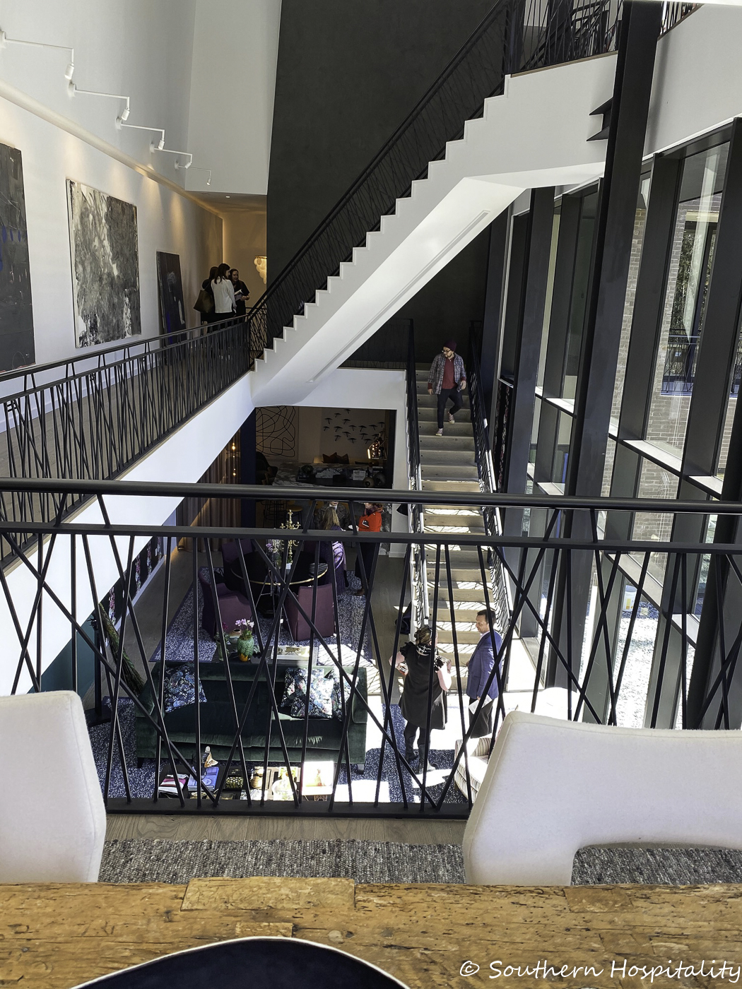
Here’s a good shot of how the staircases are laid out. You enter the house here on the middle level and then go up or down.
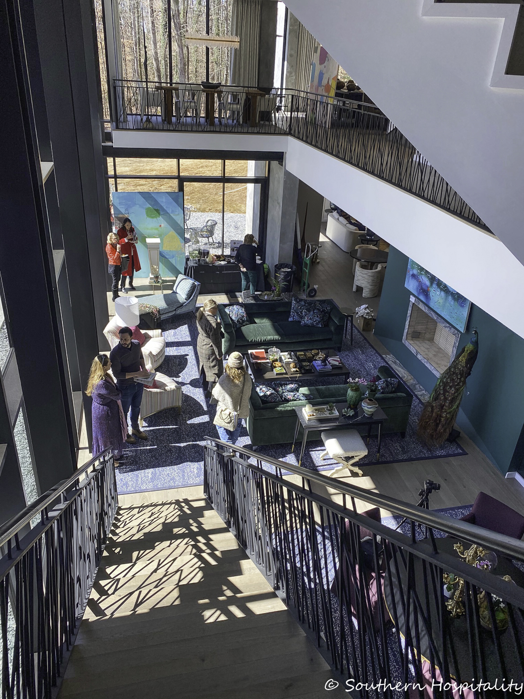
A look down the stairs to the Terrace level, with the pool to the left.
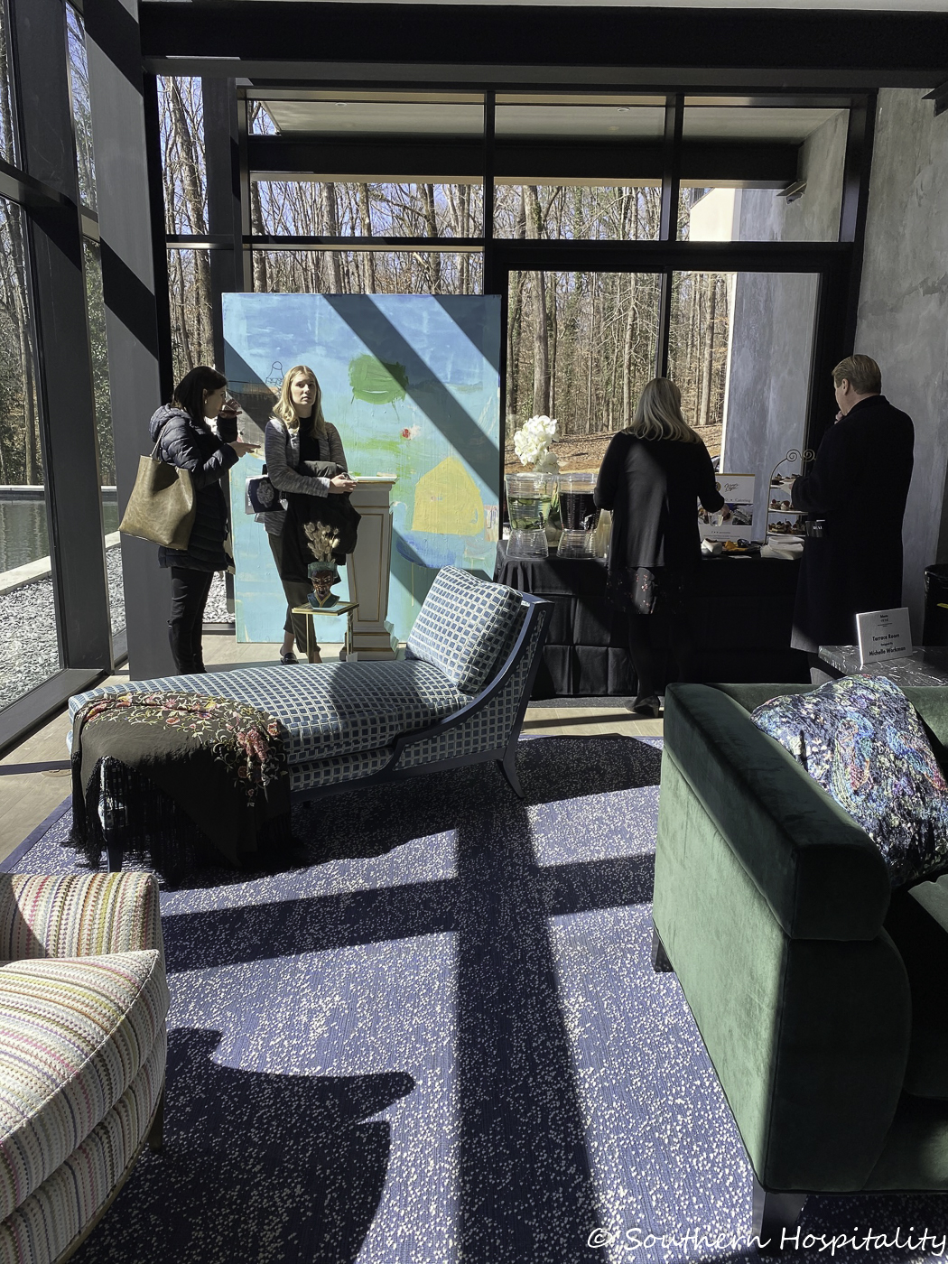
Terrace Room: Michelle Workman/Michelle Workman Interiors
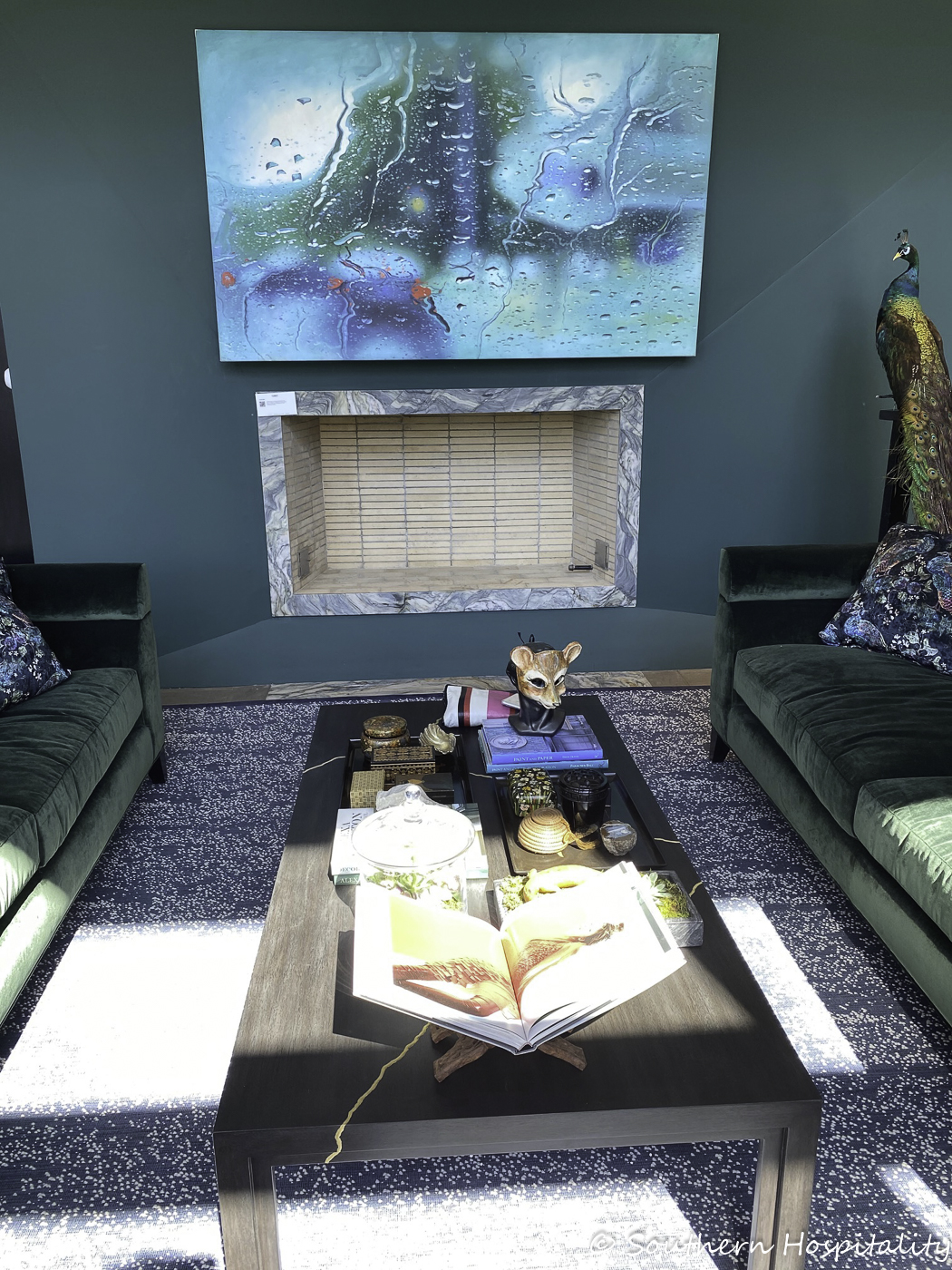
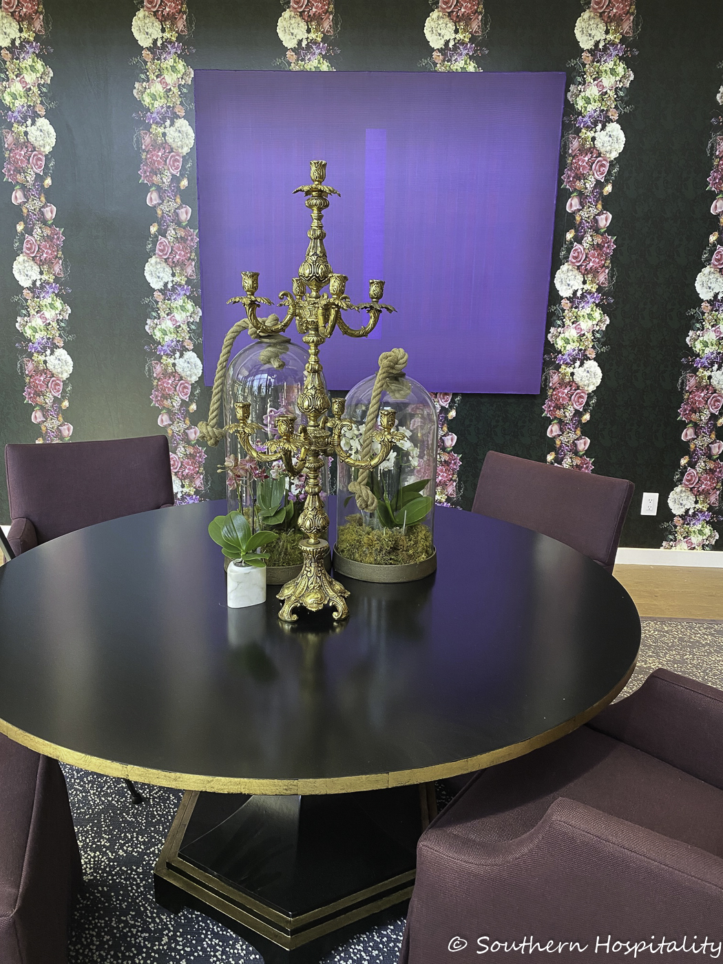
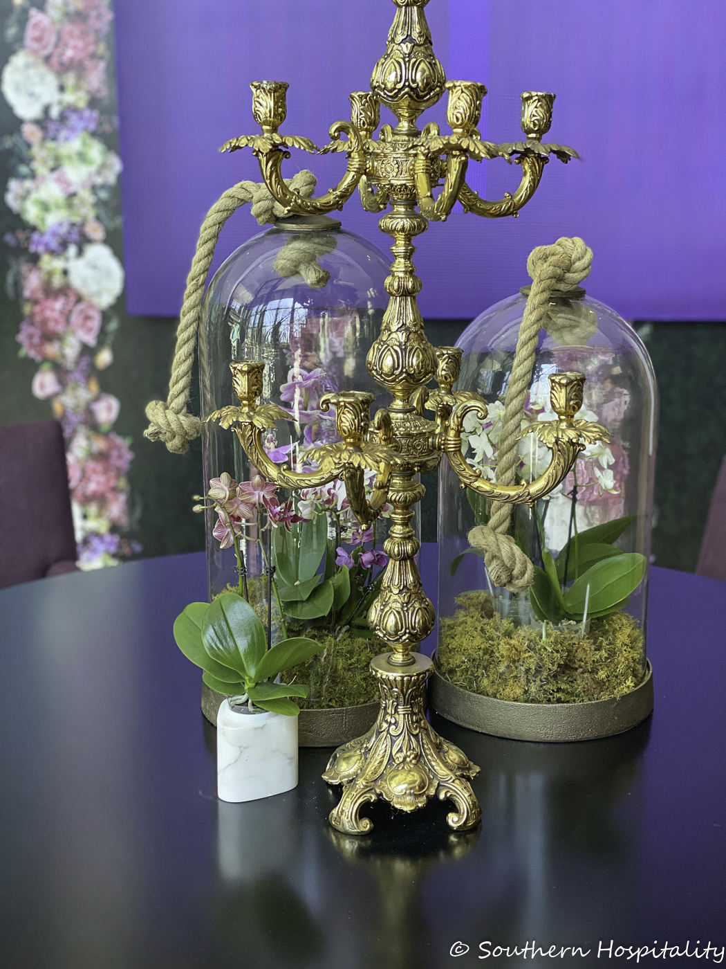
Loved this vignette of Michelle’s!
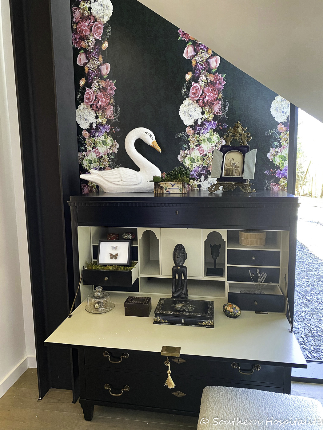
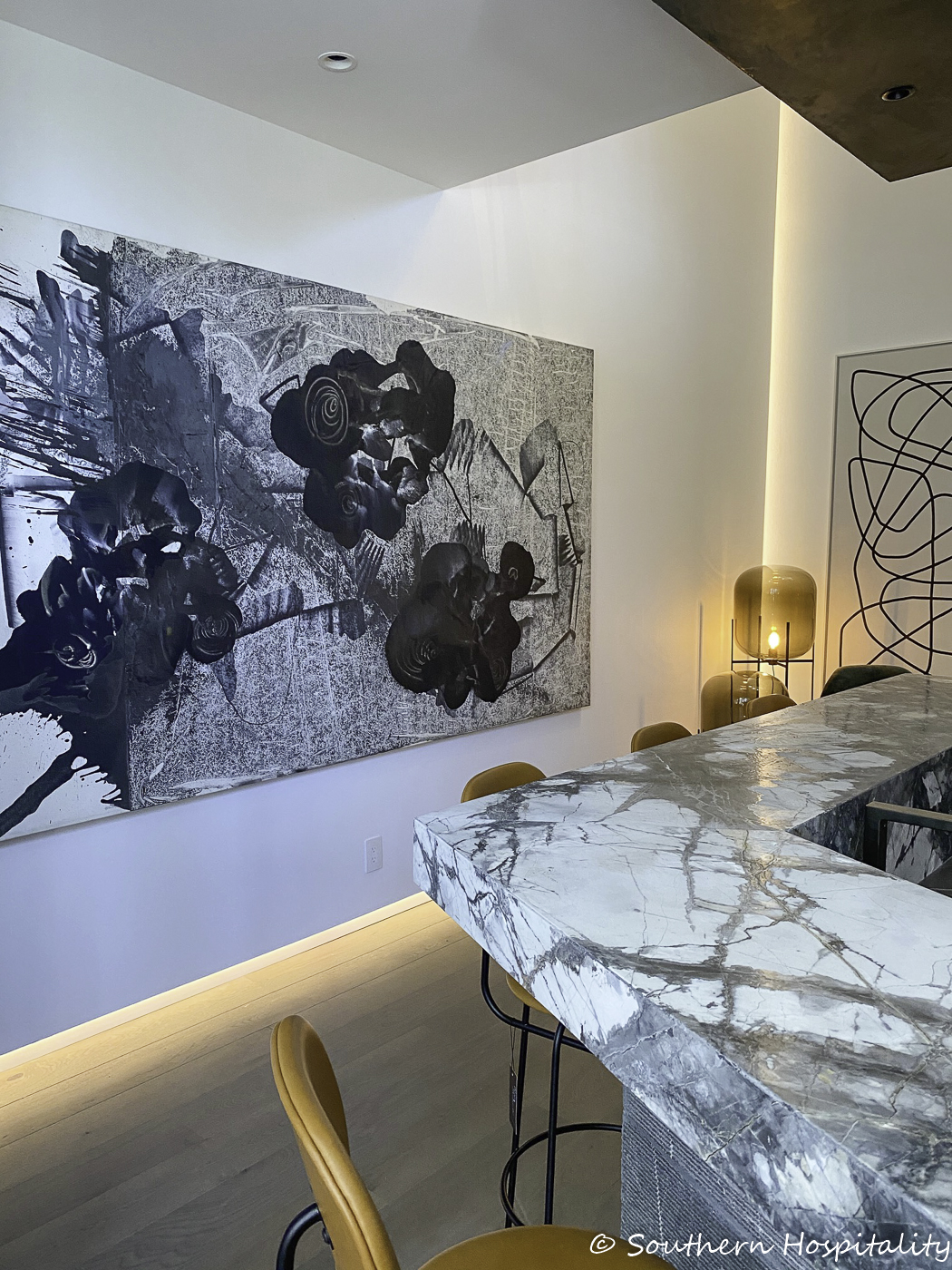
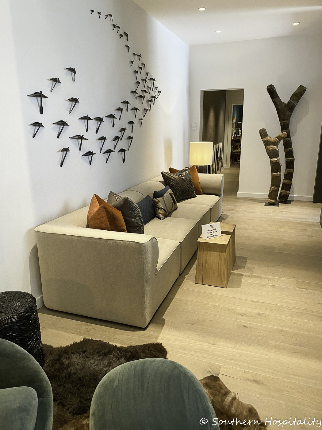
Downstairs Lounge & Powder Room: Michael Habachy/Habachy Designs
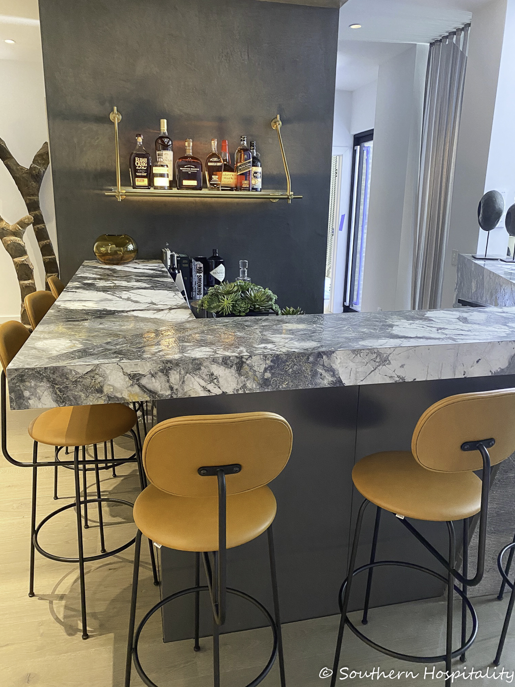
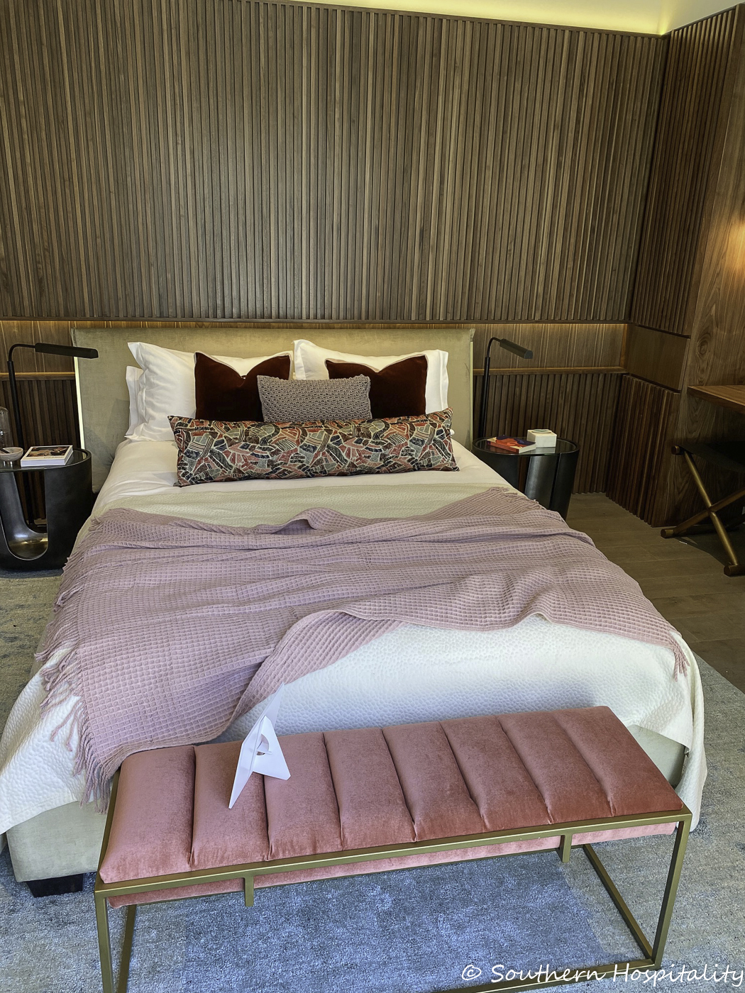
Downstairs Bedroom & Bath: Ili Hidalgo-Nilsson/Terracotta Design Build
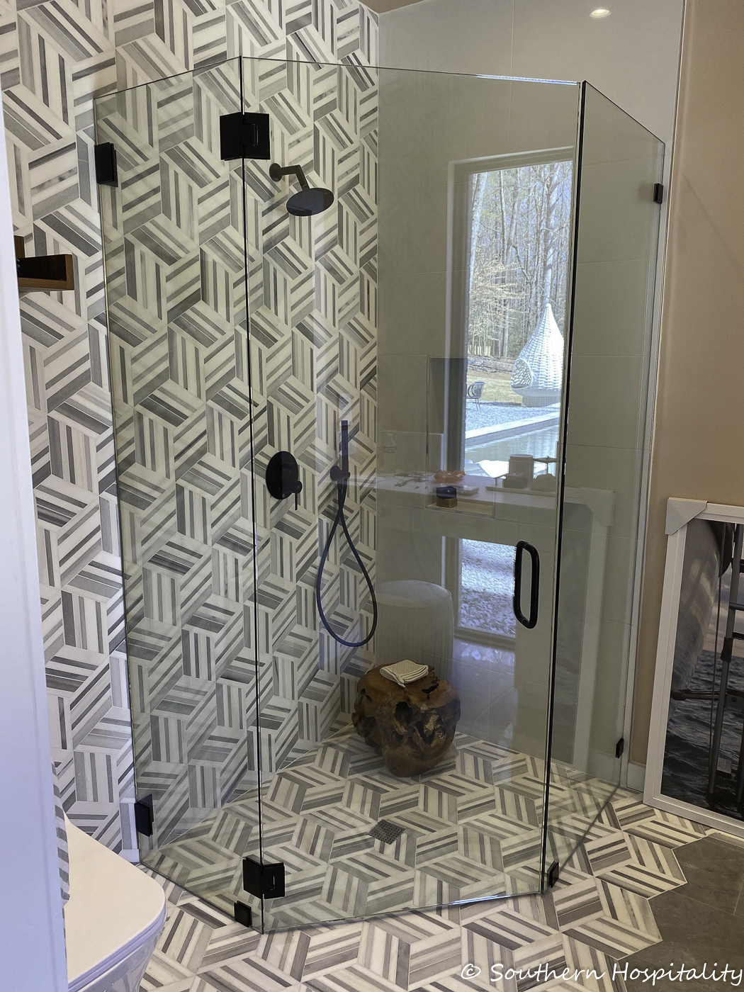
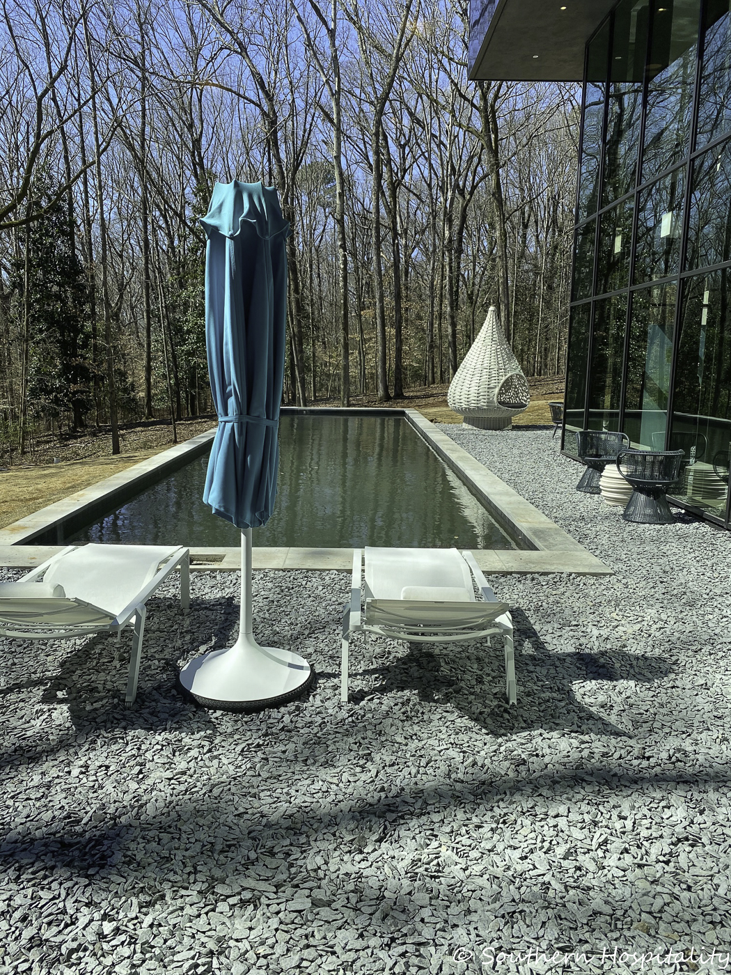
Pool Deck: Willem Stear/Tonic Design Studio
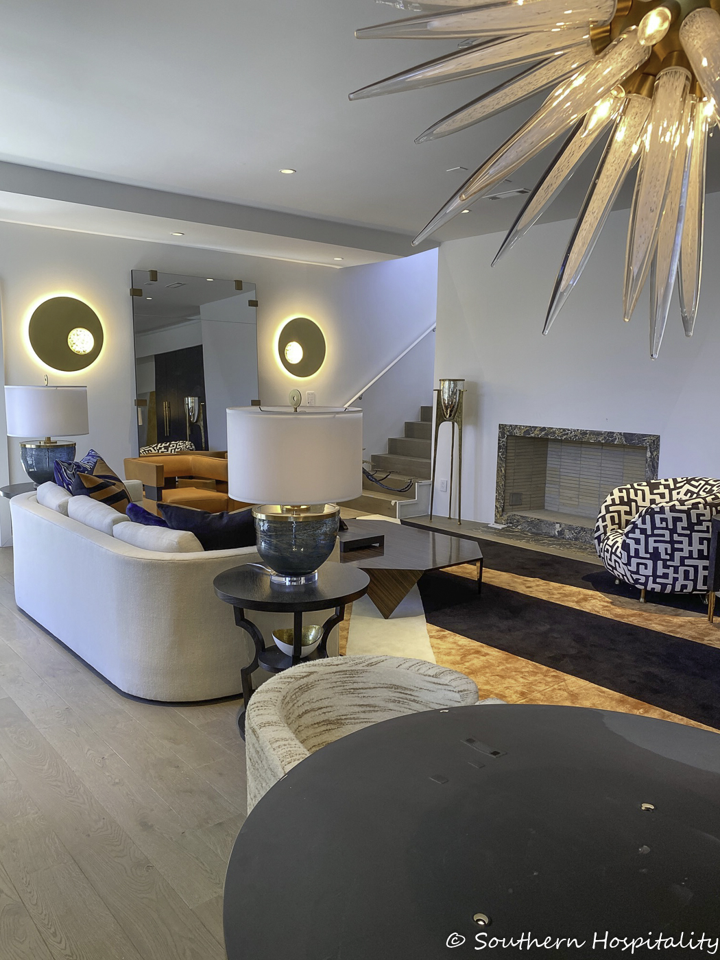
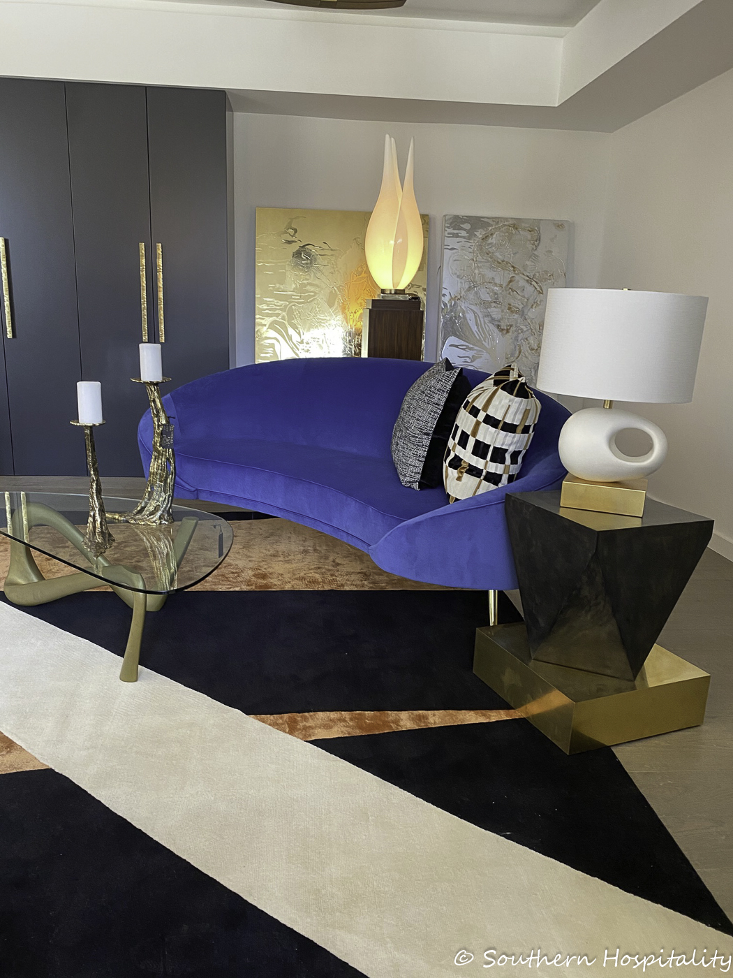
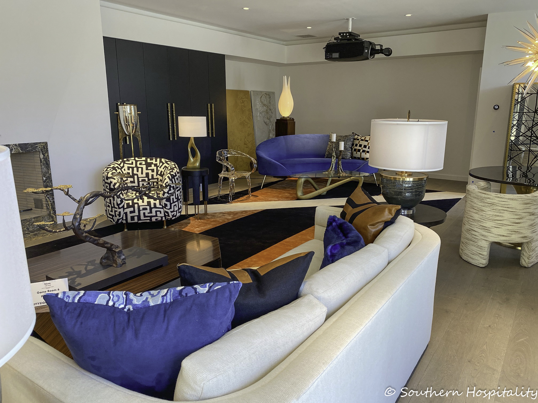
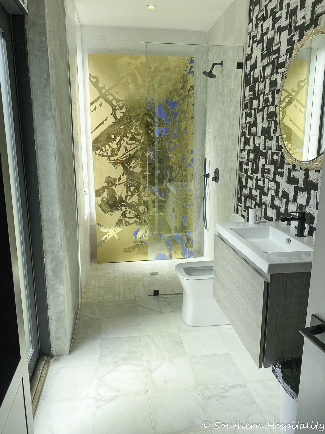
Game Room & Pool Bath: Jill Mansfield & Bryan Kirkland/Fiftyeight Interiors
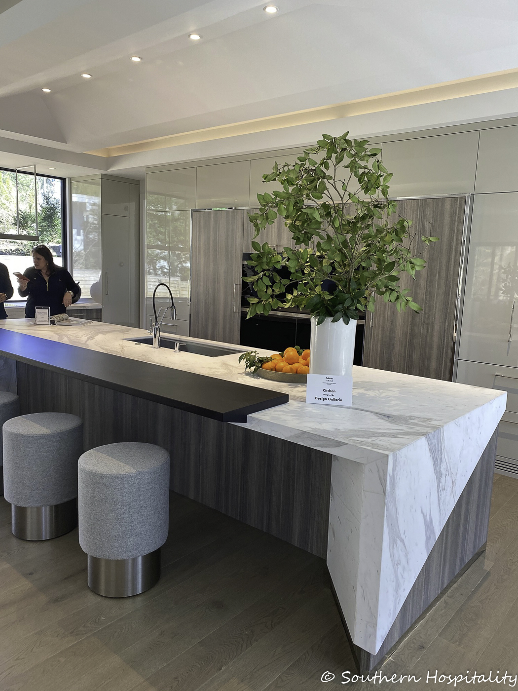
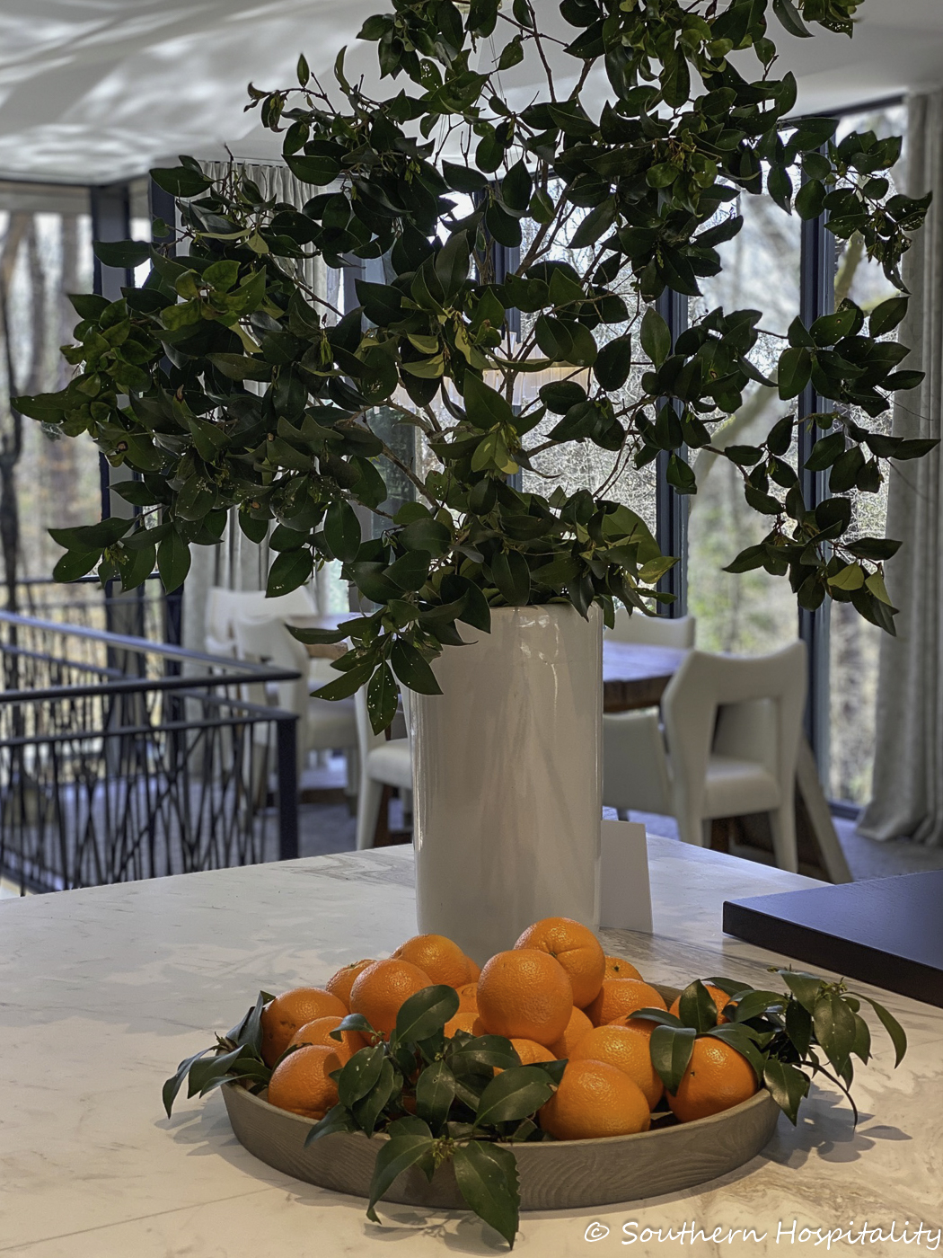
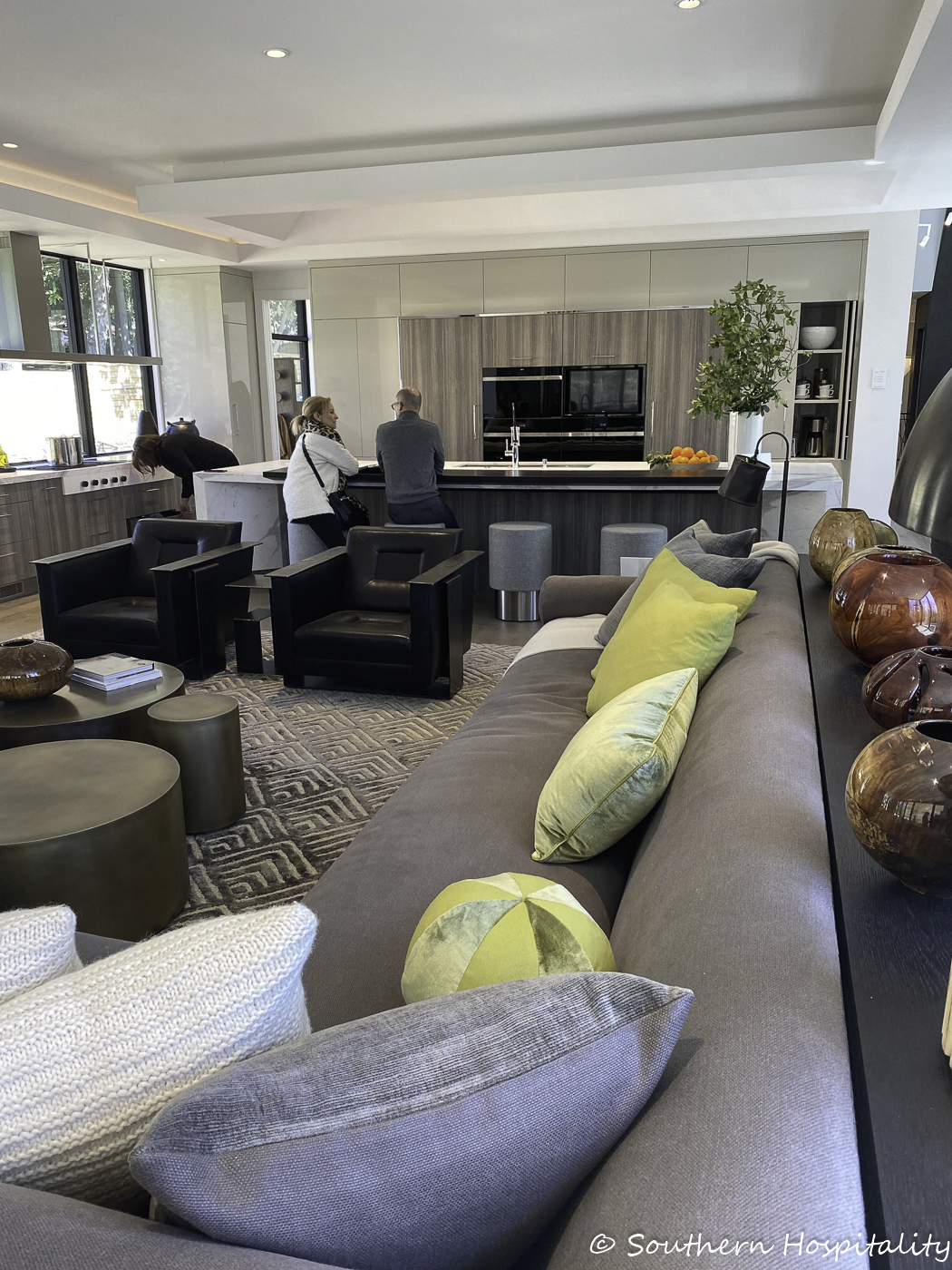
Kitchen Design: Matthew Quinn & Team
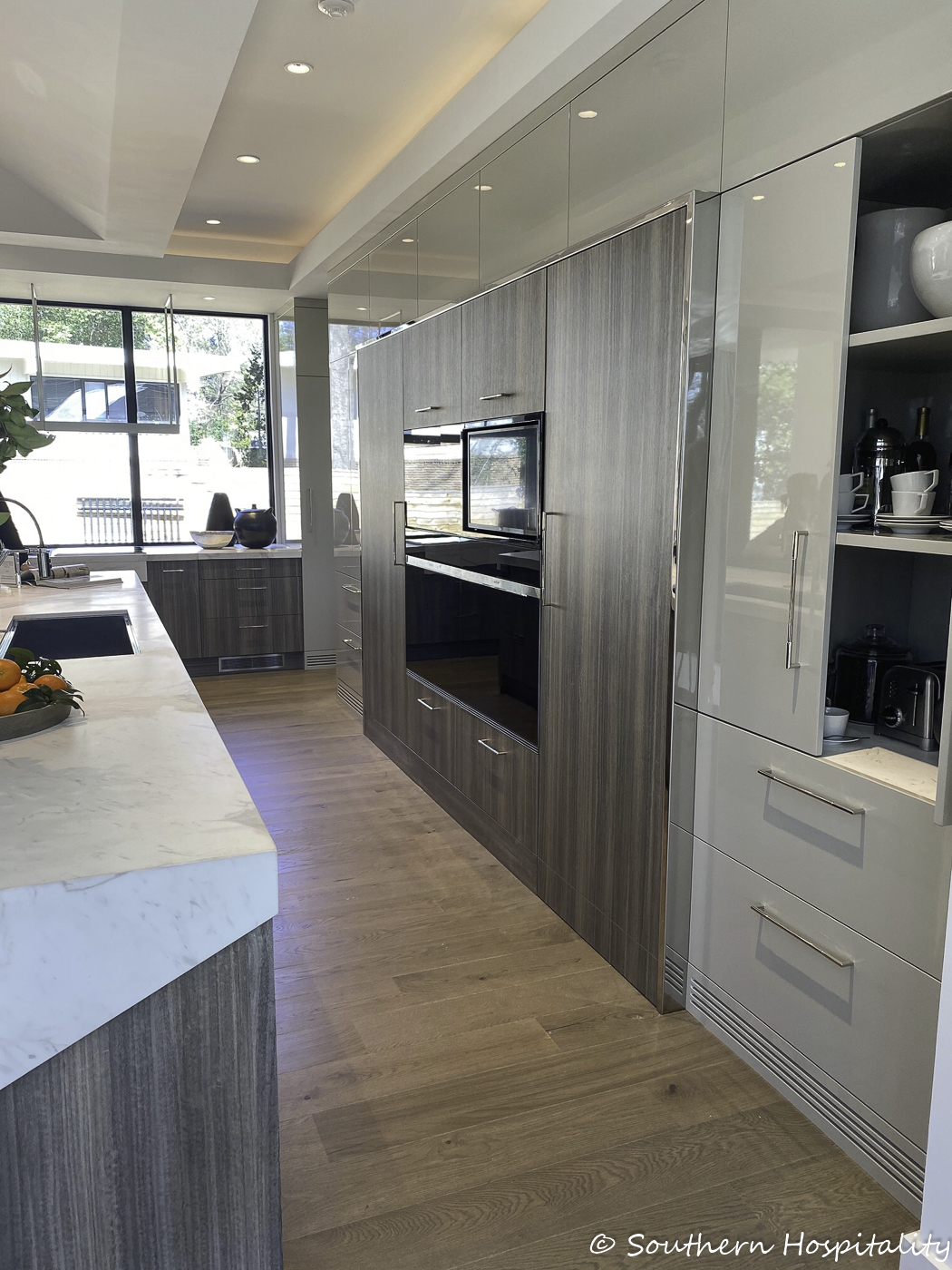
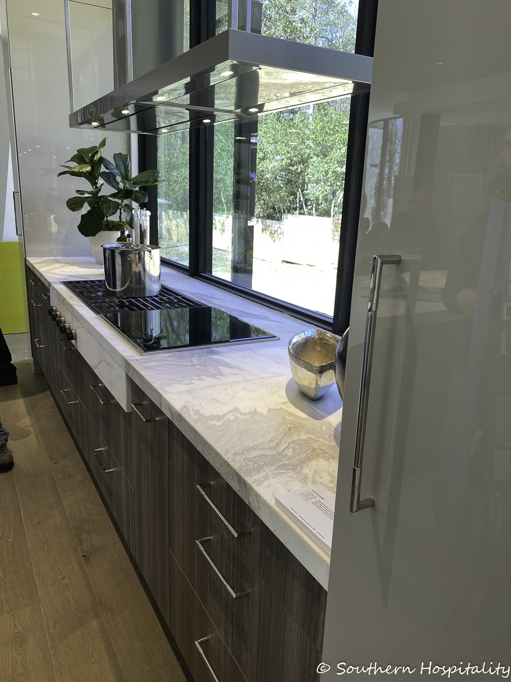
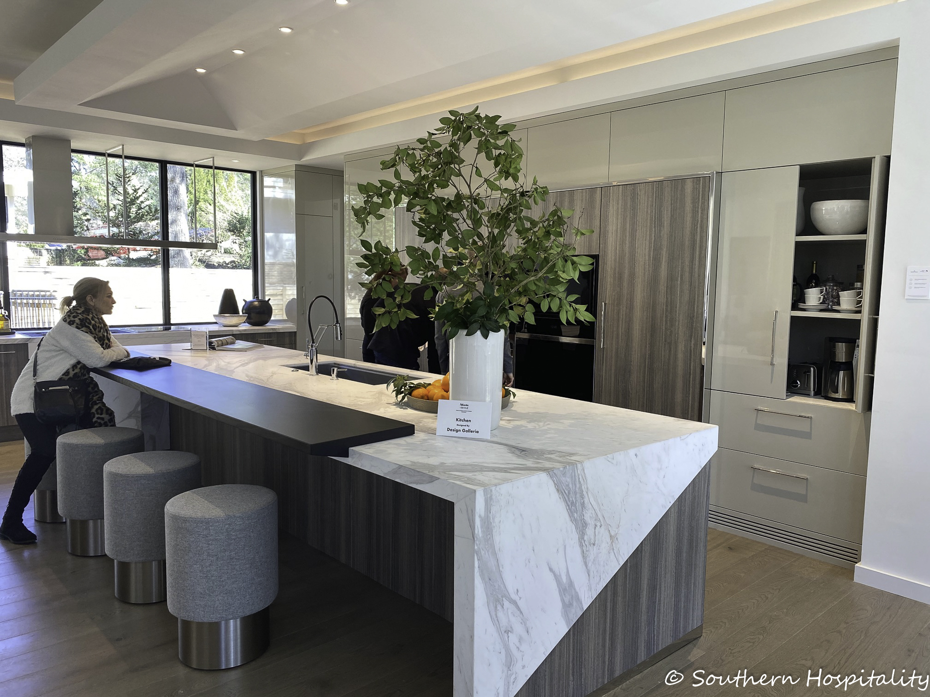
That’s my friend, Sherry Hart at the island. We had a nice chat catching up.
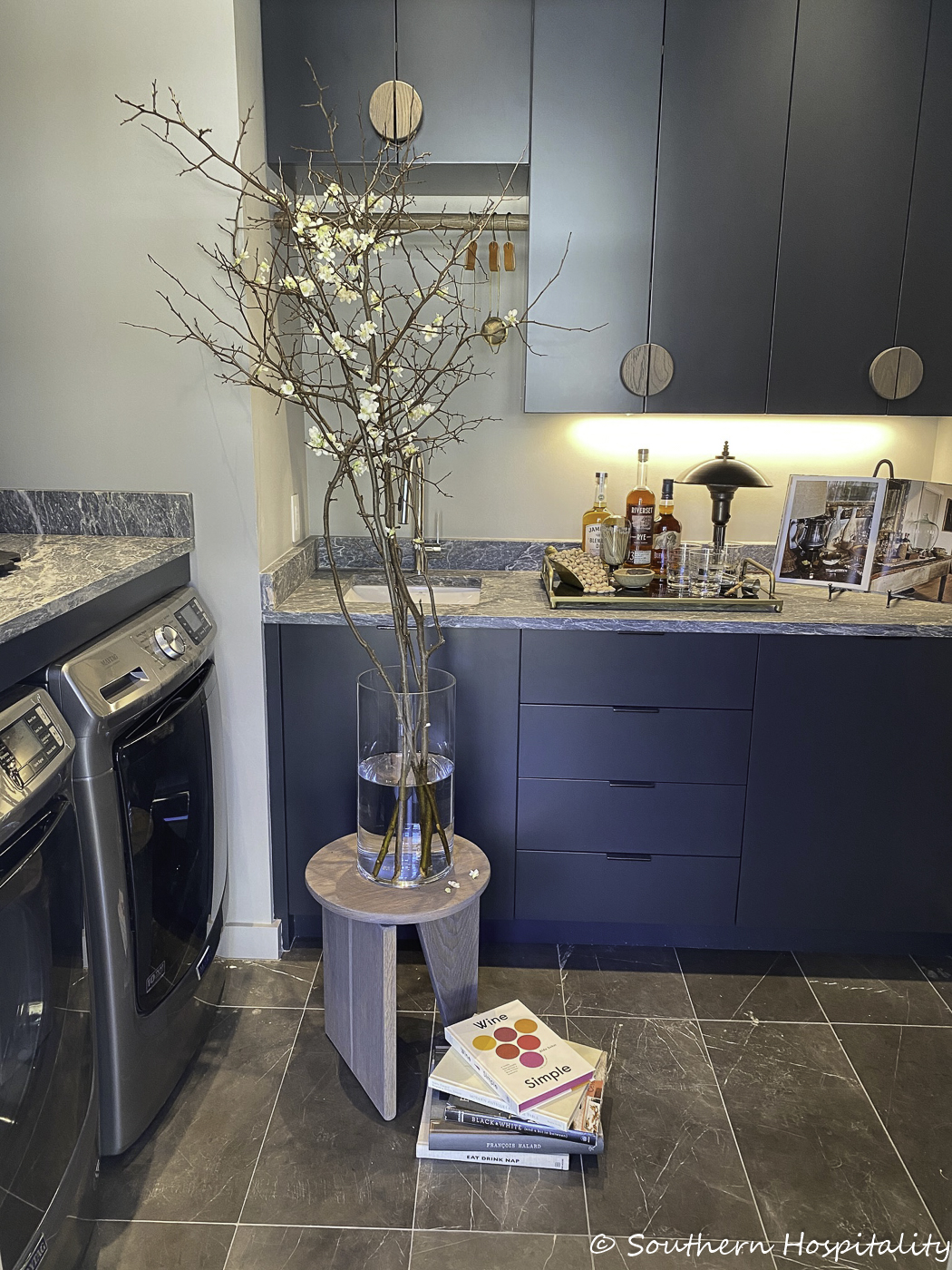
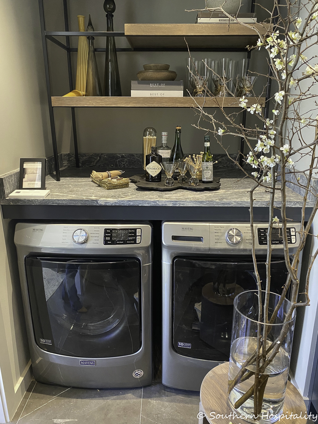
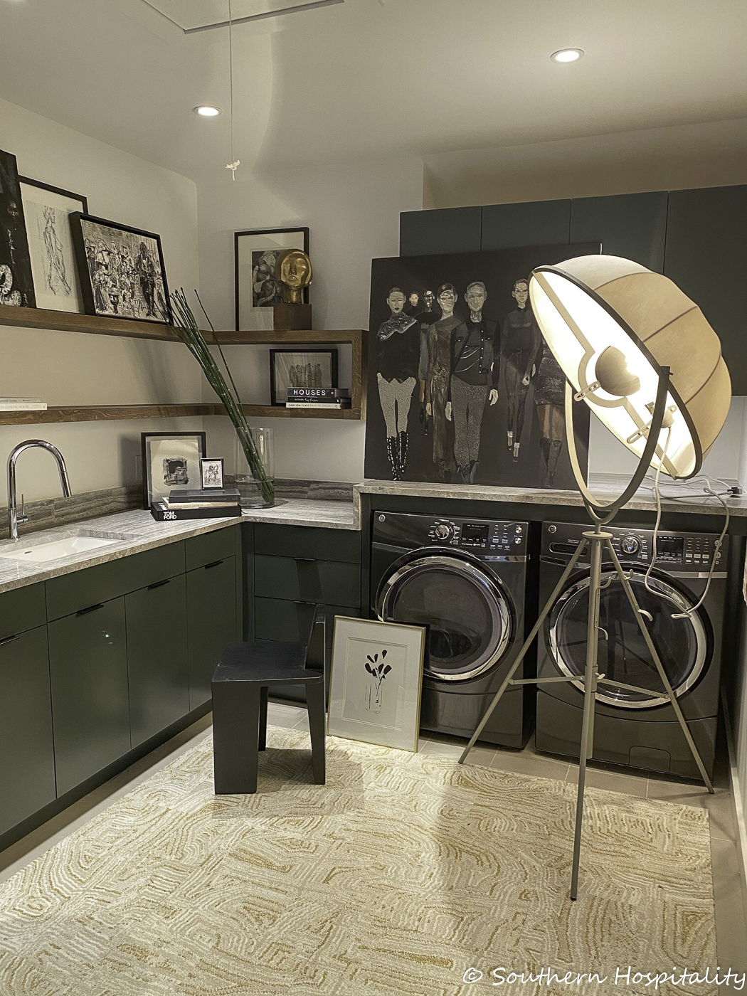
Laundry Rooms & Mud Room: Dana Lynch/Dana Lynch Interiors
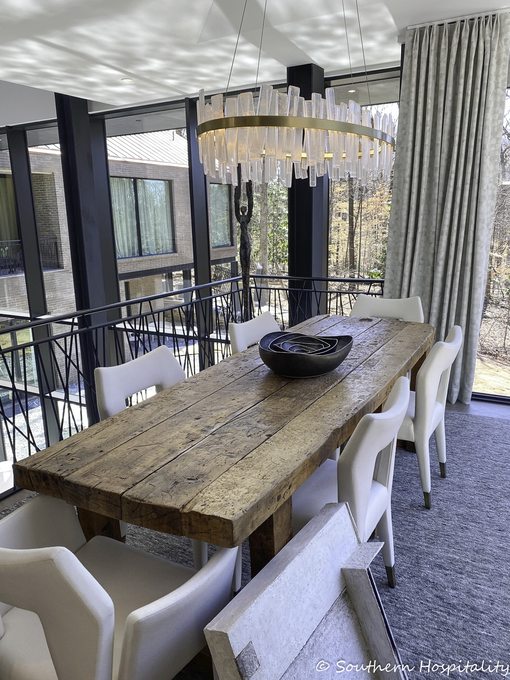
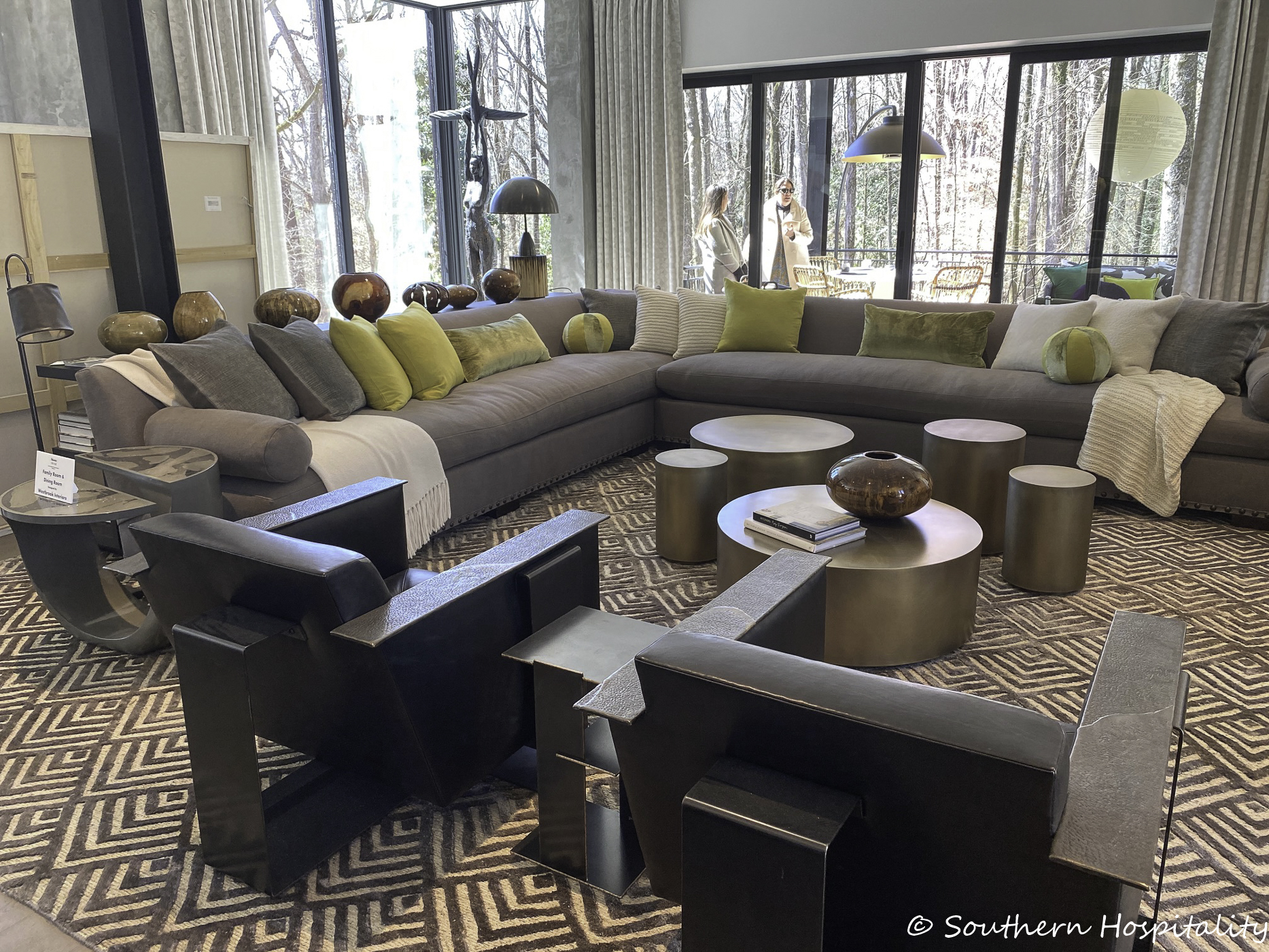
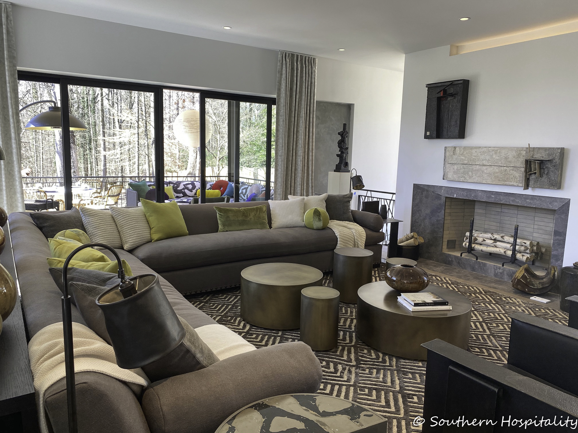
Family Room & Dining Room: Barbara Westbrook/Westbrook Interiors
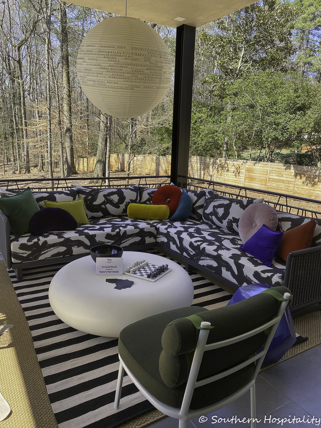
Covered Porch: Vivian Bencich & Carolyn Balfour/Square Feet Studio
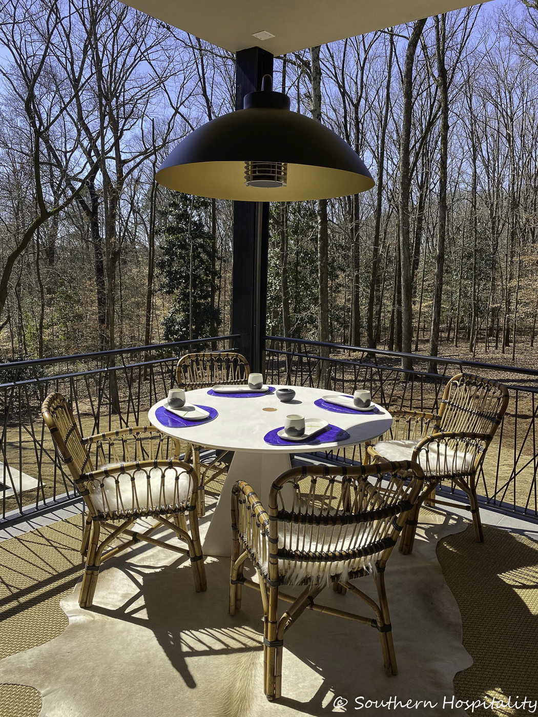
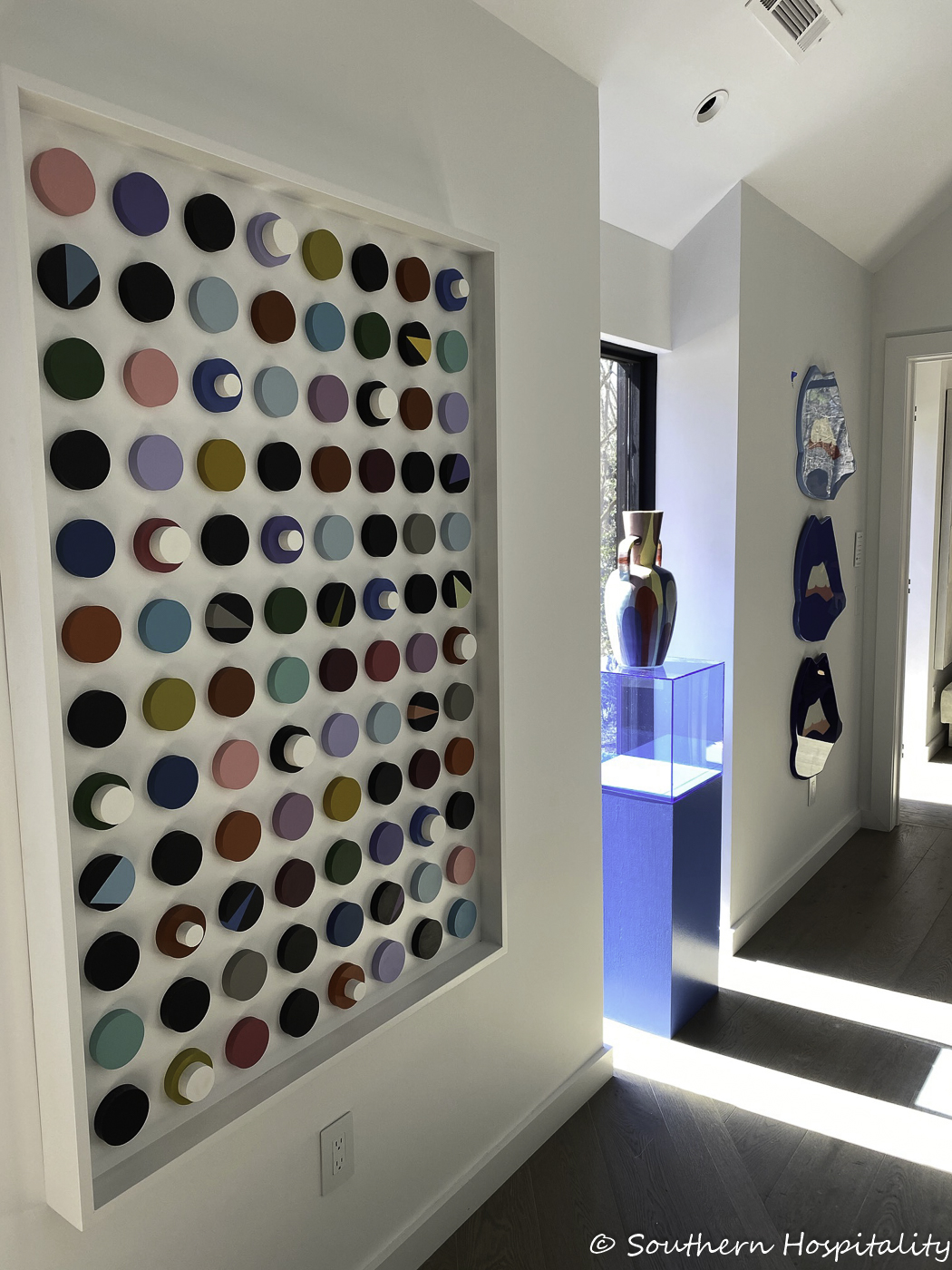
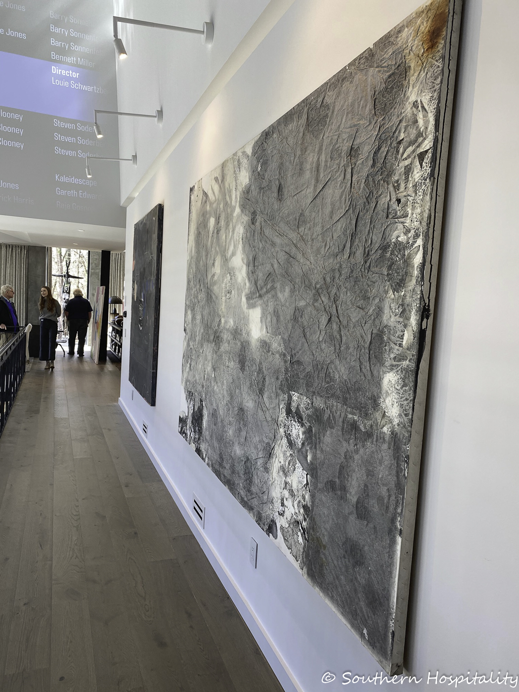
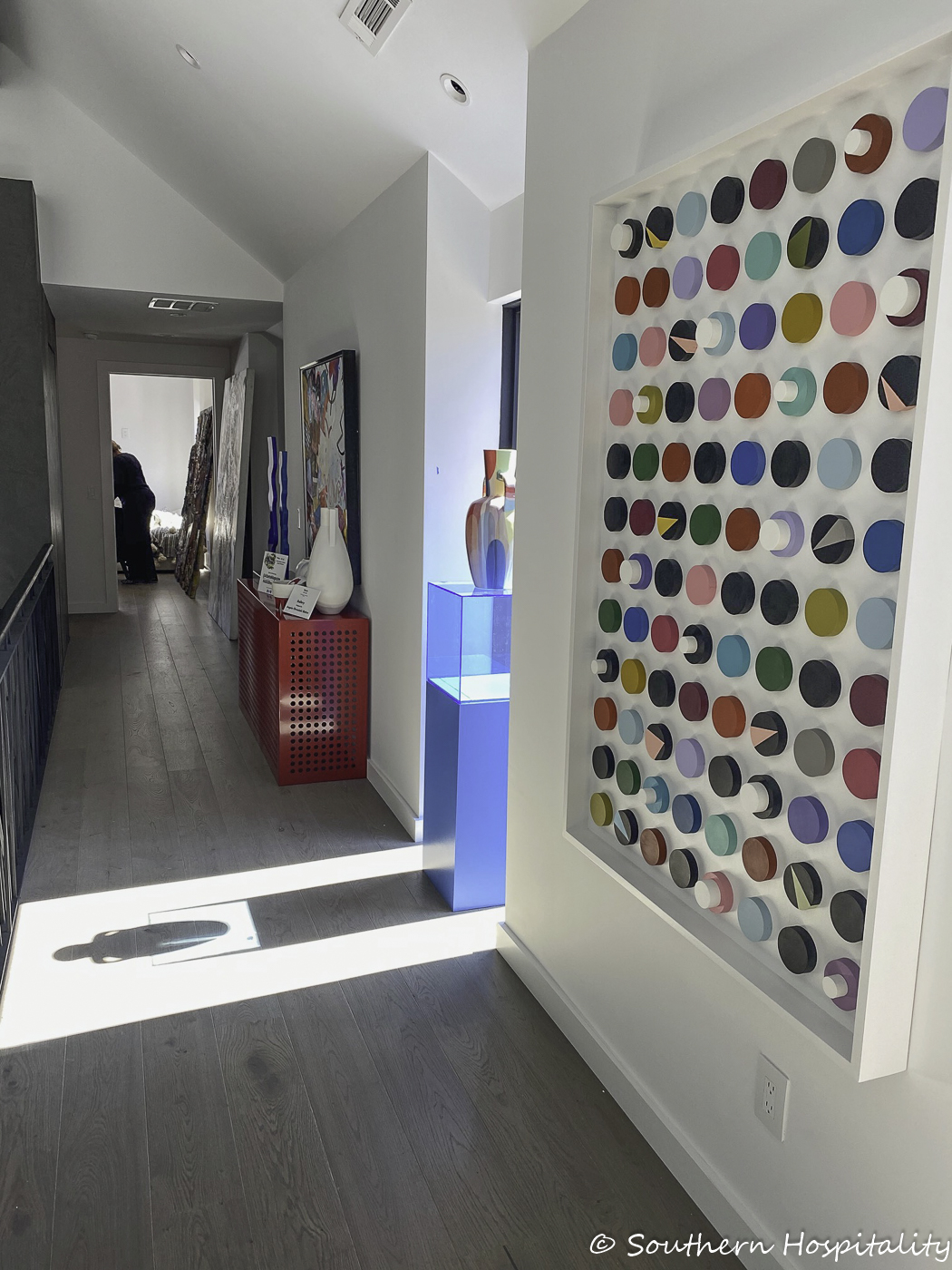
Upstairs Hallway: Angela Chrusciaki Blehm (my friend, Angela, so fun to see her soaring!)
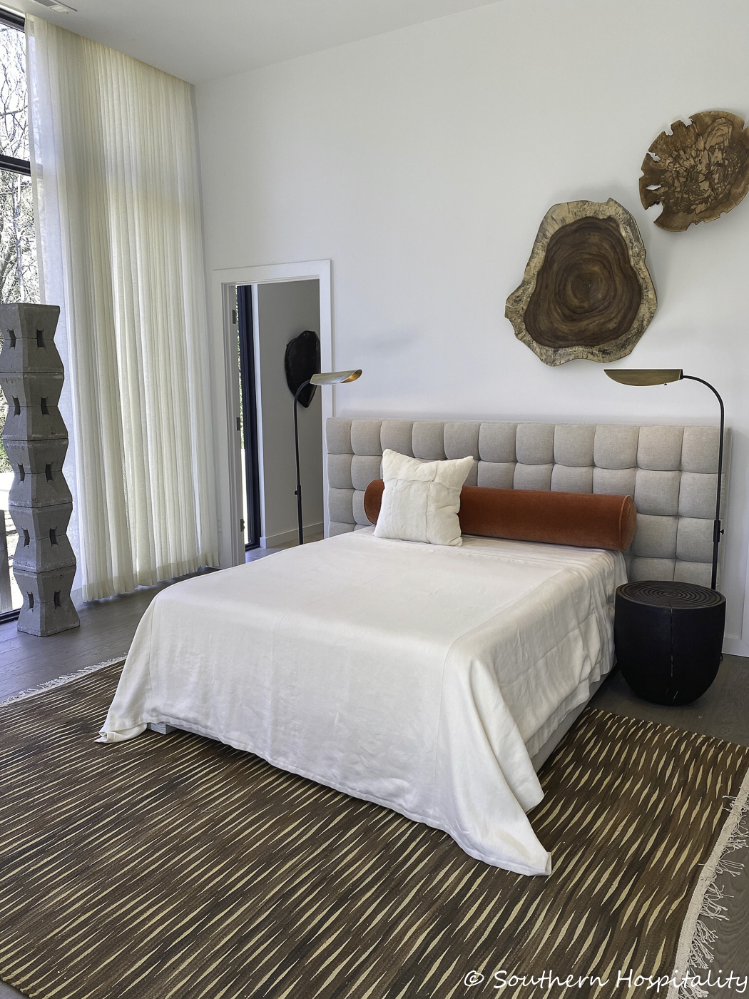
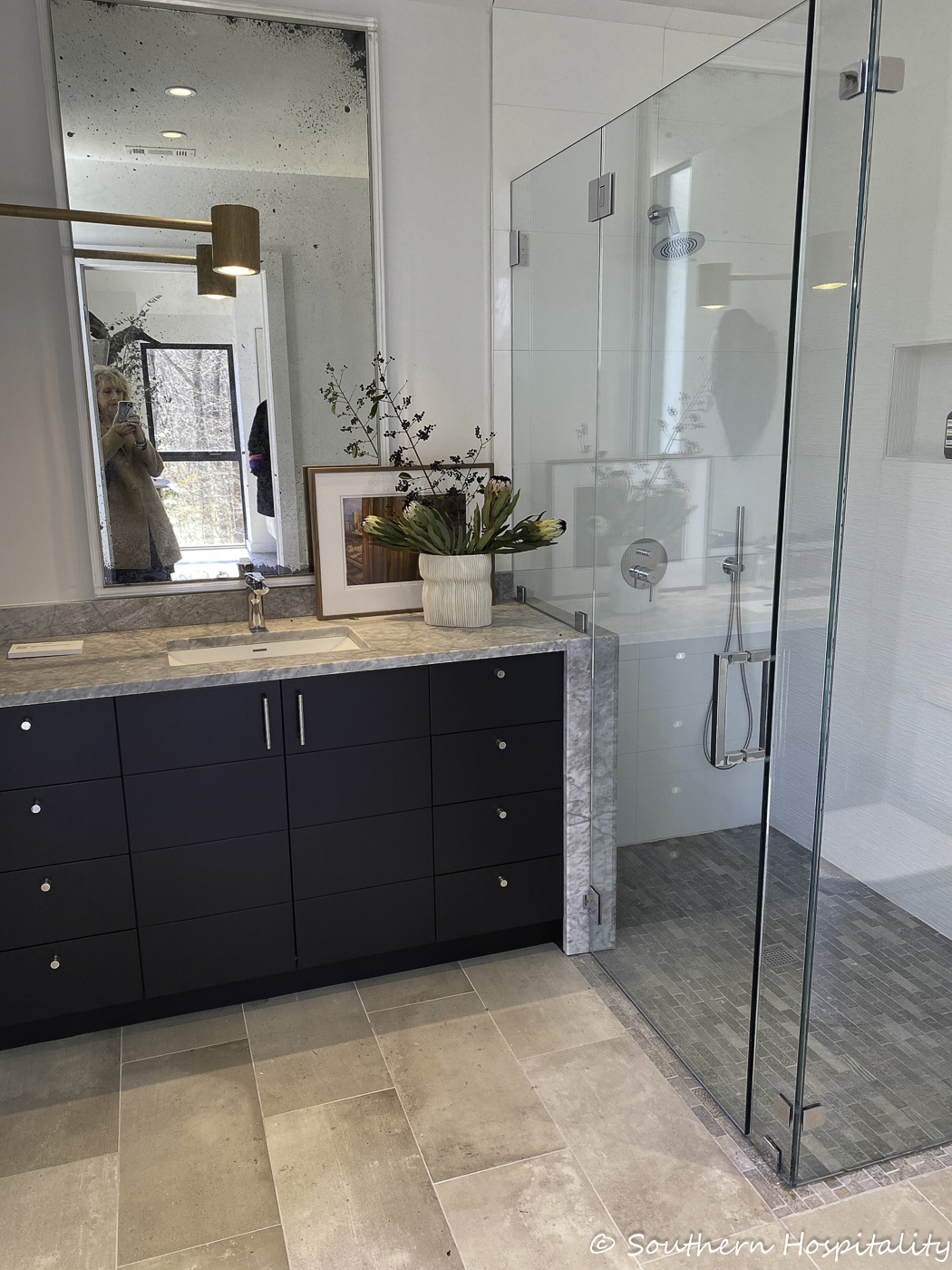
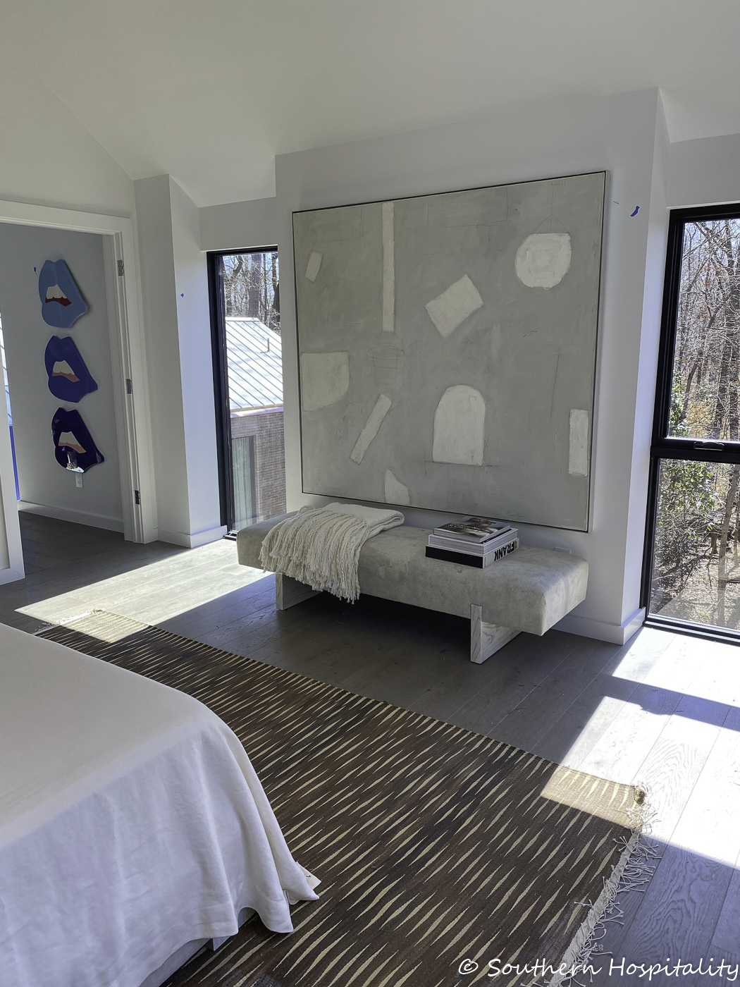
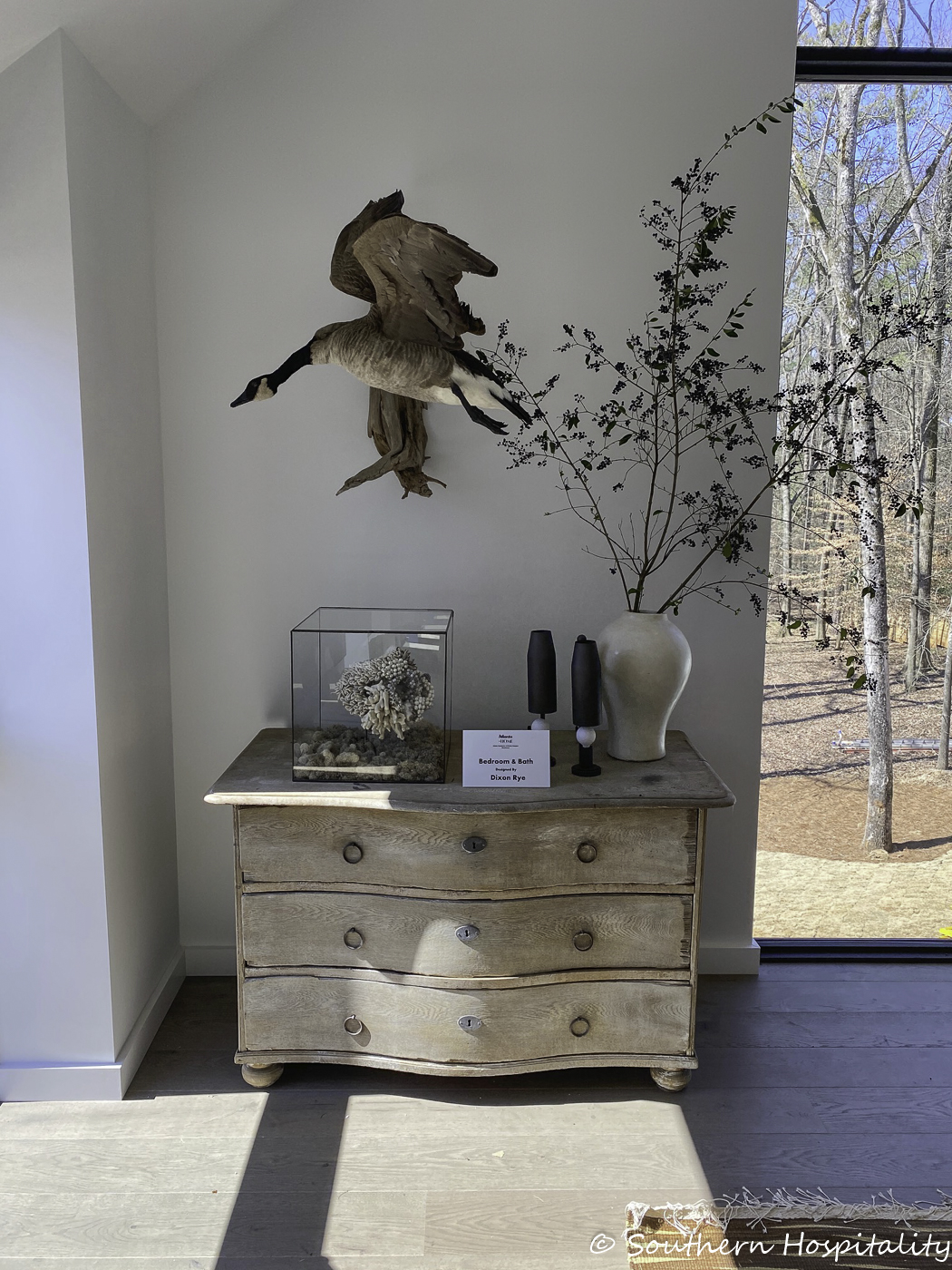
Upstairs Bedroom & Bath: Bradley Odom/Dixon Rye
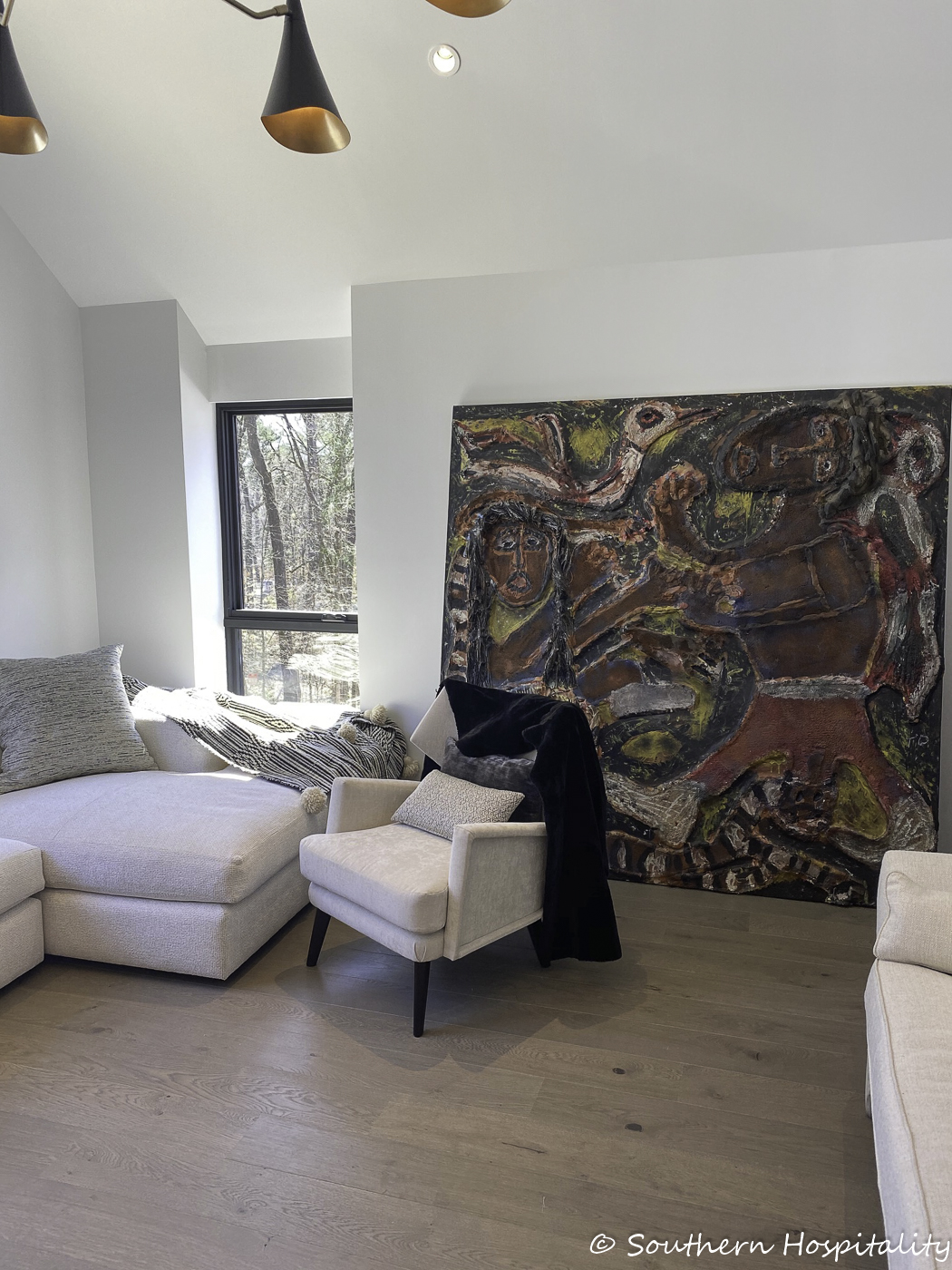
Upstairs Bedroom 2: Loren Audrey Taylor & Carolyn Abrams Taylor/Loren Taylor Interior Design
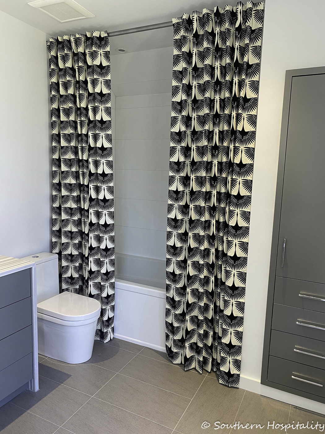
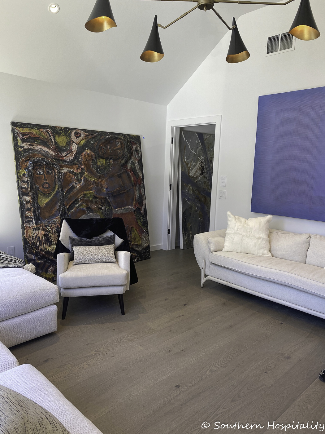
I think I missed a few spaces in my photographs, but this covers most of the house. I hope you enjoyed this, whether or not you love modern design or not, there’s no denying that this is one magnificent house.




You are right. It is the ugliest house I have ever seen on your blog. (:
Sadly I have to agree. I couldn’t find one thing that I liked and overall it just looked really messy to me. Sorry but it’s a big NO for me!
Would I ever want a house like this? No. But I surely can appreciate the talent represented in the architecture and design. Of course, the kitchen is gorgeous. Mr. Quinn never disappoints. And the built in closet in one of the baths is nice. Otherwise, only fun to visit for me.
It seems cold. For me it just lacked that – put your feet up and relax feeling. However, I get that not everyone likes the relaxed aesthetic
It is certainly not my taste but appeals to some I’m sure.
I was surprised at one thing. I would have thought this architecture would be decorated more minimalistic. I was surprised to see so many things in some of the rooms.
One word just about sums it up. Ugly. But some people like ugly. Not for me, I wouldn’t want it if someone gave it to me for free.
This house was truly ugly on the outside and the interior didn’t change my mind. I like a little contemporary but this was just way too weird and cold. I’m sure someone will want it for their dream home, but not sure I would want to know that person. LOL! NOTHING in this house appealed to me.
It is definitely magnificent! It looks more like a museum than a house. The glass on the back and the staircases have a wow factor!
Not my style at all, and I agree that the front exterior is very blah. However, there were a few pieces that I saw that I liked, like the chaise lounge in the terrace room – I could definitely curl up on that and read a book or watch a movie! And the black and white secretary in the dining room space – that looked like an antique piece that was modernized with paint and I like all the cubbies in the desk! Thanks for sharing – it was fun to see!
Um,momma always said,be positive, but? Only room I truly like is that laundry room with the ,wine,booze bottles on a tray .Lol… sorry,too modern for my southern traditional taste….🙏🏼
No thank you, I had a strange eerie feeling looking at these pics. Best thing , the laundry room and beautiful trees.
I too had a strange and eerie feeling looking at the pictures.
Thanks for sharing! It’s fun to see something different every once in awhile. I gleaned several take-aways.
Absolutely gorgeous house! Very different look from outside that won’t appeal to everyone – but I like ‘different’. The interior is beautiful and imaginative. Lots to love here!
When I saw the first pictures I thought they must be “before” shots. Um…. I always look for a consistent point of view in situations like this so I can learn to see things differently and keep me open and flexible. But this is just a big no for me.
Not my style.
A lot of Chinese Modern or Asian modern – but – wait for it.. I like a lot of the spaces. Amazing original art. The lighting was stunning. THE THING YOU CAN ABOUT THE HOUSE IS THAT THE DESIGN WAS CONSISTENT THROUGHOUT. Many ‘show houses’ are a mish-mash of different tastes and expressions. Seems this house has a central theme and decorators chosen to carry out the assignment. One person on this thread said the back was like a museum and I agree. The space with all the large windows was very gallery like – and quite breathtaking. While I would never build a home this style – it was still unique in its own right. Now the front facade and landscaping… not so much. Looks like one of those houses from a past decade that somebody started and never finished. LOL Thanks for the ‘experience’. 🙂
Definitely not my taste. It appeared to be a mishmash of colours, patterns and even style. I would love to see the home with a consistent theme throughout it. I still wouldn’t want it.
Very ultra modern. Not what I would my house to look like. Sorry!
It seems cold and not comfortable. I envy the laundry room though
Underwhelmed. It’s a hot mess.
I would describe this house creepy in an artistic way, plus cold and uncouth with the desire to be noticed as having genius decor, but it doesn’t. All of those stairs and windows on one side make it look like an office building.
I thought okay maybe the outside is odd and rather plain as some modern homes are but the inside would be totally opposite but that was not the case. I found the furnishings and design underwhelming and as some have even said plain ugly especially the bedding. Not a house I would like to pay to tour but each to his own. I did like the modern high gloss cabinets in the kitchen which fit the houses style.
Sorry, this just hit me like either a museum, or a bomb shelter. No warm fuzzies for me. But thanks for sharing. Hugs, cat